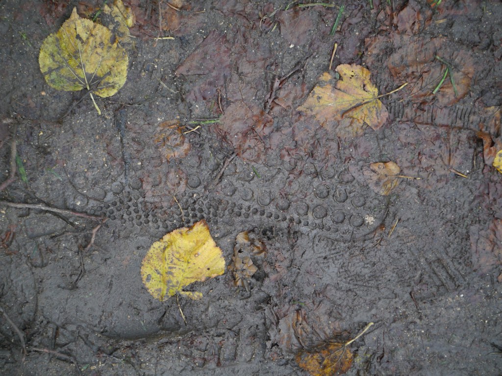
On one of my walks, I was interested in drawing, and drawing with, natural forms and materials. This began with an interest in the trace I was leaving through my action of walking, the impact I was leaving – my footprint.
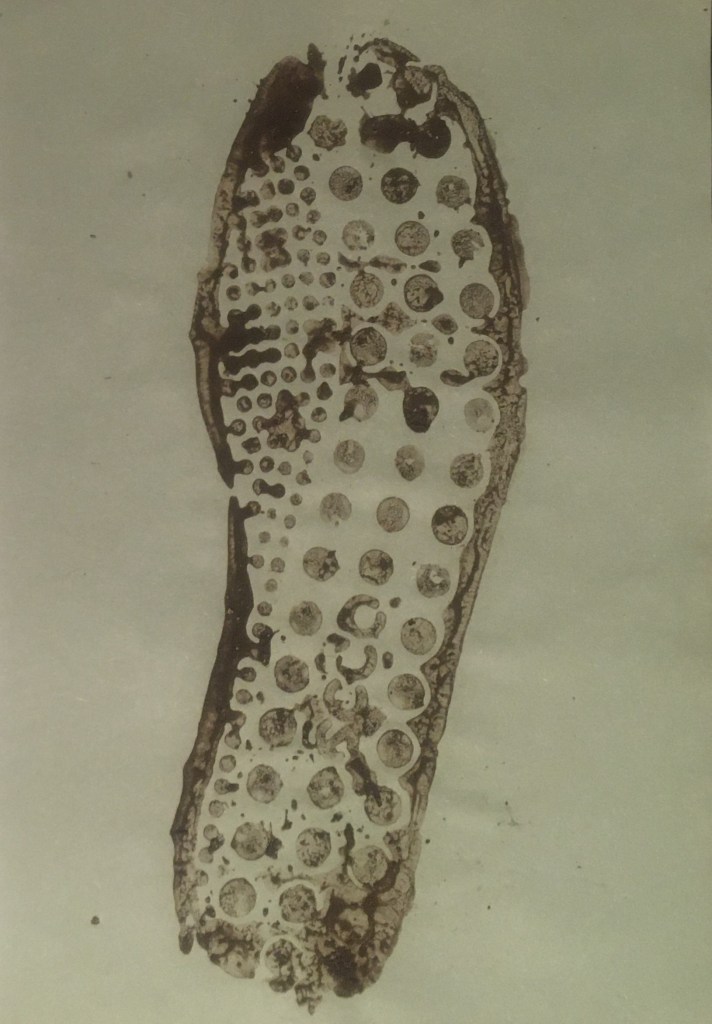
The pattern of repeated circles left in the mud is the imprint of the sole of my sneakers.
The rightmost print came from the mud in the above photograph, from the path itself, while the others were in varying proximity to a muddy puddle.
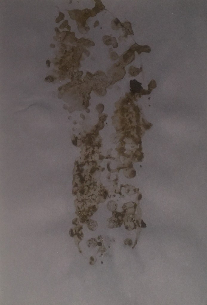
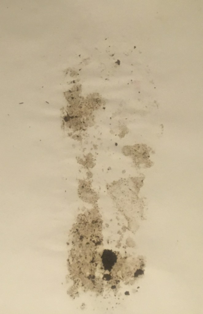
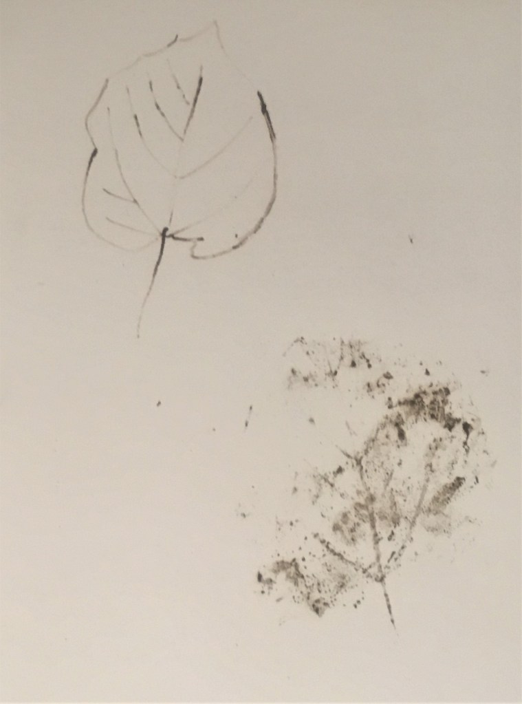
I then proceeded to print my muddy footprint on pieces of paper that I had brought with me, using different types of mud that I found around me (varying in their viscosity). Here I prefer the clearest print – the one from the path itself – and I feel this most clearly represents the impact of my walk. I enjoyed using the surface on which I was walking as a material in itself and transposing this onto another surface. It felt a fitting way of capturing the moment. I chose then to experiment with drawing one of the leaves I had been stepping on in the mud, using the mud itself. I used a dipstick to achieve a linear sketch, and printed the leaf itself. I found it interesting how similar the linear structure of the leaf came out in the print and my sketch.
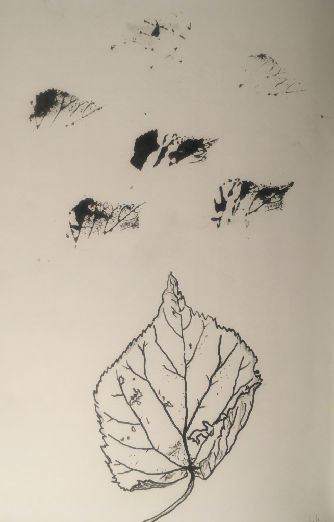
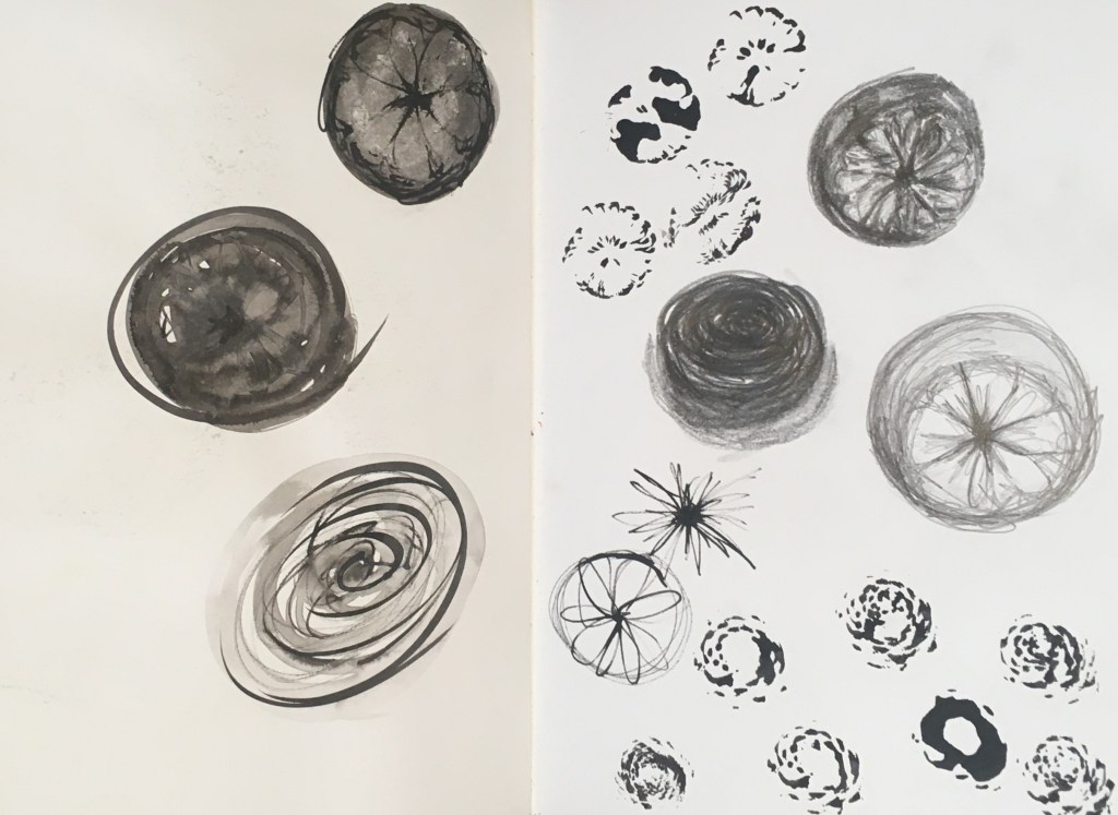
Top: Dipstick drawing with mud of leaf, Bottom: Mud print of leafI repeated this exercise using drawing ink back in the studioI repeated this once more with the remains of a pine cone that I found at the base of a tree, which had been gnawed and deconstructed by a squirrel. To the left, I experimented using ink wash as well as drawing, and on the right I also used pencil to sketch the pine cone, to gain a more in-depth study of tonality and shade.
This exploration of structural forms in nature, and their linear form, is interesting to me. Most interesting for me in the printing is how it reveals hidden forms that might otherwise be missed by the eye – particularly in the pine cone above. It was also interesting to see the transition of the printed image from when saturated with ink to after several prints – the big contrast and interesting silhouetted shapes created in the saturated images are very abstracted and intriguing I think.
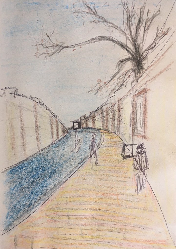
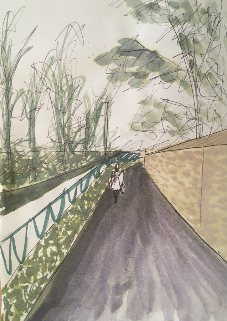
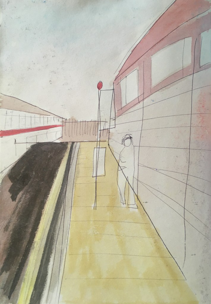
Following on from my previous post, where I noticed I had repeated a certain composition across some of my photos of the walk, I sought to research a little more about this.
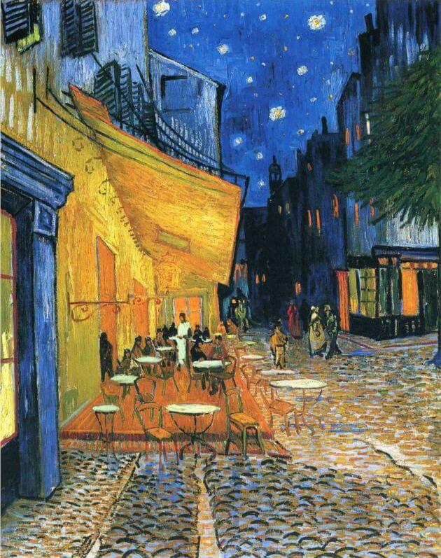
I recalled seeing something similar in Van Gogh’s landscapes that I had seen in the summer, at the Van Gogh in Britain exhibition, and looking into more of these confirmed my theory that this could have been something I picked up on there. Here he has also made effective use of yellow and blue to make even greater emphasis of this composition – dividing the canvas by its horizon near the middle, but off-centre focal point (though his tending to the right where mine was to the left). I find it interesting that he would be returning to a similar strategy for two very different scenes – the rural and the urban, with comparably similar palettes also. The small red tree on the path in the left painting is positioned almost in the same place as the figure in red on the streets in the right one.
Left: Arbres dans le jardin de lasile (1889), Right: Cafe terrace at night (1888)
I wonder if there was intention for Van Gogh behind this or if, like in the case of my photos, it was accidental or perhaps even just a result of him having honed his style and preferred colour palette? Were it to be intentional though, it could be seeking to draw comparisons between these different locations – or perhaps serve as a reminder that though they might seem opposing locations, that they share the same viewer (or that we are seeing it through the eyes of the same artist) they have a unity of experience? That no matter where we might find ourselves at a given moment we still experience the same ‘what it’s like to be me’ in that moment? It might be interesting to create a shared colour palette for my three compositions to explore this further.
Sketches exploring my compositions and seeking to simplify them
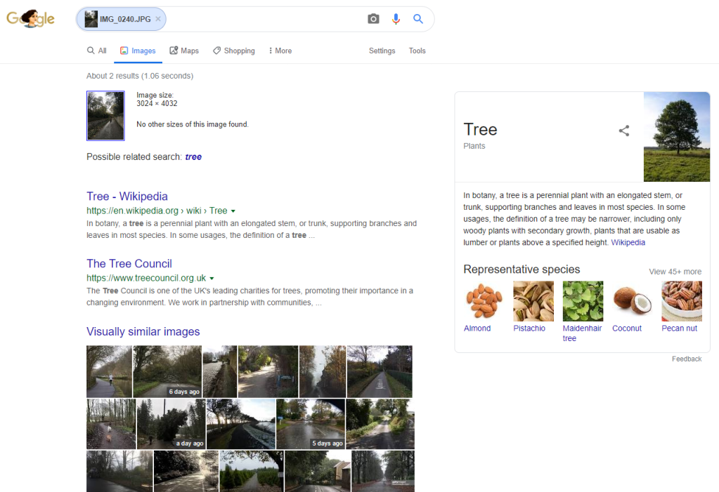
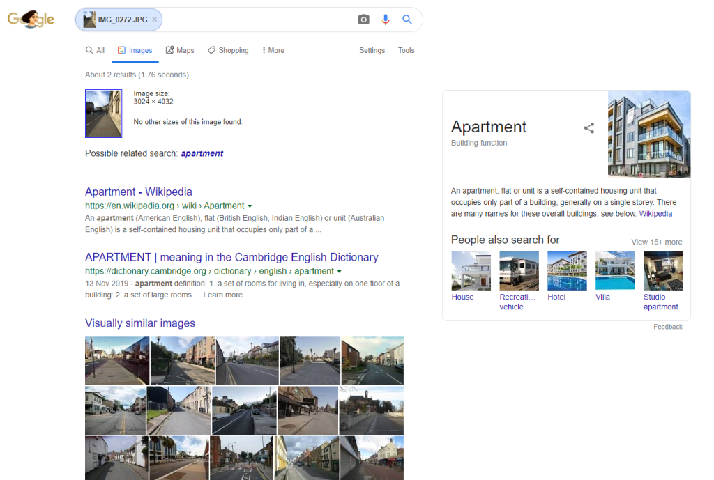
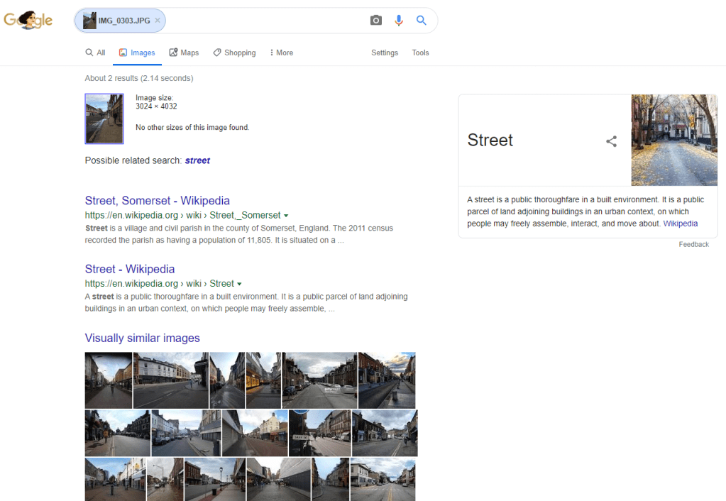
I used google image search to find out if the algorithm could find further instances of this composition. However, I found that the image recognition software was more apt to see the subject than compositional comparison – this suggests to me a more sophisticated programme than where it might first have looked at blocks of light/shade/colour (and so composition) but now is identifying objects within those blocks. It was interesting to me to see that the software was distinguishing 3 different subjects in these images: Tree, Apartment and Street, reflecting the change of environment along my walk. The images it saw as being visually similar all fell within these 3 categories, and some do replicate my composition.
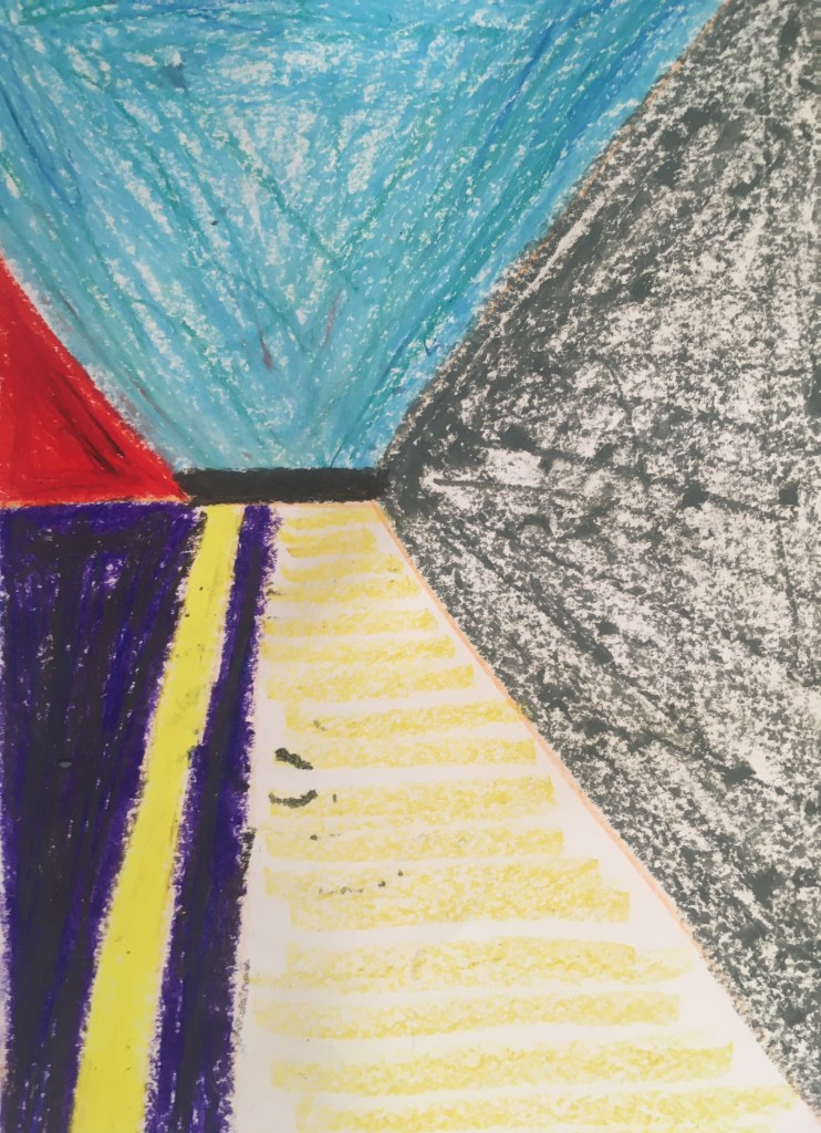
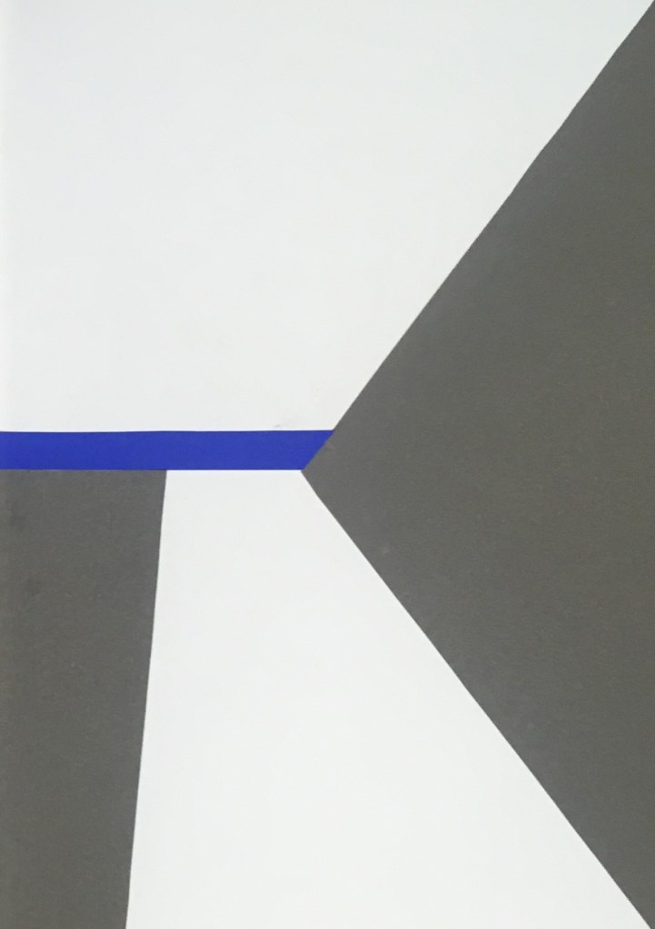
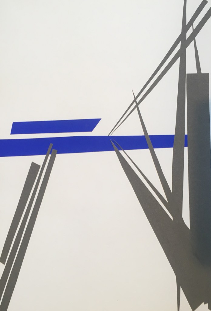
I sought to further abstract this composition, and this deconstruction of three complex images was interesting. I think the cut paper works are more successful – the precision of the shapes achieved and the flattening of the colour fields I think work well to focus the eye on the shapes and their relationships together. A more simplified colour palette also helps here I think, and I like the use of a contrast for the ‘horizon’ line. I wonder if a casual observer would still get a sense of the perspective in the original composition, or if these flattened fields would disrupt that sense of your eyes being drawn in.
Left: using oil pastel, then cut paper and cut paper fragments in the middle and right images
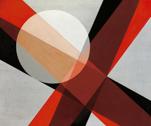
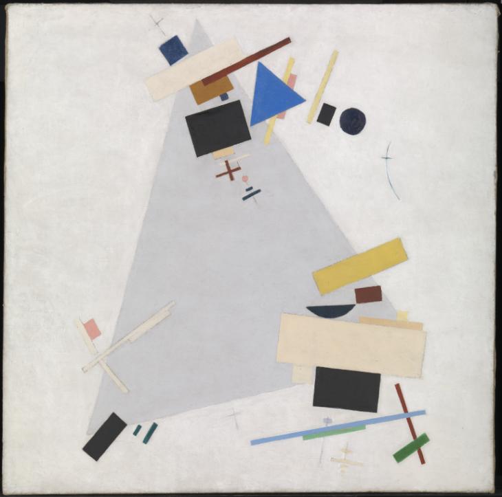
These recall for me geometric abstractions like those of Malevich and Moholy-Nagy. It might be interesting to explore further whether some of my fields are overlapping of other shapes and to explore more tonal colour palettes.
Left: A 19, 1927 Laszlo Moholy-Nagy, Right: Dynamic Suprematism 1915 or 1916 Kazimir Malevich 1879-1935
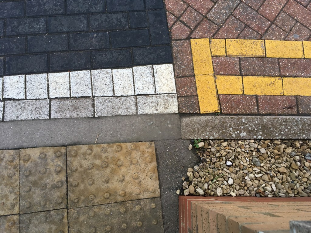
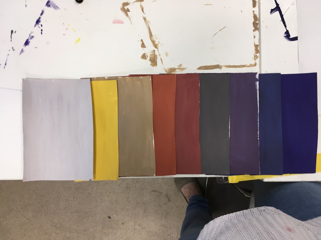
For this workshop, we were to bring in a photo demonstrating an interesting combination of colour, texture and pattern, based on the everyday that might otherwise be missed. I chose to bring in this photo I had taken of different surfaces in a car park.
We then had to mix 8 or so colours from this photo using gouache and paint A5 samples to create a palette – here they are ordered by tone.
I enjoyed engaging with the paint in this way, though did find it tricky to mix the darker tones (we were not allowed to use black in our mixing).
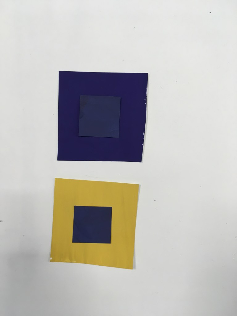
We experimented with identical colour swatches on different coloured backgrounds, to see how the interaction changes the perception of the swatch colour (after Josef Albers).
The dark blue swatch in the top configuration appears somewhat greyer and flatter than in the bottom configuration, where it appears sharper and brighter (in fact seeming closer to the background of the top configuration rather than the swatch to which it was identical).
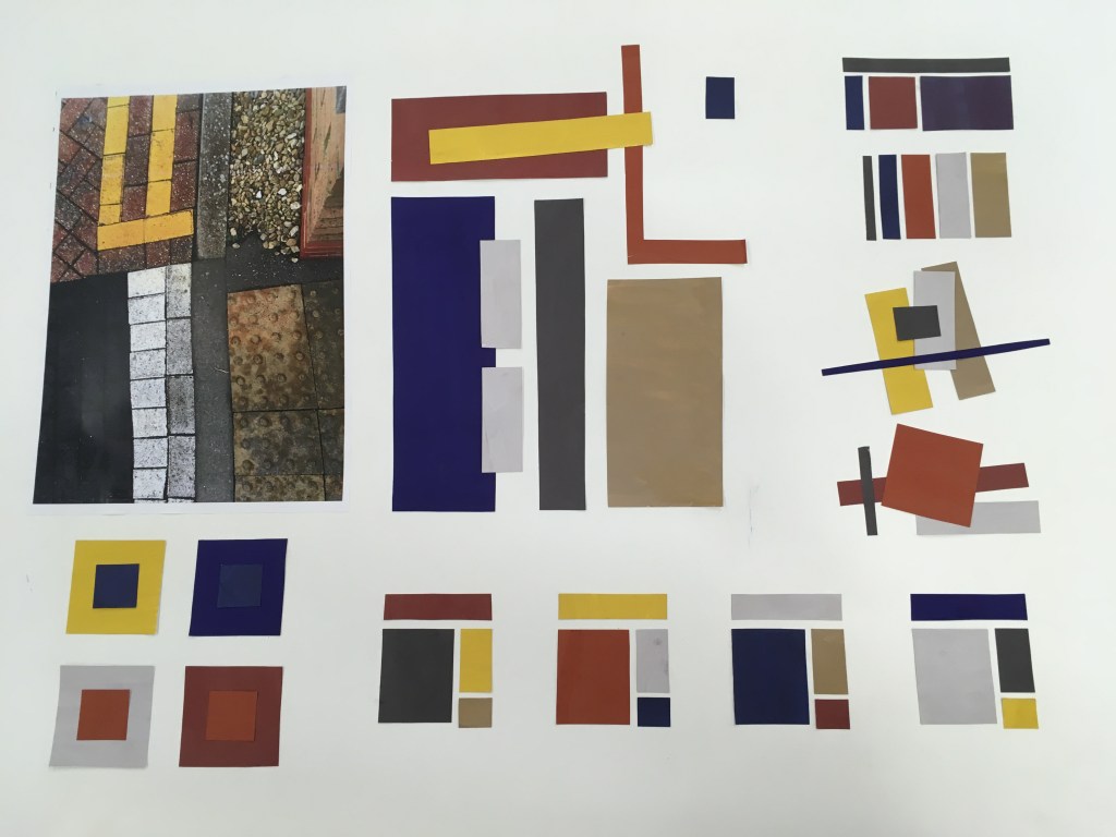
We then had to fill an A1 sheet with palettes experimenting with these different samples that we had produced. Below my work – I enjoyed playing with composition here as well as colour, and since my I had some colours that were near enough primary I produced works that seemed quite modernist and almost Mondrian. That said I think the variety achieved in the palettes that repeated one composition at the bottom of the sheet were perhaps the more successful in exploring the colour combinations, since you can more clearly compare between them.
I enjoyed this exercise and think it could be something I would repeat to help isolate a palette for further work, or that I could develop further in e.g. graphic design.
In this workshop, we were introduced to the Adobe InDesign app, taught several basic functions within the app, completing various exercises to put these to practice, and then finally asked to create several typographical representations of a word given to us from a hat.
I found this brief especially interesting to read and so think I would like to explore typography in greater depth.
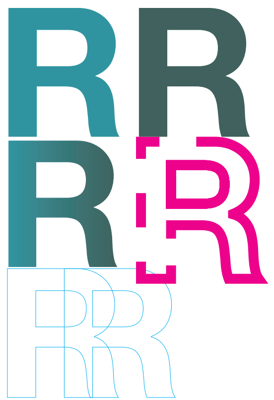
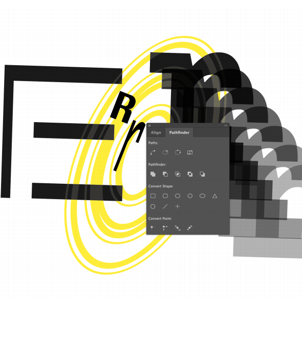
We were instructed to use Helvetica as a neutral font type, and asked to choose a letter to experiment with. I chose a capital R as I thought it had an interesting variety of form to play round with (straight, curved and wiggly).
First we experimented with duplicating and transforming the letter in dimension and orientation. Then too with opacity and layering. What’s interesting here (which I have only just noticed) is that unintentionally I arranged the page in the shape of the R I was using..!
Then, we experimented with colour fills, as well as gradients, and outlines with varying thickness and pattern.
Here, by masking certain elements of the letter by drawing a shape over it, we experimented with deconstructing the letters and marrying them to create new letters or abstractions. I enjoyed this especially, and testing how far the letter could be pushed and still recognised.
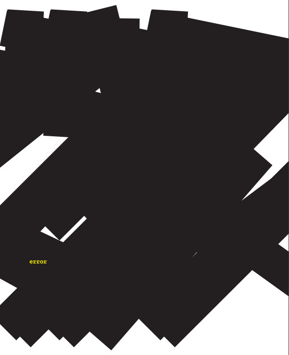
I was given the word ‘error’ to portray through type. This word for me has connotations of machinery and computing, as it’s synonymous with ‘error messaging’ in applications and computer systems. As such I knew I wanted my typograms to play on this.
I began by writing this as one word, and sought to experiment with one of the outlining functions which makes the edges angular/squared – to increase it’s artificiality. I arbitrarily drastically increased the size of this outline and it created an unforeseen interesting result, whereby it was obliterating the word itself. I liked the effect it gives, a bit like someone has viciously markered a piece of paper. Over the top of this, I included a small ‘error’ in a typeface that evokes typewriter or mechanical writing as a footnote of sorts. I chose a contrasting yellow to have this stand out, but also give a sense of alarm. Interestingly, when printed the strength of the black ink behind this yellow note means the type is almost imperceptible.
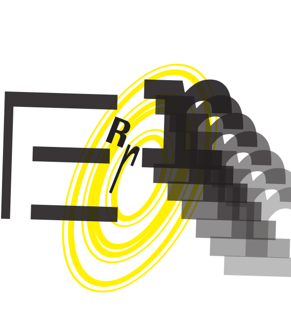
For my next page, I wanted to experiment instead with each letter in isolation. I chose to continue with the yellow/black palette for this piece as well. I knew I wanted to mix up the sizing, typeface and capitalisation of the letters to disrupt the reading of the word. I deconstructed my capital E which I find interesting since it remains identifiable despite the middle and bottom horizontal lines being disjointed.
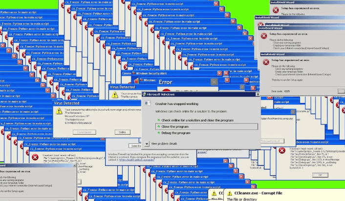
The fact I had three rs in my word was interesting, since I had been working with this earlier. I chose to still have one capital R here but I enjoyed exploring the lower case r in this instance – particularly when duplicating and varying the opacity and making this overlap. This reminded me of an error that used to happen with Windows OS and that was featured in the opening credits of the IT Crowd tv show (which again reinforced this connotation of error).
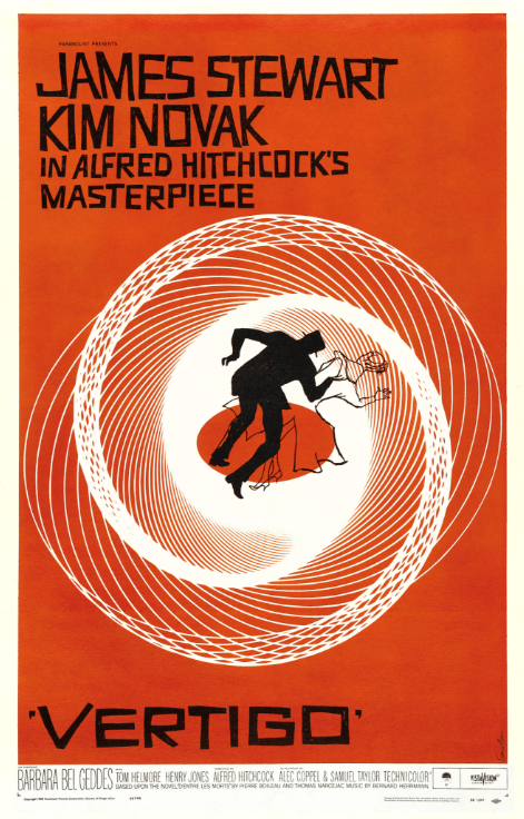
For the O, I wanted to again play with the outlining feature, and again using an oversized one, I achieved an interesting effect which effectively multiplied the letter itself. By scaling this up and tilting it I realised it looked a little like the iconic Vertigo poster, and I liked the additional meaning this could convey, alongside the repeating r, of you falling into an endless error. I backgrounded this to highlight that sense of falling into it. [Here again, the vortex is appearing as a motif!]
Left: windows virus screen, right: IT Crowd intro screenshot, below: the iconic Saul Bass poster for Hitchcock’s Vertigo, 1958
I further subverted this work by ‘accidentally’ leaving one of the InDesign function windows on top of the design and screengrabbing it to create a further page – in a postmodern sort of way.
I also enjoyed seeing this message at the bottom of the application window and thought it could in itself ironically imply a paradox of both being and not being an error.
I enjoyed this 1/2 day workshop greatly, and would like to work to extend it as suggested at the end of the brief.
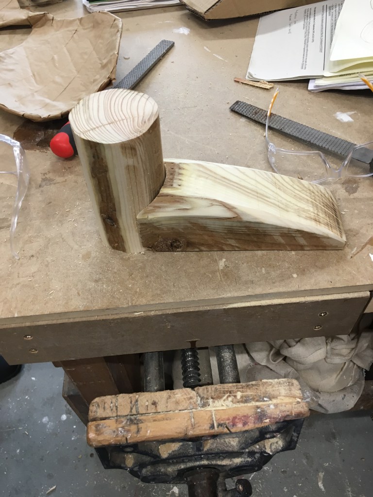
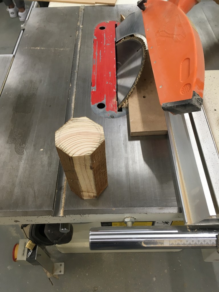
Following on from the cardboard structure I had created in the previous weeks (as a translation of the drawing I had made from my partner’s description of a plastic severed foot prop), we were tasked with further translating this into different materials – wood, and then clay moulding for a plaster cast.
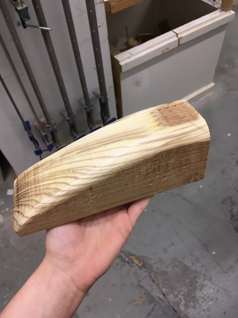
My finished wooden piece
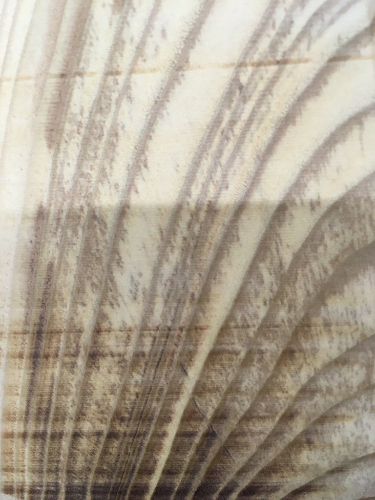
I enjoyed finding an even more generalised form for the wooden interpretation – I utilised some very strong timber (previously used as a wooden fencepost) as I wanted to evoke the solid and supportive role this object could take. Cutting and sanding this to smooth out a more organic form was hard going but I am pleased with the end result on the arch of the foot. The graining on this part also is very interesting, and unique to the material used – I think it adds a suggestion of movement and dynamism as well as materiality.
The most difficult was the concave jointing space that I cut out from the foot piece, to slot the cylinder within it. This was to replicate the joining mechanic I had used in cardboard, but it was too sharp a curve for the saw to do, so I had to cut straight towards the curve line and break off as many pieces as I could with the saw, before chiselling down by hand. This proved very hard work, and I did not quite achieve the finish I had wanted. I might find a different solution to this if I were to repeat this/look to produce a finished piece.
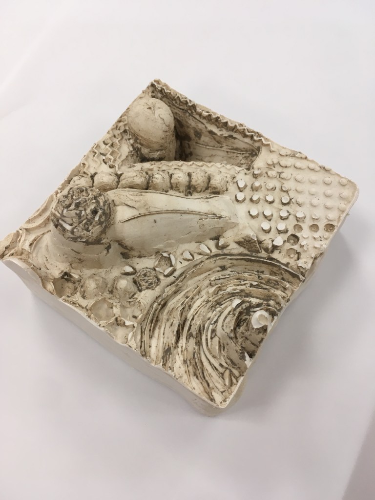
The cast plaster
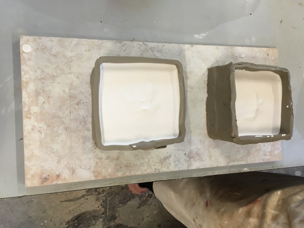
I took quite a different approach with the clay/plaster sculpting – here rather than simplifying/generalising I explored detail that had featured in my cardboard structure, and some abstract forms. I first was interested in exploring the effect of depth and relief when carving the clay, though it was difficult to fully envisage what the finished result would be in the plaster reverse. I knew that I wanted to attempt a full standing foot like I had achieved in the other materials, so I doubled the depth of my clay to ensure I could achieve the height required. I’m not sure the generalised shape that I reproduced here is as effective with this material as the detail I captured, e.g. of the severed top of the foot in the bottom corner.
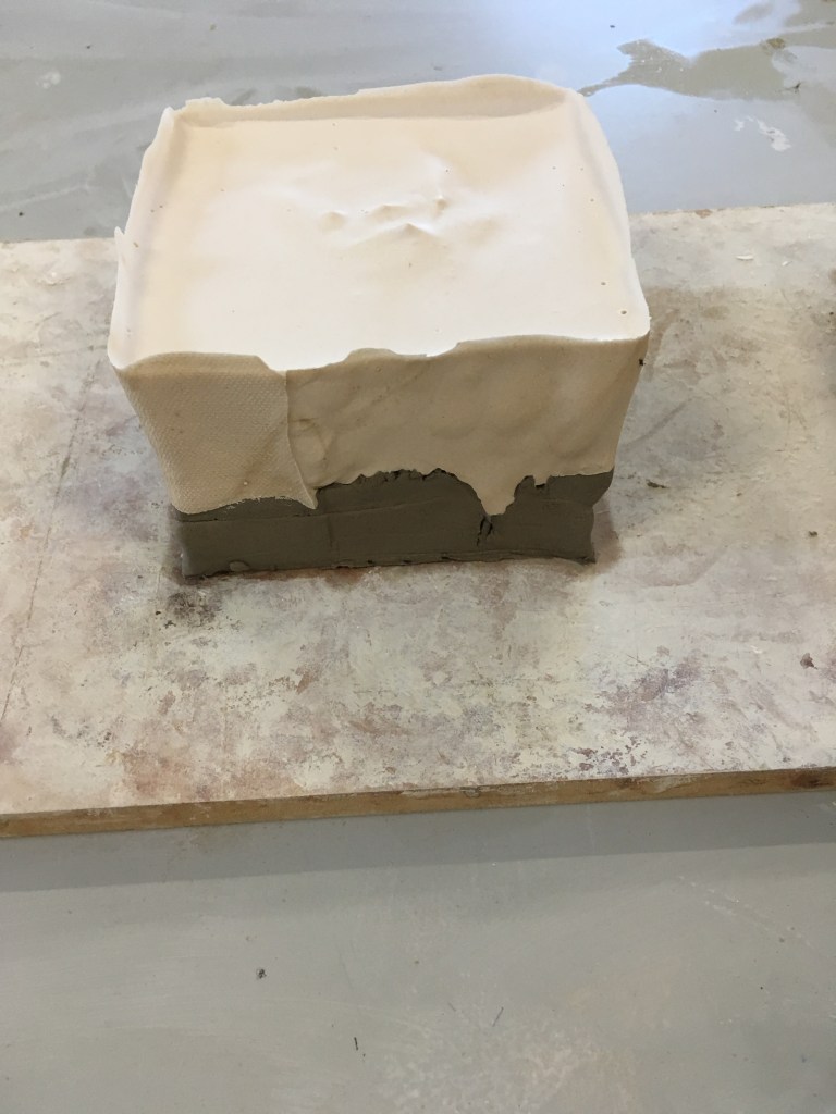
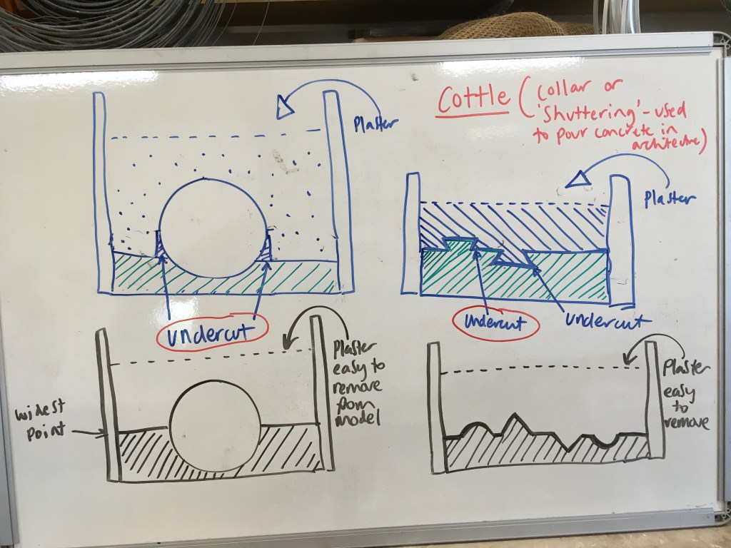
Left to right: My carved clay mould with cottle, Mould with the plaster poured in, and once set before the clay is removed.We were given instruction to prevent undercuts in our mould, which I tried to follow, but I think some of the finer detail in my design still meant clay was not easily removed from some of the crevices.
It’s interesting I think that here again we can see I am repeating the concentric circles/vortex motif that I have been exploring in survival!
I was keen to try out the single line approach with drawing for myself having looked into Calder.
First I had a go with doing a figurative piece based on my cat, Jasmine.
My first attempt (top left) I had started with a gel pen and I like the design of this work but the line quality was not as satisfying, so I moved into brush pen for the remainder. This also gave a little more freedom to my stroke, where I perhaps had been a little more focused on ensuring the pen did not lose contact with the paper with the gel, giving a more precise and static feeling.
I explored the depiction of the distinctive markings she has – a black stripe down her back and into her tail. I think this perhaps over-complicated the picture though, and I find the more simplified line drawings more satisfying. I enjoyed adding a suggestion of texture with the outline though, and developed this in several test runs. The final work I think has the best expression of this, and I am especially pleased by the impression of the right haunch – here the line is not so literally portraying her outline but highlighting the form in another way.
It was relatively quick for me to run this exercise, so could be easily repeated, though it did require several iterations for me to explore it. Perhaps this iteration gets streamlined with practice, but I am interested that this helps process the visual into something more essential.
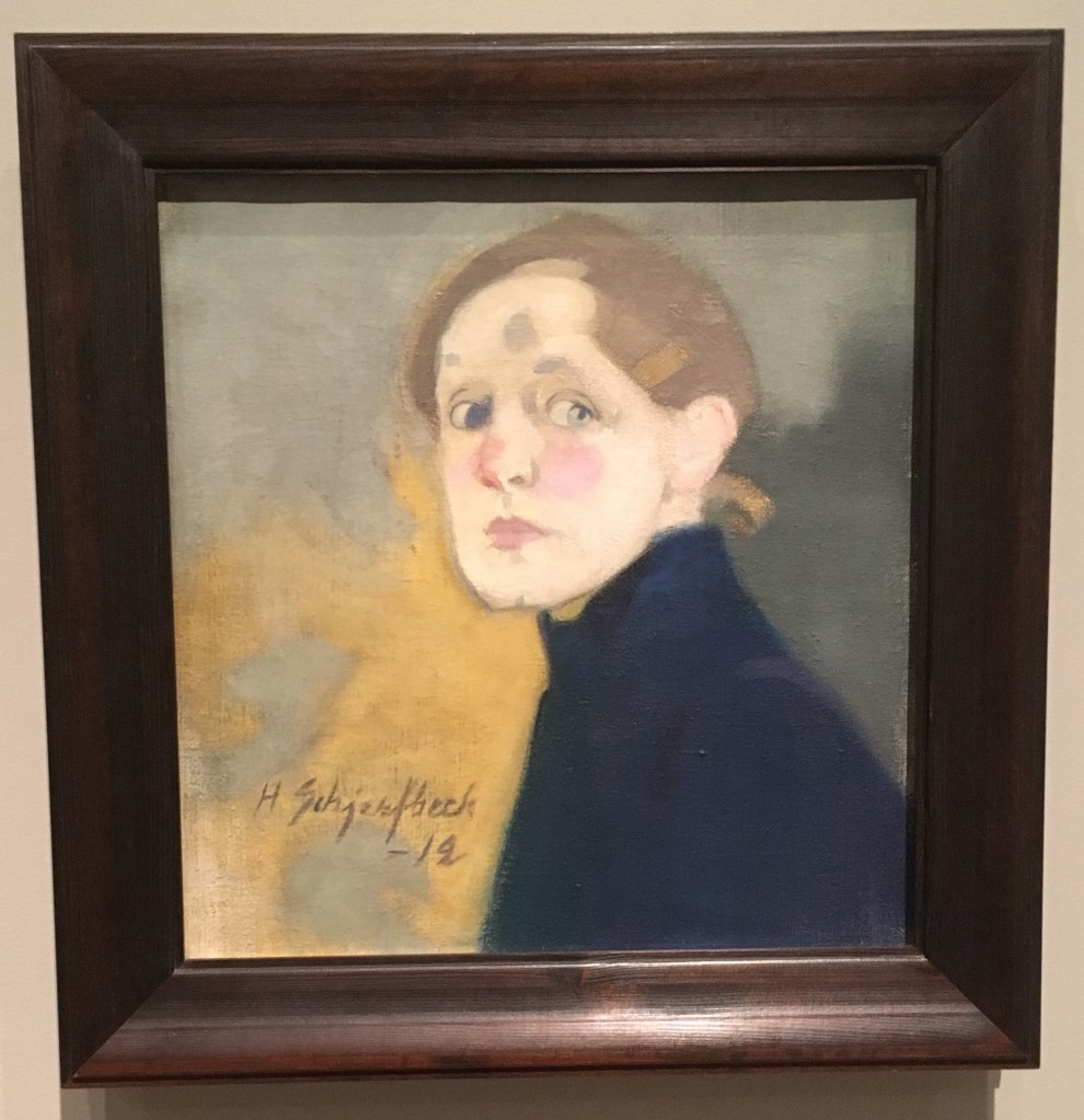
This weekend I visited the RA to see the retrospective on Helene Schjerfbeck, the first solo exhibition of her work in the UK. Born in Finland in 1862, she was an active painter until her death in 1946.
I was keen to visit this exhibition, to continue my run of women artist retrospectives in 2019, begun with Lee Krasner and Natalia Goncharova. This is motivated by various reasons for me – to do what I can to ‘vote with my feet’ and support the rewriting of art history to include women who deservedly should be included within it, in the process educating myself and reflecting on their practice, and further because something about observing depictions of female subjects devoid of the male gaze is palliative and reassuring to me in some ways. I have often felt very uncomfortable in the more historic wings of art galleries, filled with idealised and sexualised female forms, and while some women artists have continued in this convention in the hopes of subverting the narrative, I find it most interesting seeing depiction go beyond this.
The exhibition itself was divided into 5 sections, split across 3 rooms, suggesting that the curator could have filled a good number more rooms if given the space!
Dreaming does not suit me. To work, to live through work, that is my path.”
Helene Schjerfbeck
I think this artist held a deep emotional intelligence, and conveying complex emotional narratives in her work. I will highlight the works I found to be most interesting here, in the order in which they were presented in the exhibition.
Section 1.
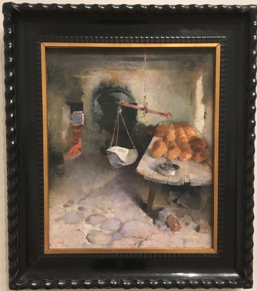
The Bakery (1887)
For this painting, Schjerbeck had set up her easel in a working bakery but chosen not to depict the bakers who no doubt would have been present at the time. In this sense she is already subverting the conventions of naturalism. I found this painting a little unsettling, and reflected on it for some time. The scales, just off centre, are unbalanced. We see a large table filled with fresh baked buns, just laying there (the perspective of this feels like it is exaggerating the size and dominance of this in the space). There is a sense of stillness and murkiness in the room, which is contrasted by the vivid light from the furnace emanating from around a corner in the distance. It implies for me a sense of waste, empty endeavour, inequality in a land of plenty.
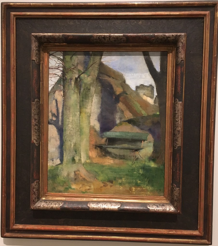
Shadow on a wall (Breton landscape), 1883
I was intrigued to see this painting in the exhibition, following my own thinking around depiction of shadows and impermanence. For me, this painting was interesting as she had taken great care to depict the detail of the young branches on the foregrounded tree, to a very fine degree, but the subject of the painting itself, the shadow, contrastingly feels slightly sketchy or blurred. I wondered if this could be defying the convention of the object of focus being also the main subject of a piece (as in photography for instance). The effect is such that it is as though we are only seeing the shadows in our peripheral vision, as though they are some ever-present looming darkness. I think this must be the intention, since the landscape itself is fairly sparse, and the space taken up by shadow is quite large, you cannot focus on the tree without seeing it.
Section 2.
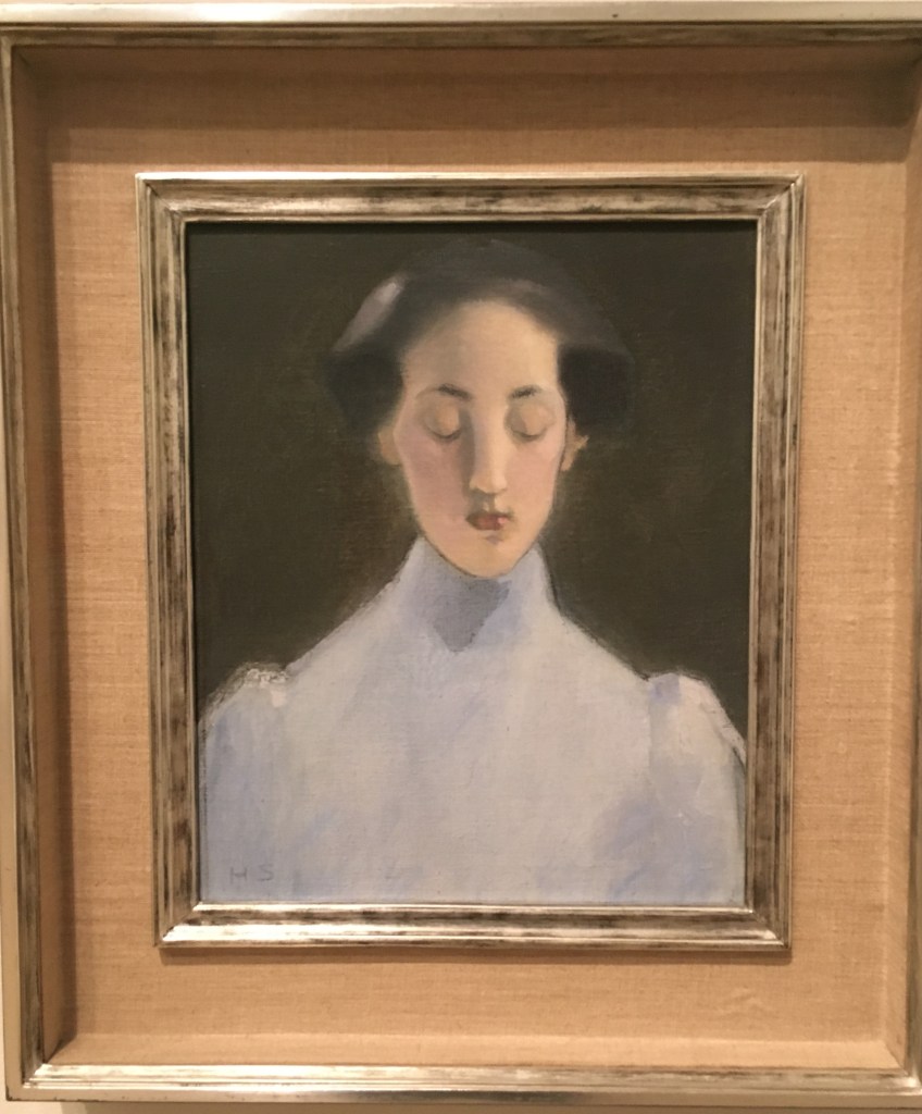
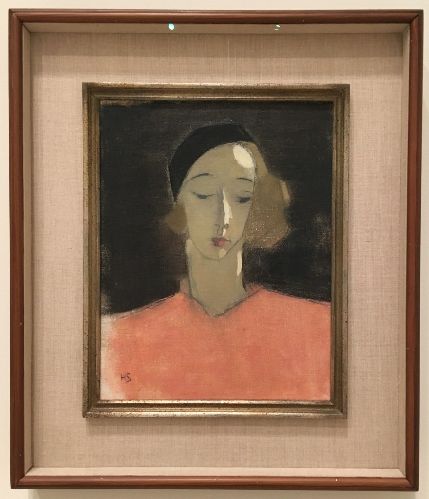
Silence, 1907
There is an interesting quality of light in this painting, her blue dress and delicately lit face contrasting with the plain dark background. The shape of her long neck and sloping shoulders makes her look ethereally elongated, and removed. Again here a sense of stillness and reservation – even regret from the downturned eyes?
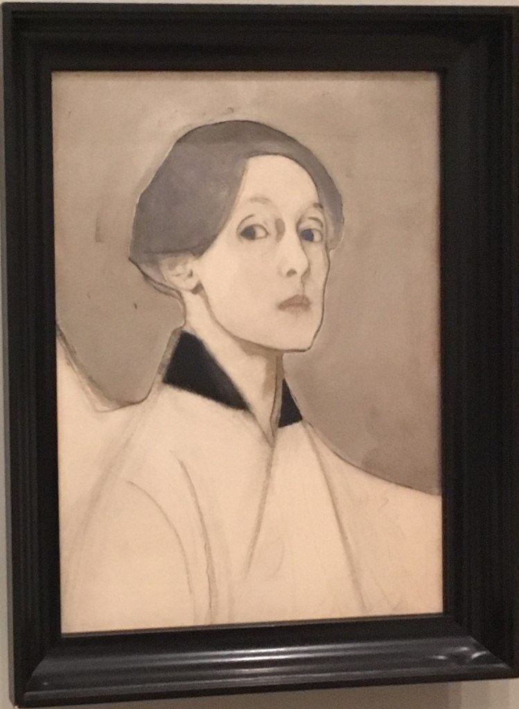
Section 3
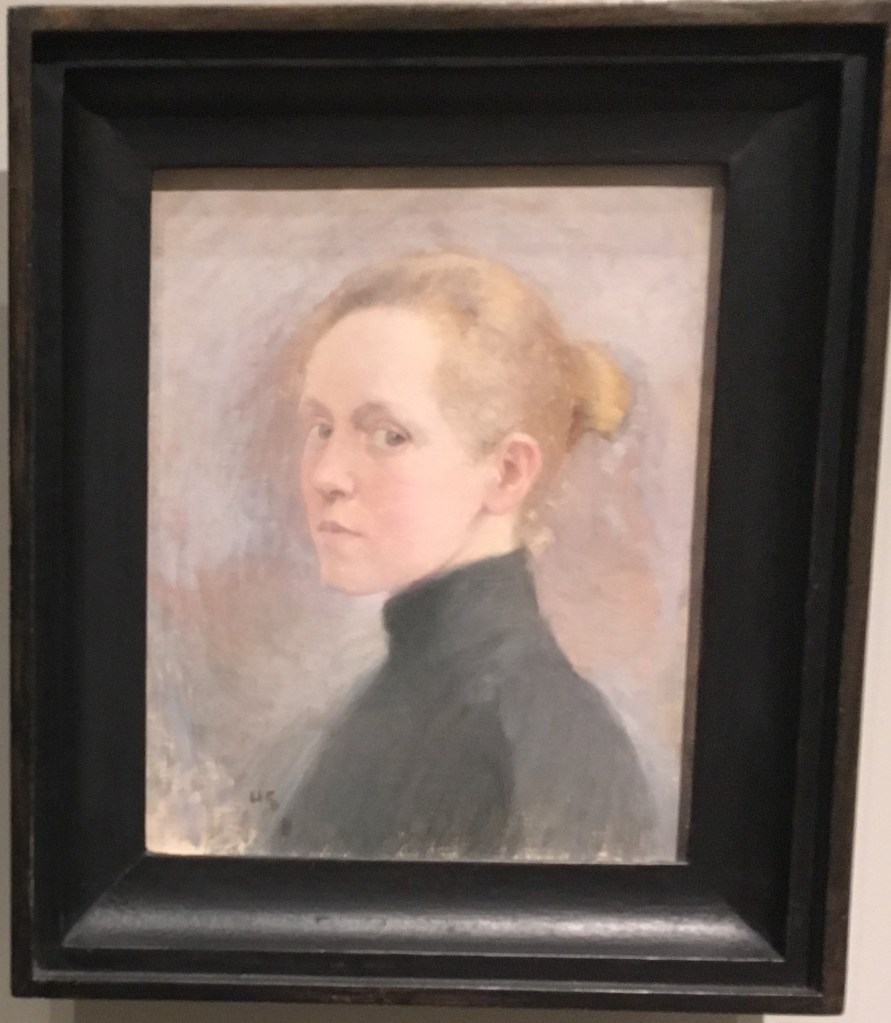
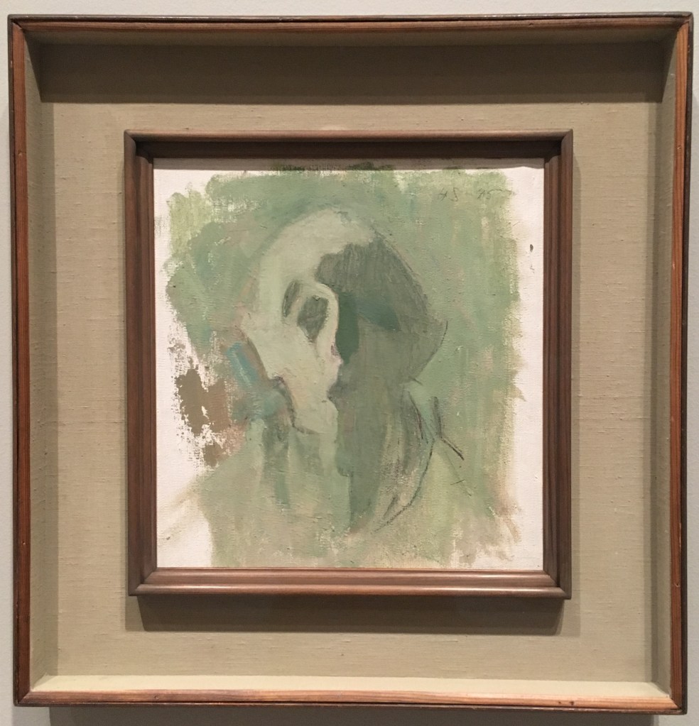
This room was dedicated to her self-portraits, painted throughout her life. Her style became more abstracted over time, and she confronted her mortality and the deterioration of age head on, with the final works completed within a year of her death at 83.
I found it quite a challenging room to be in, and felt that not only was she exploring that physical change she was seeing over time, but also capturing perhaps her self-perception and attitude towards herself. It is not a sympathetic view of aging we see in her final works, the figure abstracted to almost not being human. I wondered if here the figure of Nosferatu from early cinema might have been an influence (the film was released 20 years prior) – if so characterising oneself as a monster is certainly suggesting a troubled internal world.
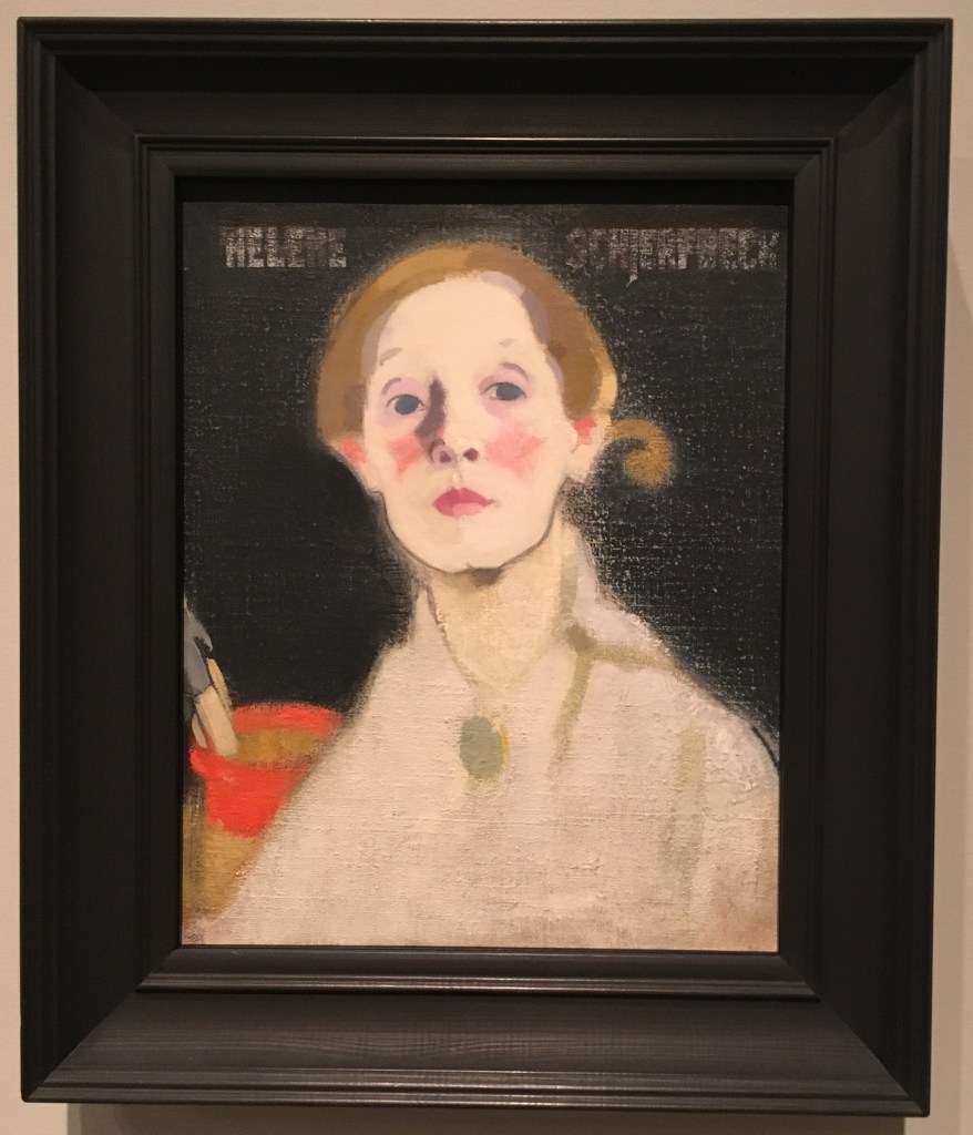
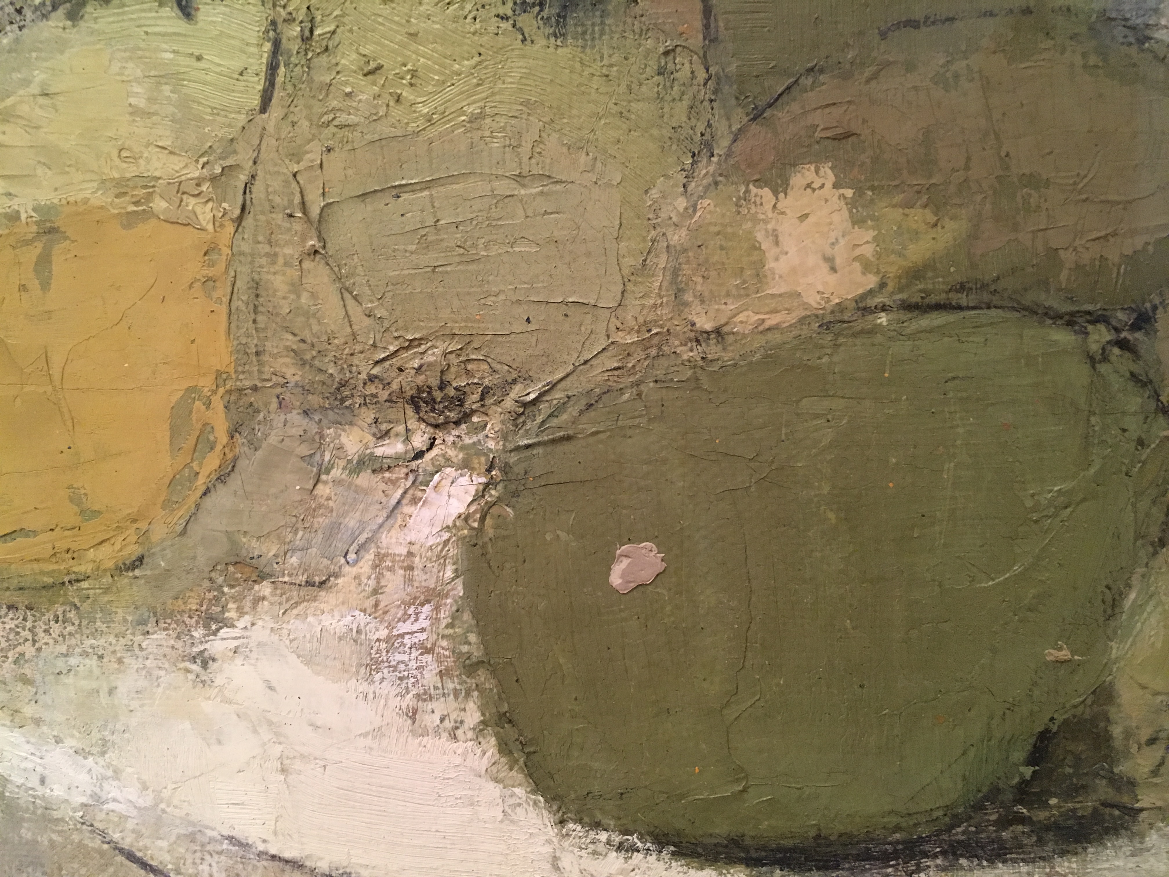
Schjerbeck’s technique involved applying paint and then scraping it off or rubbing it back. She repeatedly reworked surfaces with a brush, palette knife or cloth and even sandpaper. The layering and erasure emulate the effects of time in paint. In some cases, parts of the canvas are deliberately left bare, using this texture as part of the picture.”
RA notes – Helene Schjerbeck exhibition
I was interested to read about her techniques with paint – she used oils which I am not familiar with but if applied thickly I imagine a similar effect can be achieved with acrylic? Could be interesting to experiment with this.
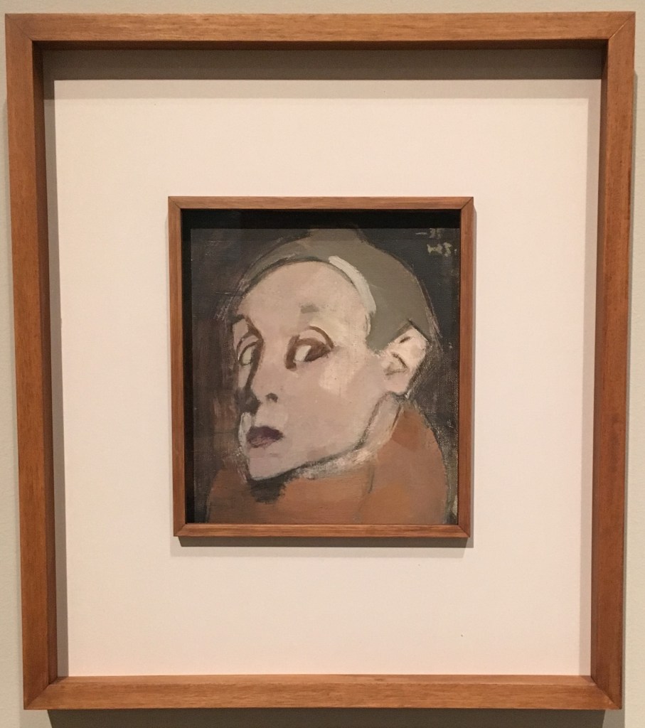
Section 4
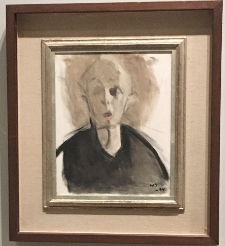
Girl with beret, 1935
In this room, we saw more of Schjerfbeck’s portraiture, and here her style has developed further. She is using a variety of source material, including the latest fashions from Marie Claire and Chanel, as well as using her own memories and imagination to influence her work. This results in something more abstract and generalised, and though here again there is a woman with downcast eyes, here it suggests a sort of melancholy or regret for me, with a sharper light being cast on the figure.
Section 5
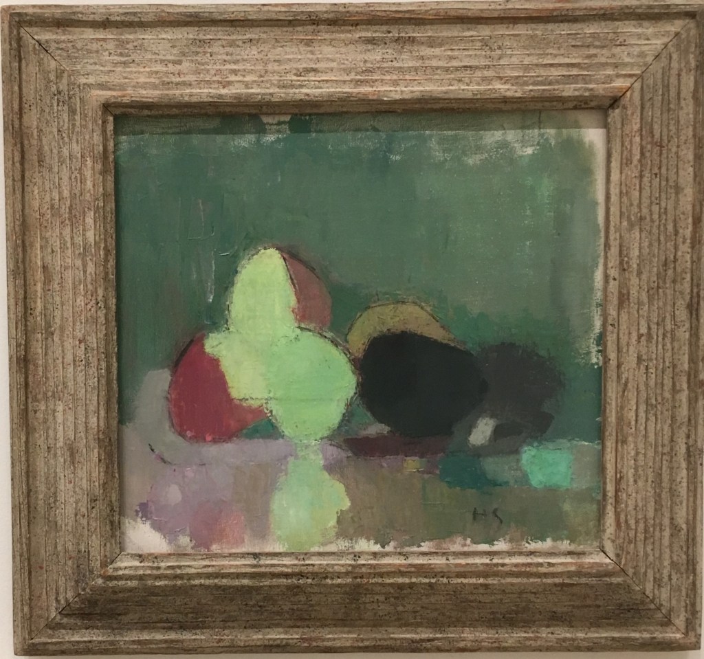
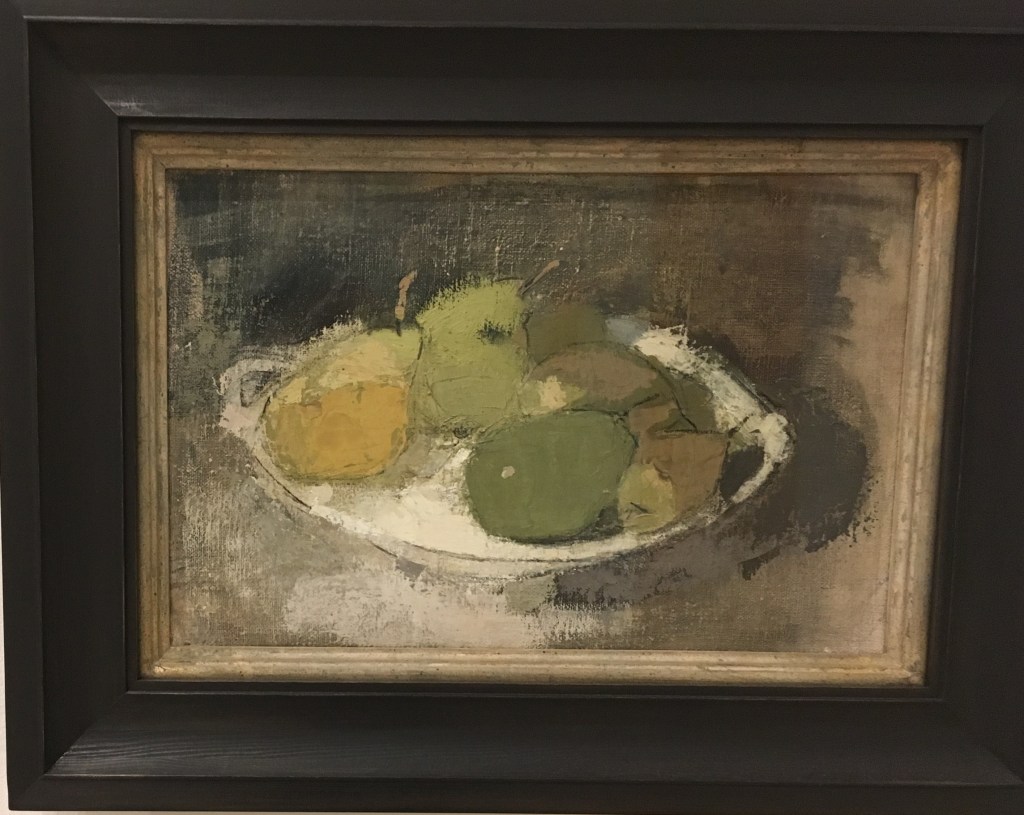
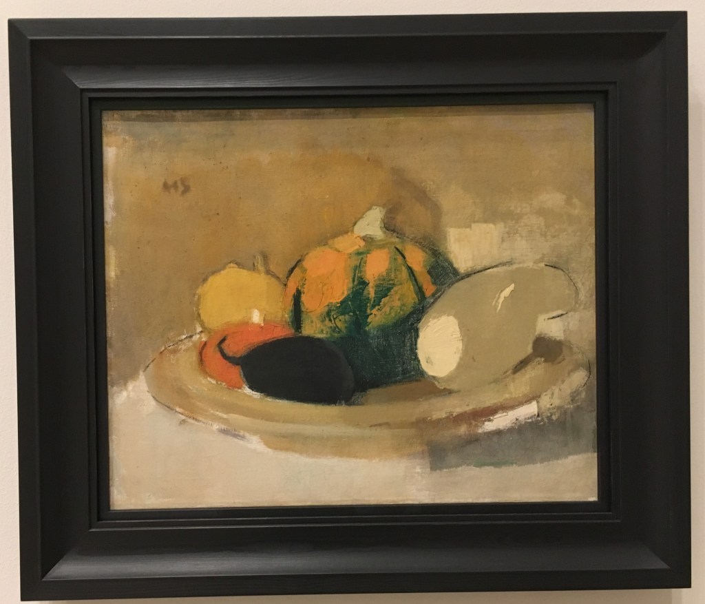
Her still lifes are for me really interesting. The exhibition notes stated that she would work on multiple canvases at a time, doing these as a counterpoint to the many portraits she did. As such I think she may have been a little freer here and we see her particular approach to painting clearly evidenced.
I especially liked seeing the variety of marks she used for the pumpkin still life and how the intent with these marks is not to recreate/emphasise what must have been a very rounded shape.
This exploration and experimentation with abstraction did not quite take her far enough in my view, and I left feeling like if only there had been a further section to her working life we might have gotten somewhere exciting. It left me somewhat unsatisfied, having seen the broad experimentation of Lee Krasner and Natalia Goncharova. But I certainly enjoyed seeing the depths of emotion contained within her works nonetheless.
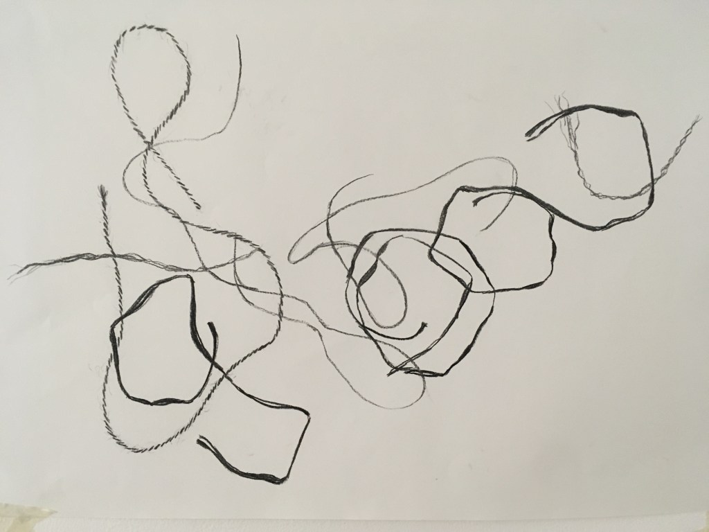
Charcoal drawing of where pieces of 4 different types of string landed when dropped from a height onto paper
In this workshop, we were introduced to 3 different approaches to drawing, and performed exercises that incorporated an element of chance within them: stochastic, system, and collaborative. We were then invited to expand on these exercises further.
The above image is what I produced for the stochastic (organic) drawing exercise. One by one I dropped pieces of string onto my paper and drew where they had fallen. I was keen to capture the difference in texture and shape demonstrated by each string type and varied my marks and weight with the charcoal to do so. I think this has been quite effective. In doing this exercise, the longer I went on (say after the first 6 drops) the more editorial I became with how the string fell – I still dropped it from a height and observed how it had landed, but if the composition was not quite to my liking I tried again without documenting this shape. It was interesting that I gained confidence/a sense of agency once I had a feel for the task at hand – that there was a sort of dance in a way of the relinquishing and regaining of control with chance.
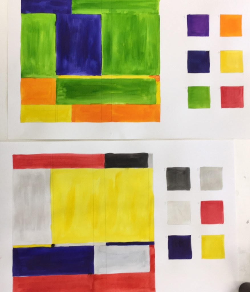
The second exercise we performed was the system drawing. Here we were told to draw a grid and then populate 6 squares to the side with 6 colours. Then we were told we would be rolling a dice and painting 6 consecutive shapes within the grid with the colour for square 6 if we rolled a 6, or 2 consecutive shapes with colour 2 if we rolled a 2, etc.
(top) my first grid, (bottom) I repeated the exercise with a less brilliant palette a la Mondrian
The third approach was collaborative drawing. Here we would receive an instruction from Myfanwy and add an element to the paper in front of us (e.g. draw a line). We would then pass the paper on as instructed (e.g. pass it twice to your left, and rotate it through 90 degrees). We continued like this for some time, adding what we had for breakfast, a drawing of something in the room, a pattern, etc. Finally, we were instructed to retrieve the paper that we had started with and made our first mark on (the line). We could then add to or remove elements in order to make it uniquely our own.
Here is my finished collaborative work. I chose not to obliterate any contributions from the work, though I submerged the pattern (which had been done in biro in the bottom right corner) beneath my ink strokes so that only the texture of the pattern could be seen.
I enjoyed this exercise, though I find the artefact itself I am left with does not fully capture the process I myself went on. Since I had created equivalent elements for each of those seen in my finished work, but they are not here seen, I feel there is something lost along the way. I also dislike that the orientation of the piece is difficult to really nail down, with the elements often being drawn at contrasting ones. But it was an interesting exercise.
For my self-guided piece, I was keen to do another piece that captured the element of dropping. In the session we had been introduced to the below work by Jean Arp (that does appear to have been choreographed somewhat) and I was keen to try this method out for myself.
Jean Arp, Untitled (Collage with Squares Arranged according to the Law of Chance) 1916, MoMA
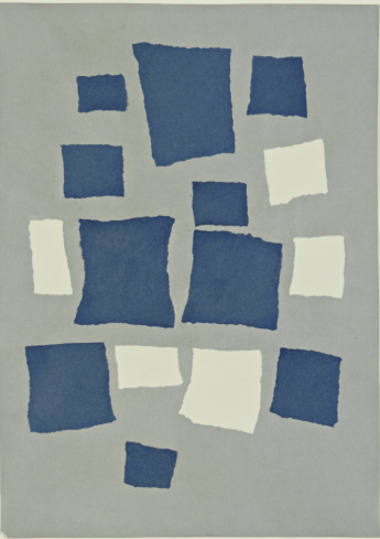
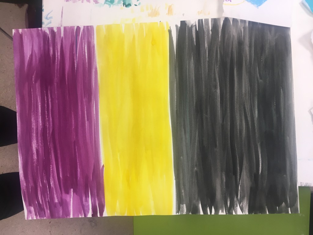
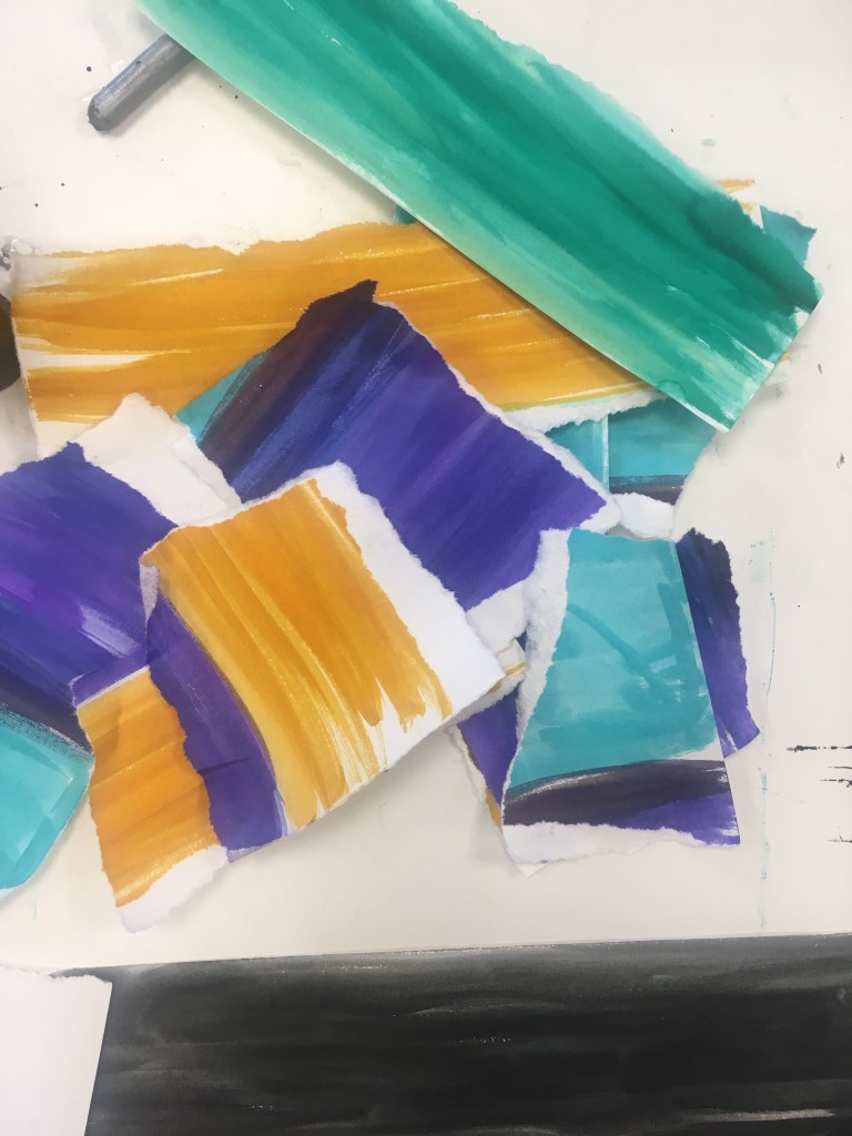
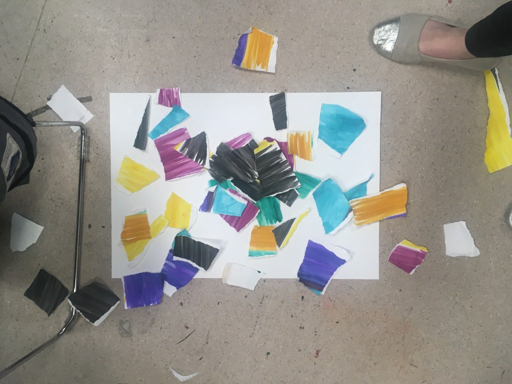
I first painted colour fields onto pieces of paper with a chosen palette, then arbitrarily teared them up into pieces.
Then above an A1 piece of paper that I had placed on the floor, one by one I (without aiming/looking blankly into the distance) dropped the pieces approximately above the page. I varied the position of my arms in relation to the paper, but maintained roughly a height of 1.5m.
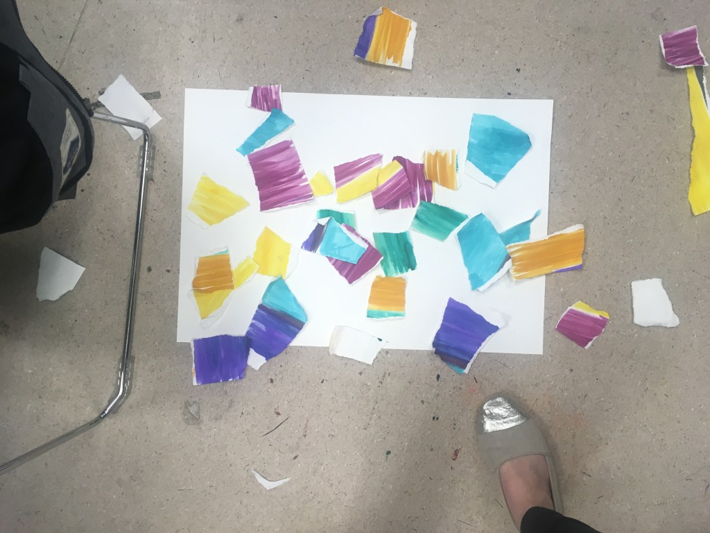
In my first attempt, I found that much of the paper floated off the page, and others ended up clumping into little piles. I felt that the clumping/pile effect might be difficult to effectively capture by sticking, as I would need to deconstruct first and then recreate and might lose something in the process.
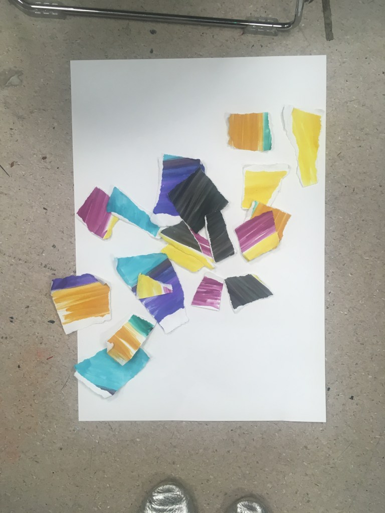
For my second attempt, I decided to introduce an element of system/rule to the dropping, and not drop all the pieces of paper in one sequence. Here I chose to drop the coloured pieces one by one first, and then reappraise prior to dropping only a selection of the black pieces. This was interesting, but I still found that the pieces formed a pile/clump.
I decided to restrict the number of pieces of paper I dropped even further. Here I chose to remove from the collection pieces that did not fully have torn edges (i.e. exclude the pieces that had a straight edge)
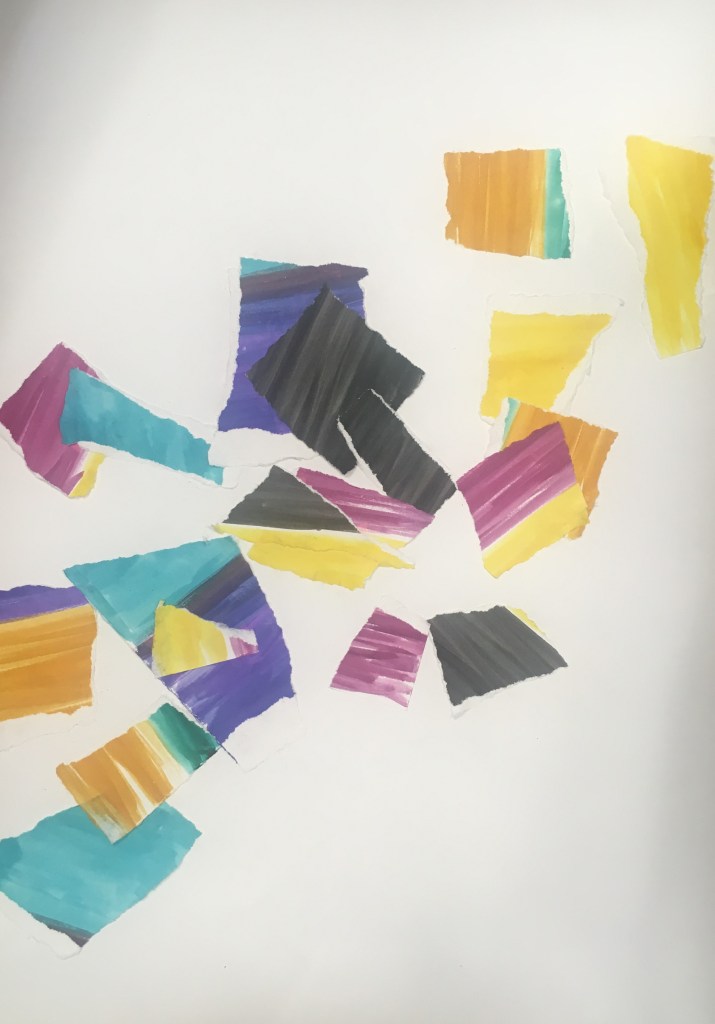
3rd attempt with restricted pieces of paper
I was very interested by the fact that in restricting the number of pieces I used, the composition appeared to coalesce to a form of sorts – here a diagonal stripe. Below the piece following sticking down with Pritt stick.
I think it is interesting that texture and depth has been lost to some extent in the process of capturing these by sticking them down. A loss in a move to permanence from something impermanent?
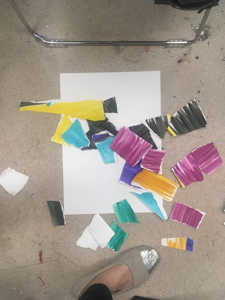
I chose to repeat this with the remaining pieces that I had excluded onto another piece of paper.
Intriguingly, again a diagonal shape was formed, this time in the opposite direction.
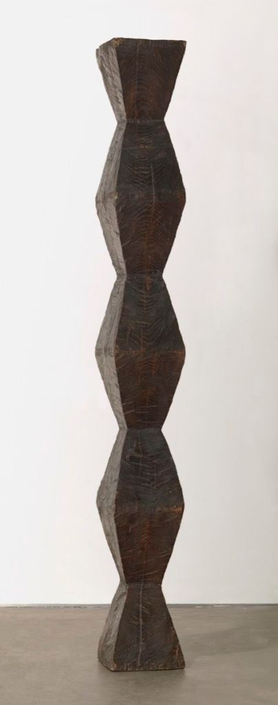
Endless Column version 1, c. 1918 Constantin Brancusi @ MoMA
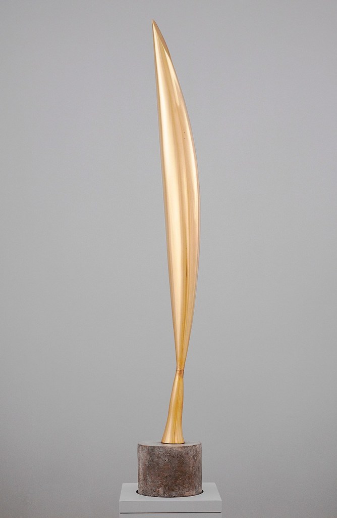
Fish c.1930 Constantin Brancusi @ MoMA
What is real is not the external form, but the essence of things
Constantin Brancusi
After my experience with the Gained in Translation task, I was interested to learn more about how sculptors have sought to capture the essence of an object in simplified or generalised forms. This seems to be of particular importance in considering the work of the sculptor Constantin Brancusi.
He paid great attention to the material with which he worked, coming from a crafts background. This means the artwork gives a sense of being formed quite naturally, not working against the fabric with which it has been created. The fluidity of metal, the roughness of stone, and the smooth flint of granite.
What is intriguing though in particular is his depiction of the subject. He has not sought for it to resemble the subject in a physical sense, but has imbued it with an abstract sort of resemblance. The Danaide conveys a serenity and composure of the subject; the bird in space, graceful dynamism; the fish streamlined movement that in a flash would disappear from view. In a sense here he has depicted the qualia of the subject (as philosophers might term it) – that is, he has relayed the experience of witnessing the subject within his artwork: the ‘what it means to see a fish’. This is beyond simple emotional expression and onto something quite more conceptual depth.
This too can be seen in the Endless column. He is giving us the illusion of a pattern, a motif, that could be repeated ad infinitum and conveying to us what it might be like to experience that.
That he would return to several of these motifs again and again, producing unique versions sometimes with only slight nuance, is perhaps less interesting to me. But the notion of repetition on a theme and meditation is perhaps something to consider.
I think it is also noteworthy that he mostly shied away from geometric design and instead focused on smooth rounded shapes and organic-like forms.