Unit 2: Fine Art – Dérive (pt 2)

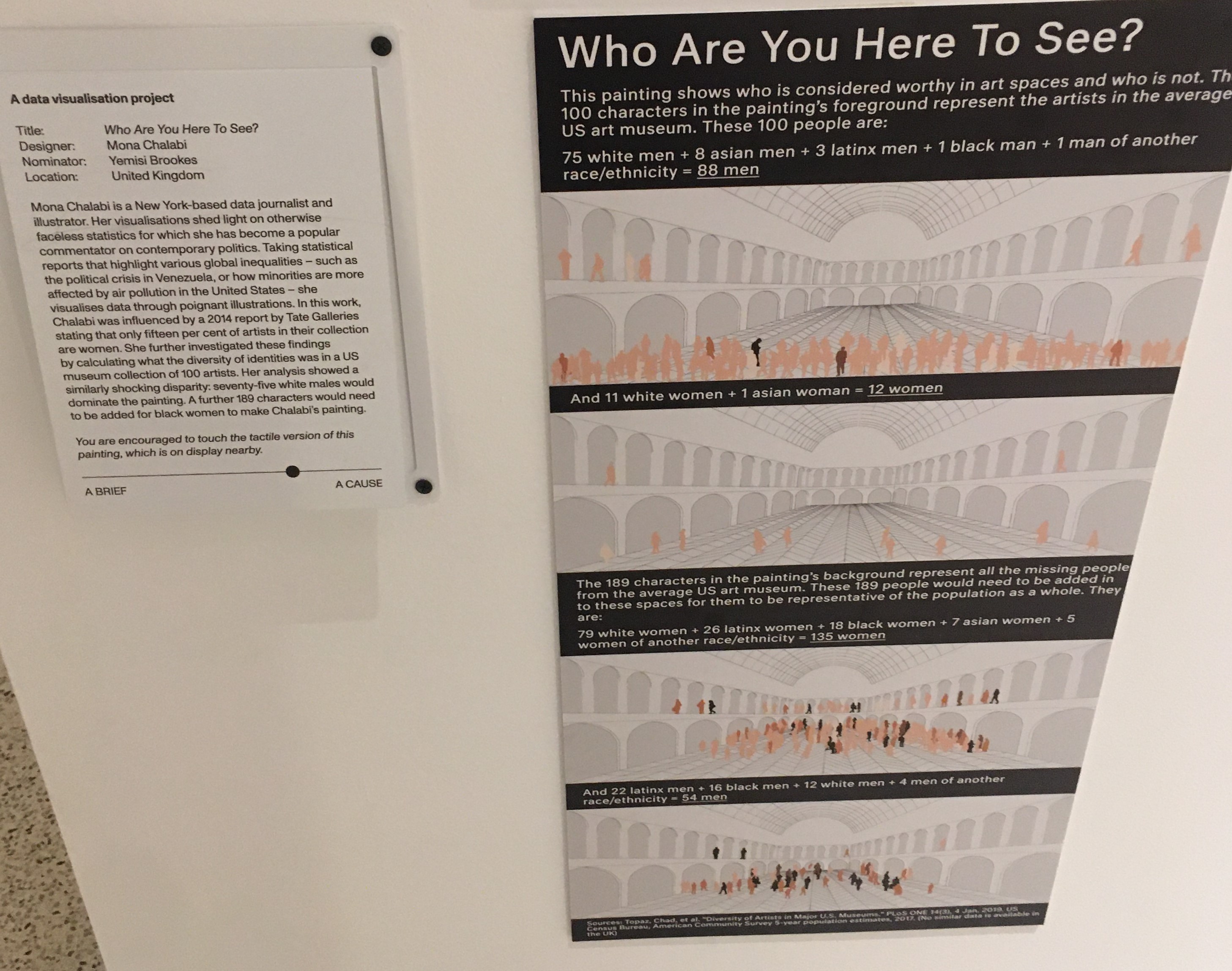
Following on from my previous post, where I noticed I had repeated a certain composition across some of my photos of the walk, I sought to research a little more about this.

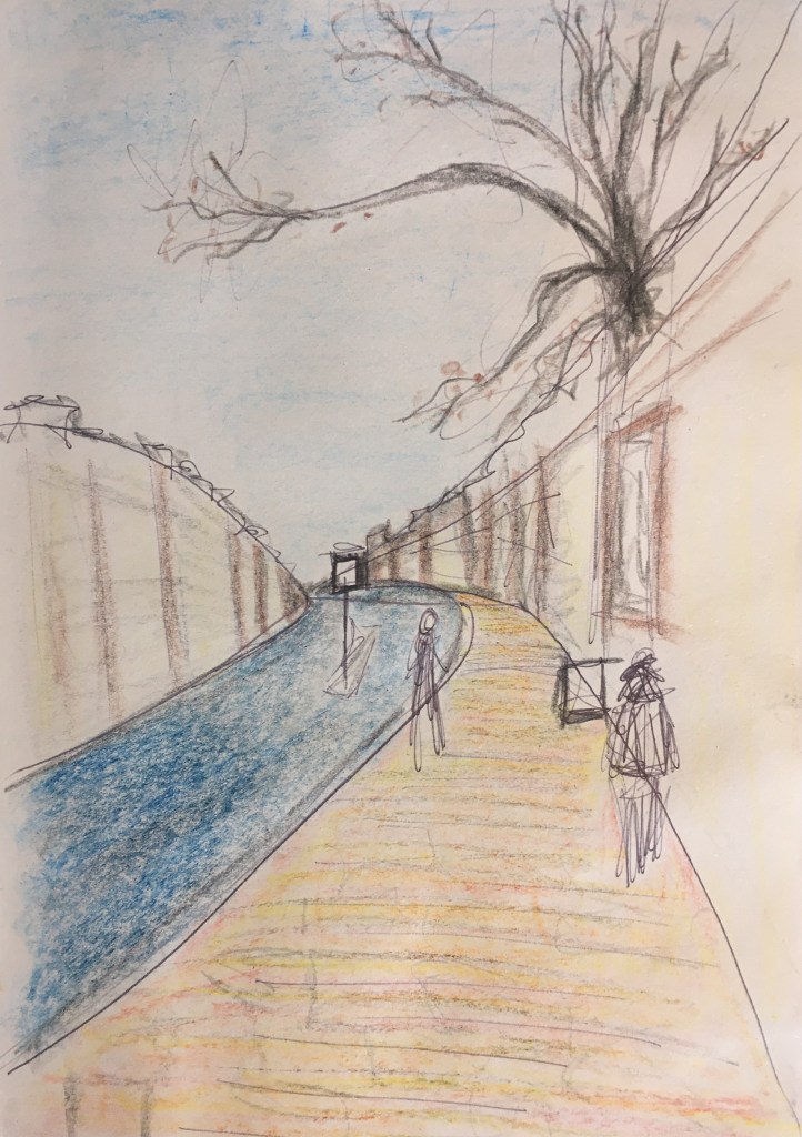
I recalled seeing something similar in Van Gogh’s landscapes that I had seen in the summer, at the Van Gogh in Britain exhibition, and looking into more of these confirmed my theory that this could have been something I picked up on there. Here he has also made effective use of yellow and blue to make even greater emphasis of this composition – dividing the canvas by its horizon near the middle, but off-centre focal point (though his tending to the right where mine was to the left). I find it interesting that he would be returning to a similar strategy for two very different scenes – the rural and the urban, with comparably similar palettes also. The small red tree on the path in the left painting is positioned almost in the same place as the figure in red on the streets in the right one.

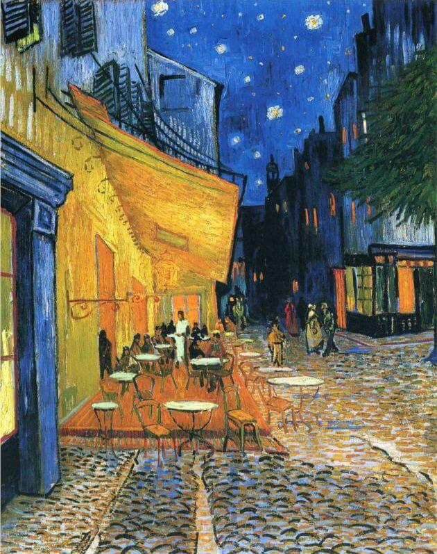
I wonder if there was intention for Van Gogh behind this or if, like in the case of my photos, it was accidental or perhaps even just a result of him having honed his style and preferred colour palette? Were it to be intentional though, it could be seeking to draw comparisons between these different locations – or perhaps serve as a reminder that though they might seem opposing locations, that they share the same viewer (or that we are seeing it through the eyes of the same artist) they have a unity of experience? That no matter where we might find ourselves at a given moment we still experience the same ‘what it’s like to be me’ in that moment? It might be interesting to create a shared colour palette for my three compositions to explore this further.

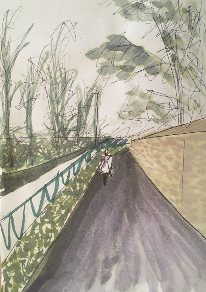
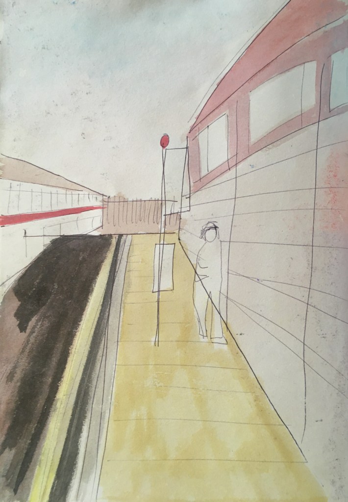
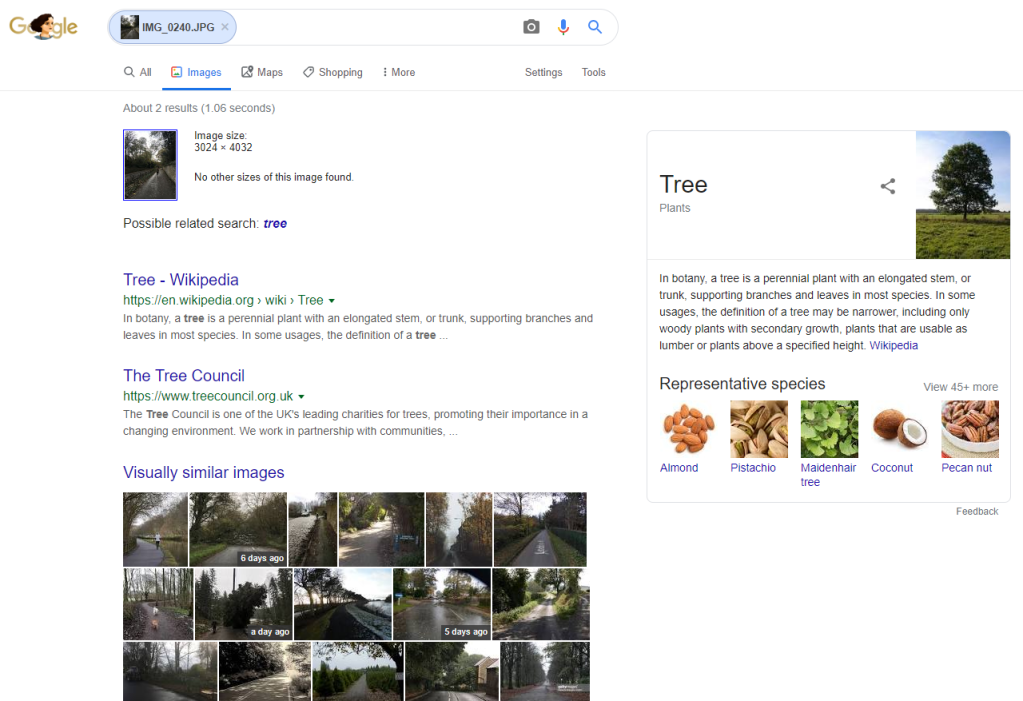
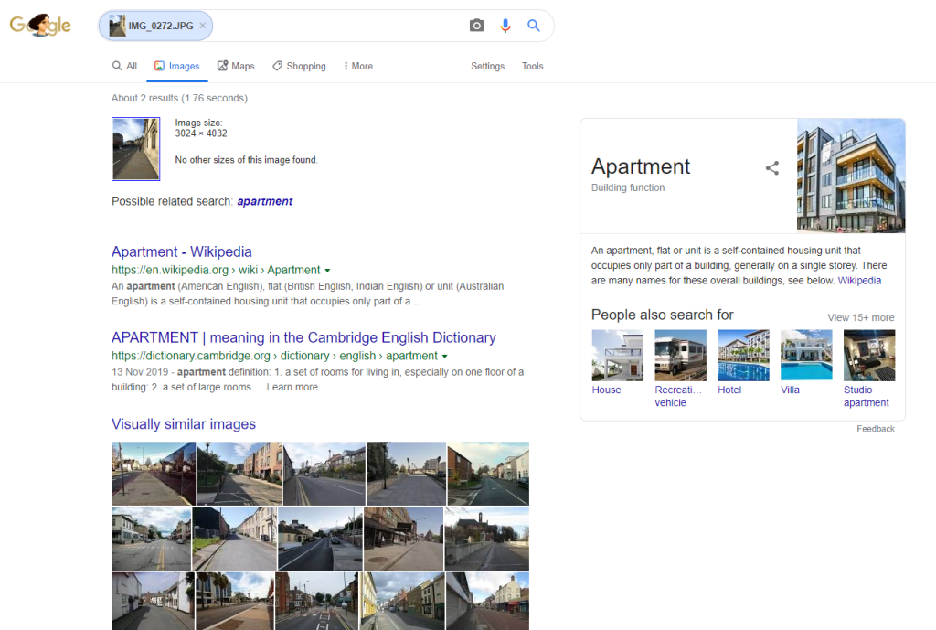
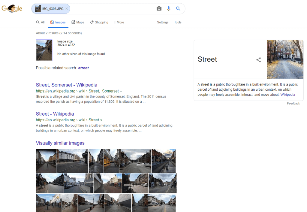
I used google image search to find out if the algorithm could find further instances of this composition. However, I found that the image recognition software was more apt to see the subject than compositional comparison – this suggests to me a more sophisticated programme than where it might first have looked at blocks of light/shade/colour (and so composition) but now is identifying objects within those blocks. It was interesting to me to see that the software was distinguishing 3 different subjects in these images: Tree, Apartment and Street, reflecting the change of environment along my walk. The images it saw as being visually similar all fell within these 3 categories, and some do replicate my composition.

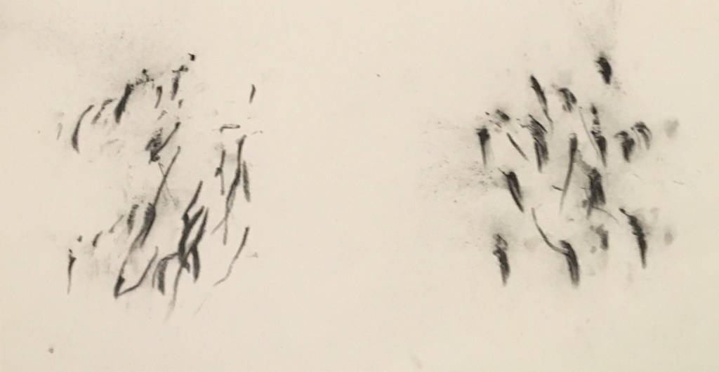
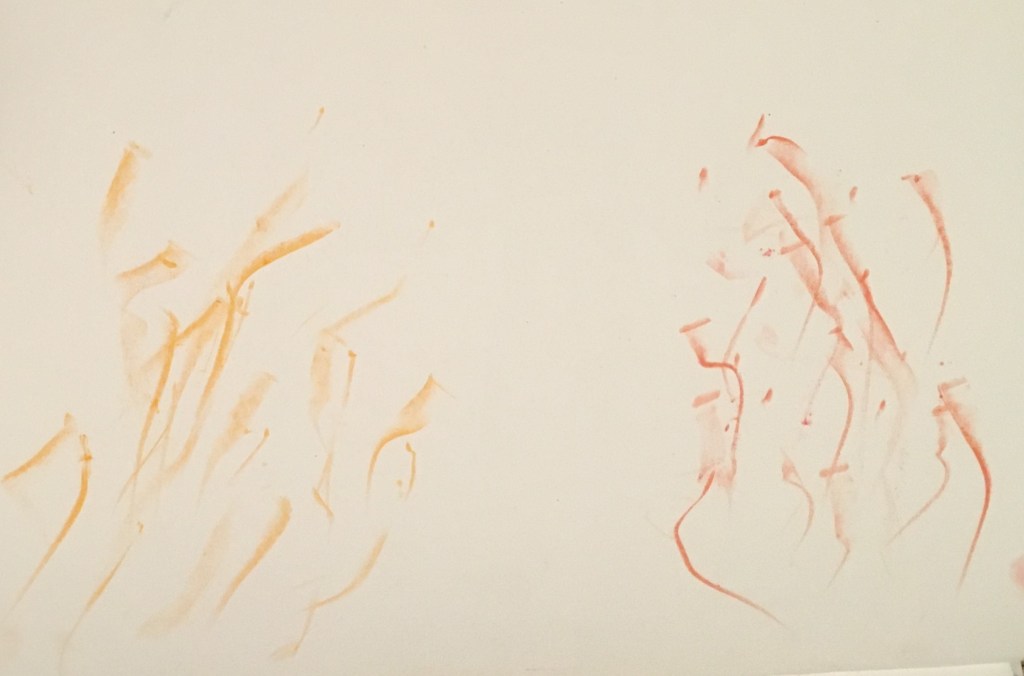
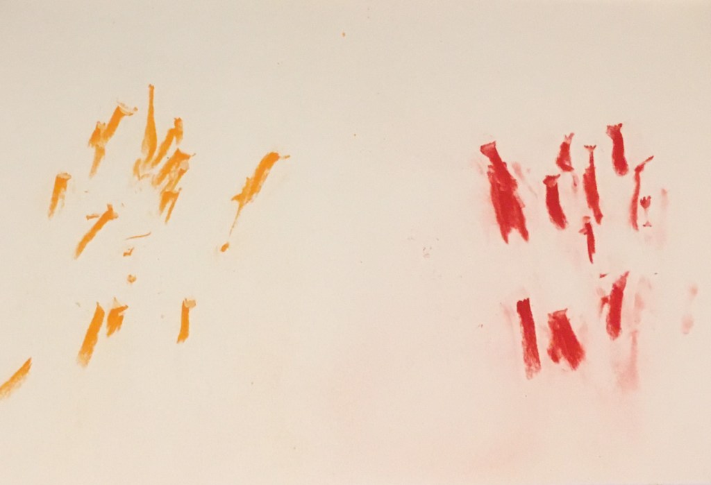
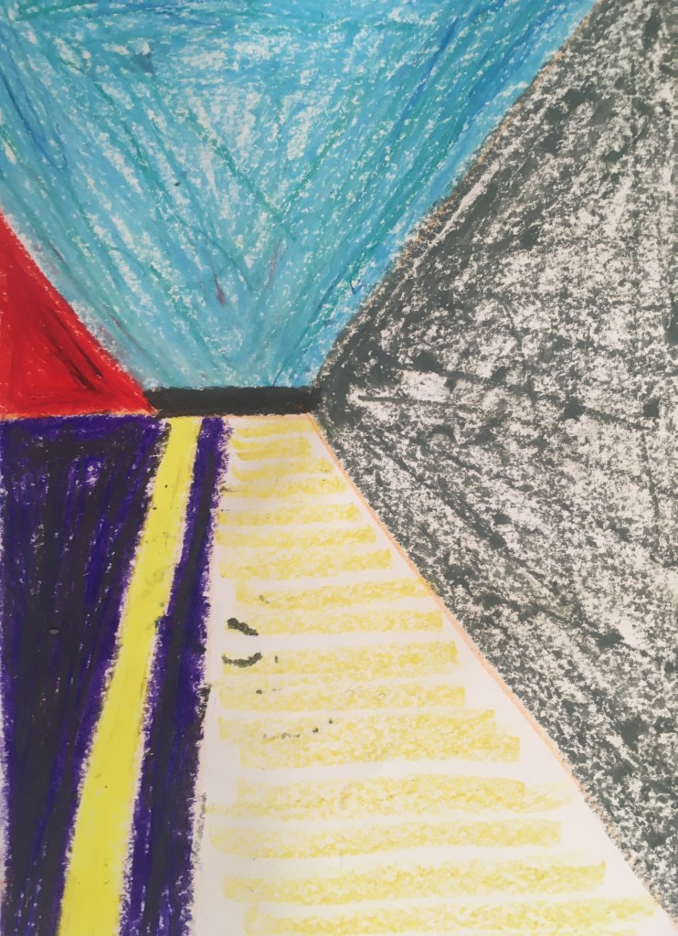
I sought to further abstract this composition, and this deconstruction of three complex images was interesting. I think the cut paper works are more successful – the precision of the shapes achieved and the flattening of the colour fields I think work well to focus the eye on the shapes and their relationships together. A more simplified colour palette also helps here I think, and I like the use of a contrast for the ‘horizon’ line. I wonder if a casual observer would still get a sense of the perspective in the original composition, or if these flattened fields would disrupt that sense of your eyes being drawn in.

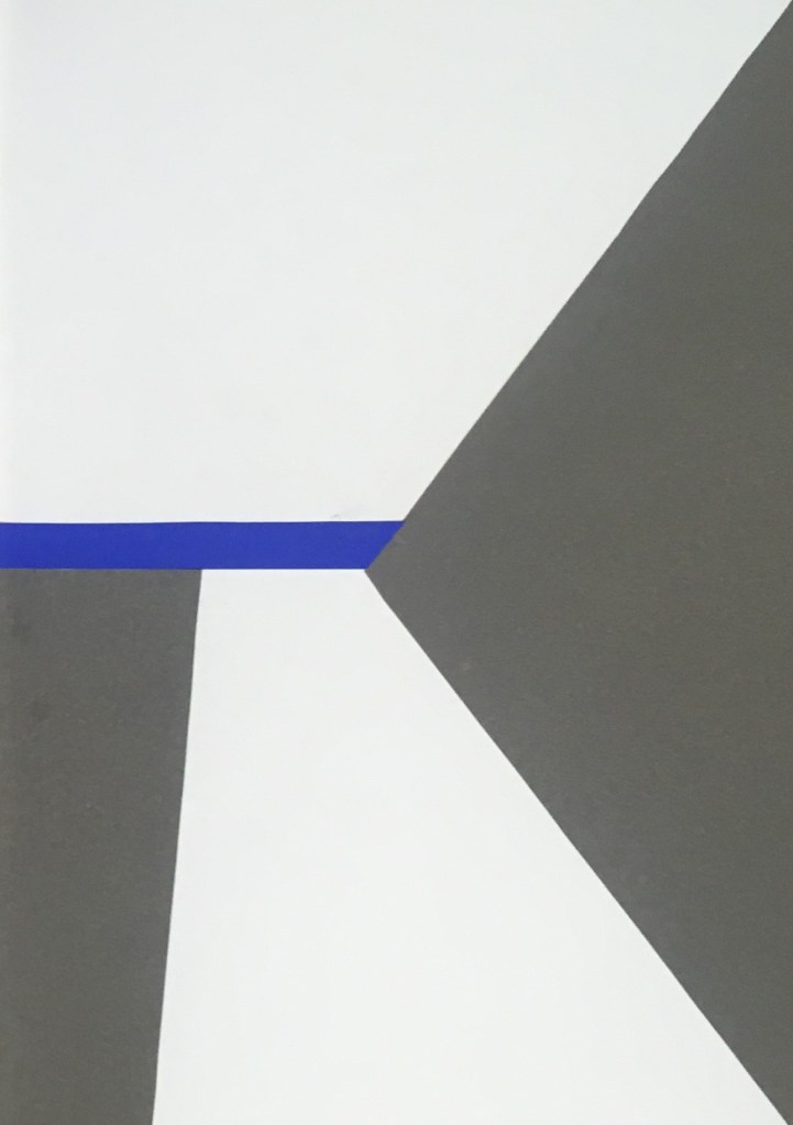
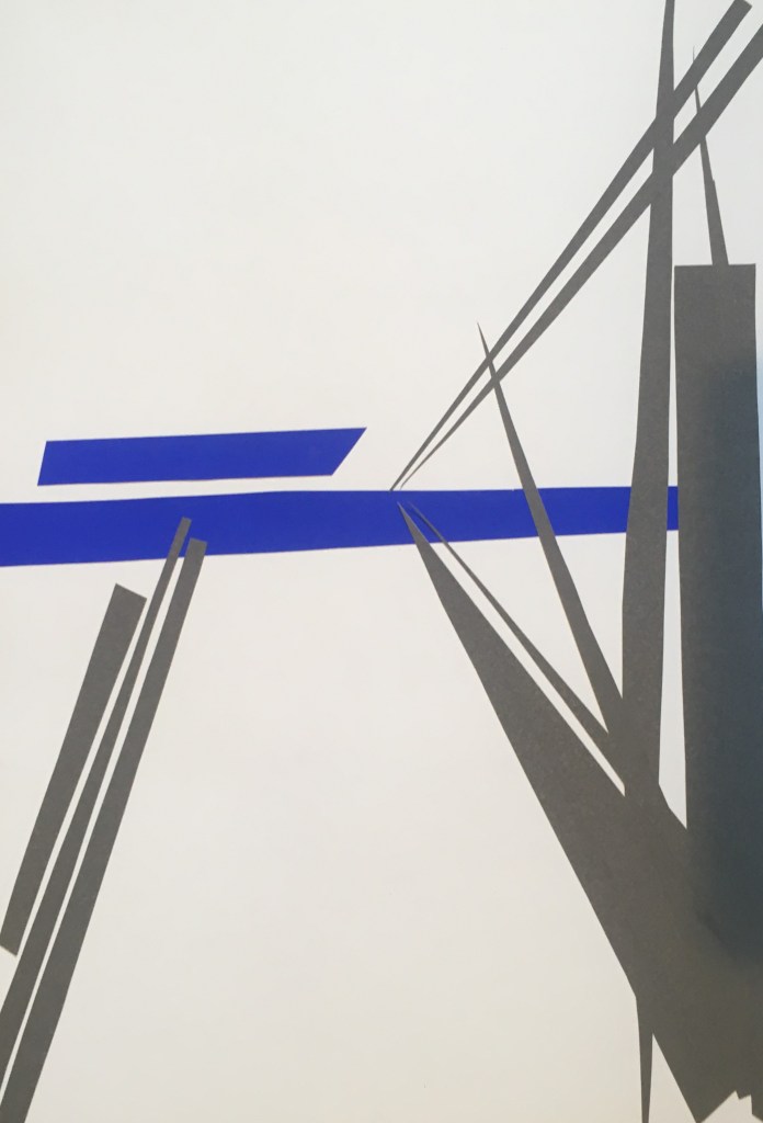
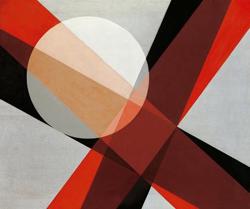
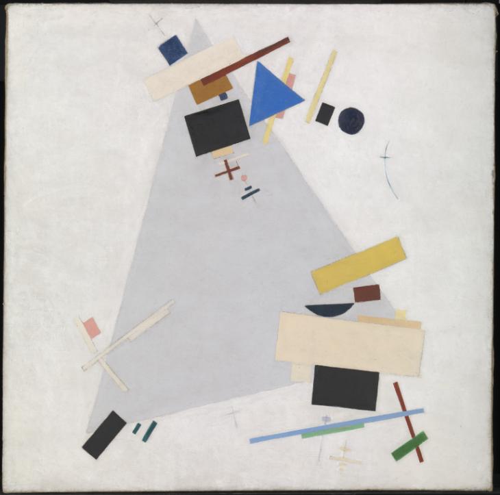
These recall for me geometric abstractions like those of Malevich and Moholy-Nagy. It might be interesting to explore further whether some of my fields are overlapping of other shapes and to explore more tonal colour palettes.

Unit 2: Fine Art – Dérive (pt 1)

For this 3 week project, we were briefed to take a walk to a specified random dot on a map of Oxford, adopting the dérive (drift) strategy. We were to capture our walk and repeat it as often as we liked to gain a broad variety of experimentation.

The red dot on the left is the destination, and the black dot on the right my origin at the FAD studios. I have entered in here the routes taken on my 1st and 2nd walks in black and blue (though the distinction is hard to see here – the 1st walk follows the orange road directly where the 2nd veered off)

I chose not to use my usual means of finding directions – using Google Maps on my phone – and instead used my instincts to direct me to the point on the map I had been given. For good or ill, I was familiar with the route I might take to reach it directly, since it was the main route into town and then the train station, which I had done before though never in one go. So for the 1st undertaking, I did not drift so much in the route taken, as in what directed my attention. I hoped to capture many different things on my walk to potentially explore further.

I spliced together shots taken from the same height while walking at intervals during my 1st and 2nd walks

I was interested to observe the different surfaces I walked upon, the noise levels in these different areas and the kinds of marks and detritus I might encounter in these different spaces. Walking along a tree-lined main road into more urban city centre in my 1st walk, and then in parkland, surburban residential roads and towpaths in my 2nd (when the ground was considerably wetter). It is also interesting how my pace varies according to the gradient and the stage in my walk. I attempted to transition the shots by matching up the point in my gait and the foot with which I am stepping, but the video did not always line up, with my foot exiting or entering at different heights in the frame.

During my 1st walk, I wrote words I encountered as I walked – to enable this I used an A6 notebook in order to most easily note them on the move. This included words I thought to describe the walk (most evidenced at the beginning of the walk), graffiti, signs, notices and advertisements that caught my attention (most prevalent in the city centre), and words I happened to overhear from the conversations of passersby.

I also quickly sketched things that I took a particular interest in – this varied from symbols to ironwork and water pumps to the cracks in the pavement.

Reviewing the notes I made now the words are sometimes humourous in their decontextualised state. For instance, the conversational words of passersby and colloquial language used by shop signage to entice foot traffic in store are easily confused. Can you tell which is which?

"Oh hello pop in don't be shy" 
"Rohan, it's what's inside that counts"
"See you later"
"Ruby says chill!!"
"Yeah it's basic stuff mostly"
"Do you know where you're living next year?"
"How good is your hearing?"
"I'm getting something from Tesco"
"What's going on..."
"I haven't had any blackouts which is nice"
"So hard"
"Over the next few weeks..."
"No it's not even that"

Below are a series of photos that I took with my phone on this walk (I had not been briefed ahead of the day so did not have my camera with me). I am interested here in a number of themes – pavements surfaces, ironwork and filigree, quirky animals, graffiti and signage, the colours yellow, black, blue and stone. The final image, of a yellow building with white pillars, stands where the dot on my map was placed.

In collating the above gallery, I noticed that three images mirrored the same composition, and were also representative of the beginning, middle and end of my walk. This was quite accidental but I find it interesting that I repeated this action with a pedestrian the focus of each, the pavement tailing into the distant with the horizon somewhere to the centre right of the frame, a tall wall to the right of it guiding our eye.

Unit 2: 3D – Data Visualisation (pt 1)

Ahead of our first session, we were provided with a brief to collect data about ourselves over 7 days that we would be visualising over this 3 week 3D project. I chose to record my use of technology by clocking the time I interacted with screens over this period. I made use of the Screentime function on my iPhone to log my phone usage with great accuracy, and manually logged my use of the computer, TV and other screens (e.g. on the treadmill) as best I could.

The results of this proved to be both intriguing and mildly horrifying. Overall, screentime accounted for almost 39 hours in my week – equivalent to around a quarter of my total time in a week, or more than a third of my waking hours in a week (assuming 8 hours sleep per night).

The first session clarified further the task ahead – to create 30+ maquettes visualising our data with different materials/techniques. We were introduced to some artists who had either been involved in data visualisation or in 3D pieces that could have been adapted to serve in this way.

First, we used paper. I found it tricky to move beyond a straight graphical representation of the data and get beyond the 2D of the paper itself.

Left: Infinite scroll study, Right: Scale segments showing proportion of time spent in a week – from top Non-screen time, phone time, tv time, other

The infinite scroll is an element I am interested in exploring further – the mechanism used by social media apps such as Instagram and Facebook which meanas a you never complete/reach the end of a feed and could scroll downwards on it forever. I learnt about this feature in an episode of Abstract on Netflix with one of the Instagram designers, Ian Spalter, who cited this as his biggest regret. This study was simple in construction – the paper leant itself easily to this shape – and i extended the length by sticking multiple sheets together. I like that you could potentially unroll this piece and discover how long it goes for, but the fact it does have an end may undermine my intention? I could relate the length specifically to the length of time on an average day spent on my phone.

The other paper work, where I carefully measured the 2D areas to represent each proportion of my time to scale, may be more accurate to the purposes, but I found the exactitude limiting. It was only in the larger non-screen time I found myself becoming more engaged in the creative process. I tore the paper into individual strips which I then scrunched and stuck back together in striated layers. The idea here being that time spent away from screens enables the greatest degree of freedom. It was interesting that Sarah considered the non-screen one as a piece in itself, and commented on its brave construction. Perhaps it could act as a visualisation of that free time alone?

In the afternoon we moved onto paper clay. While we could have explored its materiality akin to paper (once rolled and allowed to dry a little) I was more drawn to its very pliable putty-like texture and in working with it in this way.

From top (clockwise): Thumb 7 day screen time bar chart, screen/non-screen pie chart, screen/non-screen balls, scale models of the different screens according to time spent in a week (phone, laptop, TV)

I used scale again here to explore the comparison of data within context of use. The two screen/non-screen proportional pieces are pleasingly simplistic. I like that with the balls you are drawn to holding them and weighing them in your hands, and did wonder about constructing a weighing scales to demonstrate this too. The pie chart comes across like a cheese wheel which I find quite amusing.

The 3 screen models appear quite surrealist to my eye, with the phone so outsized (while the tv and laptop could work together quite reasonably). I like that in fact the phone could believably be true to life scale, and then in that sense the TV and laptop actually the surreal scale.

I enjoyed most the tactile making of the thumbs though. I used the natural wrinkling of the clay as it was compressed to evoke the creases in the skin, and found it pleasing to be moulding a thumb using my own thumb – and using the nail of my thumb to create the thumbnails on them. That there are 7 is eye-catching (where we might expect a set of 5) and when collected in this way it is difficult to identify them as thumbs (where you would usually only have 1 in a set!). So playing with people’s expectations here is quite fun. Also, how they stand up from the base makes them appear as though coming out of the surface – a little creepy to my eye, especially since I had them all bent as though mid-scroll. The size of them relates to the length of time spent using screens in each day of the 7 day period, so is in effect a bar chart.

This was an example of using the thing itself to identify the thing, which we saw being used to good effect in journalistic data visualisation. I think this is more akin to illustration, where the data is telling us a story and the visualisation lends itself to communicating part of that – using visual shortcuts to aid understanding. Mona Chalabi (data editor at Guardian US) does this to good effect. I came across the below piece in the Beazley design of the year exhibition in the Design Museum in London, relating to this blog post on the Guardian website.

The fact she has used actual people within a gallery to signify the people who are and are not represented in modern galleries in the US is really powerful. First because we can ‘read’ the data quickly – that predominantly white males are present within the foreground (here being used metaphorically as those who are foregrounded in the art world – who is brought to our attention). In doing so she has made use of the classic Fine Art conventions of perspective in history painting I think to evoke the sense of tradition and out-datedness of the modern art world in how it has done this – the romanesque arches in the gallery emphasise this. It’s also particularly powerful I think because it humanises these underrepresented artists by actually painting them as simple silhouetted figures. It is too easy for statistics and data to dehumanise and cloud our understanding, while dehumanisation is especially problematic when we are considering populations considered to be ‘outliers’ or minorities (i.e. women, non-white races and cultures). The key is in cuing empathy – showing the human impact of data, as the numbers are usually all too easily swept under the rug (as the infamous quote below highlights). I found this article in the Guardian particularly interesting on this subject.

The death of one is a tragedy, the death of millions is just a statistic.

Joseph Stalin

Half term research and experimentation: Abstract Expressionism

Over the half term weeks I enjoyed taking a break and slowing down the pace of my practice. However I still found myself eager to engage in research!

So I started reading this book I had taken out of the library – a heavy tome so I am still only part way through – and have been really captured by the characters Mary Gabriel introduces from the New York art scene in the 1920s onwards. I was moved to read the book to pursue a deeper understanding of Lee Krasner (whose retrospective at the Barbican this summer I had been bowled over by), but too in hopes of learning about the other 4 women the book biographied who were also innovators within the Abstract Expressionist movement (and regrettably overlooked in the art history): Grace Hartigan, Elaine de Kooning, Joan Mitchell and Helen Frankenthaler.

(Below: works included in the Barbican Lee Krasner exhibition – I found the gestural quality and sheer scale of her work breathtaking)

I have found it particularly interesting so far to understand more about the context of the inter-war period for American artists, their sense of being onlookers from the European art scene that dominated, and the driving need for these artists to pursue abstraction. For Krasner, this was greatly guided by her tutelage under Hans Hoffmann.

You cannot deny yourself. You ask, am I painting myself? I’d be a swindler if I did otherwise. I’d be denying my existence as an artist. I’ve also been asked, what do you want to convey? And I say nothing but my own nature. How can one paint anything else?

Hans Hoffmann

Some other quotes contained in the book have been notable too

I found that I could say things with colours and shapes that I couldn’t say any other way – things that I had no words for

Georgia O’Keeffe

Painting or poetry is made as one makes love – a total embrace, prudence thrown to the winds, nothing held back

Joan Miro

Though I find this contextual background really interesting, I wish that it was accompanied with greater emphasis on the works they produced. I suppose I would like this to be an exhibition of its own (though it would need to be a really big one!!). I am interested to go and find works in the flesh for each of these artists (I know of a Krasner in the Tate Modern but I wonder if there are others in the UK, or of these other women?)

Anyway, I was inspired by reading about these intrepid women to experiment for myself with expression. I have til now adopted a swooping style not unlike that of Krasner (though perhaps more akin to a doodle). As yet I have not ventured into paint or proper layering, only sketches thus far as I feel I need to refine the vision before doing so.

I experimented here with using my left and right hand simultaneously to generate this gestural mark, with graphite first, then with willow charcoal. I am interested by how they differ between my hands – the left hand marks seem more erratic, staccato feel – almost vibrating with energy. I like this frenzied effect and I think it is to do with the strongest/most defined lines being straighter, more repetitive and generally within a similar axis/plane. Contrastingly, my right hand marks are more concentrated and looped, though not exactly restrained. For me, here the energy seems constrained instead – caught up inside itself. I think this perhaps reflects more of the intention I had had but it’s interesting that I find the left hand marks more pleasing. Altogether I think the charcoal most effective

I was keen though to try a different expressive technique (one that I thought of when lying awake one night). I conceived that this would involve rotating my arm through almost 270 degrees – starting behind me and swooping over my head and down onto the paper. This was to deliver some force in the contact with the paper, and also to some extent eliminate my control over the mark. Using this forceful hitting also seemed something that could be rhythmic and expressive – not necessarily violent but certainly with an element of physicality to it.

I was surprised by the tailing of the strikes on the paper. I especially like the indents of graphite that can be seen in the paper, and the contrast between the tone of the struck marks and these tails as I lift the graphite back up again. As I had seen in the Chance workshops (in dropping pieces of paper) some order did seem to be produced, as the marks appear to cluster and be heading off together towards the top right corner. They remind me of tadpoles or perhaps sperm, certainly life potential, which is interesting as I had not anticipated this connection (though in reflection now I notice how ‘alive’ this experiment made me feel).

The action itself felt freeing and I was keen to continue experimenting. Here again I tried to see if there was a difference between the marks of my left and right hands. I saw here that the left handed marks were less clustered, less ordered, with greater diversity in the marks made. Again here, I prefer the effect of the softer charcoal, and I am intrigued by the use of colour with this technique, as I think it evokes a vivid liveliness that is not communicated by the charcoal alone.

I am interested to move these experiments into paint, though I am nervous about making a big mess. I think it would be really interesting to try hitting a field of wet paint to see the effect of the impact in this reversed sense.

Signs and Narrative in Art: A R Penck – Research

I recently discovered the ArtRabbit app, which tells you about art events and exhibitions in your area. I was excited to get involved in more live art happenings, and a view into the art world outside Brookes. On here, I saw a half-day conference (free for students to attend) at the Ashmolean in Oxford related to their exhibition on A R Penck, and decided I would go along.

Curator Lena Fritsch gives us a mini tour of the A R Penck exhibition at the Ashmolean after the various talks, in front of the Edinburgh (Northern Darkness III) mural.

A R Penck was one of several pseudonyms for Ralf Winkler, which he first used in the 1960s to elude the authorities in communist East Germany (GDR), which has stuck. Self-taught, following an apprenticeship in advertising, he looked to masters such as Matisse and Picasso, prehistoric cultures, as well as popular culture comics and scifi to influence his work and style. He moved to the West in the 1980s, and lived in London for some time.

Shaped by the subversion of his early work (having to operate in secret with scant materials, smuggling his work to the West), his use of symbolism and repeated motifs is of particular interest to me, as is the fact that his work sought to communicate socially relevant narratives.

This exhibition focused on the development of his ‘Standart’ stick figures, which were used expressively as well as to form signs relating to the concept of man and social power systems. Often the Standart took on the form of a hunter, to play on the primal urges and timeless aggression of humans. Below we can see his exploration of this form expressively through various media (pencil sketch, printmaking, sculpture, paint and ink)

I think for me the more interesting executions here are the print and the painting, with the flat layering of colour accentuating this flat essentialised form that we still recognise as human.

I appreciated understanding a little more of the narrative within the Edinburgh mural from the curator Lena Fritsch, though I think a much lengthier talk would be needed to grasp all elements of this large scale work fully. She drew our attention to the elements featured which captured something of the zeitgeist from 1987 (when the painting was created on-site at the Fruit Market Gallery in Edinburgh). The middle image above shows two standarts (each holding a different letter) coming together – symbolising the softening of the cold war, with American and Russian interests meeting to discuss disarmament during this time.

The right hand figure sees a hunter, a dynamic figure covering much of the space, carrying a spear in two hands and a wheel in another (symbolising change/time?). He is breaking about a shape that hangs above the two conciliatory figures, with another letter falling out from it – perhaps to show the new phase coming?

The left hand detail was not mentioned specifically in the talk, but to me appears like figures falling out of a dinghy/life raft – perhaps a warning that this is yet still potentially unstable times?

I think in pictures before I think in speech. Before thinking in pictures I think in abstract motions. The content of such motions is abstract gesture. Such abstract gestures are what interest me.

A. R. Penck as quoted in the Ashmolean exhibition notes

I enjoyed his more abstract work, though I think it was most successful when working with a limited colour palette of only one or two, to help focus be drawn more to the gestural quality. I had not previously come across the art term ‘neo-expressionist’ but this is how his work has been described.

Henry Moore Gardens/studios – Research pt 3

Finally, I enjoyed on my visit attending the exhibition of his drawings, to see how these had a changing role in his creative practice through his career, which lasted 7 decades. The exhibition was organised chronologically by decade, starting in the 1920s with his life drawings, and finishing with the works he produced towards the end of his life. It was interesting to note that it was in light of his drawings in the Second World War that his career really took off, despite this not being what he is best known for today. (Pictures below are taken from a book as no photography was allowed in the exhibition)

In the 1930s he began developing his own individual style and used drawing as a tool for developing ideas for his sculptures.

In the 1940s, the war effort meant that he worked almost exclusively in drawings, and was commissioned to document the London Blitz, producing sketches and large drawings of Londoners sheltering in the London underground. I like the use of perspective in the below tunnel, emphasising the sheer volume of people down there (barely perceptible as figures) disappearing into the distance, they seem unending – quite evocative and haunting. This motif was repeated in the portrait beneath.

This was a technique I saw him using in many instances – multiple studies/idea development on one sheet for a sculptural work. I like this idea of trying out lots of things in sequence and having them laid out next to each other like this.
Here we can see how the ideas developed in drawing were translated into sculpture.
Head, 1958

The above work is one of a triptych of Head studies shown in the exhibition from the same period. This was during the phase where he was now using maquettes primarily to develop his sculpture ideas, so drawing was more for creative release. As such his approach was more experimental, and took him into printmaking and tapestry. These Head drawings were done with crayon as a wax resist against watercolour and ink – I find these very effective and am interested to give this a try myself.

I also liked the linear effect in his charcoal pieces here above – the tendril-like branches in silhouette are very effective here. I believe that ‘The Artists Hands’ is one of his more well-known drawing motifs.

Drawing, even for people who cannot draw, even for people not trying to produce a good drawing, it makes you look more intensely. Just looking alone has no grit in it, has no sort of mental struggle or difficulty. That only happens while you are drawing.

Henry Moore, 1978
Here I have experimented with abstract forms using the wax resist of crayons as Moore had done. It was also quite pleasing to experiment multiply on one page in this way. I would like to repeat this exercise when I am needing to generate ideas as well.

Henry Moore Gardens/studios – Research pt 2

Disregarding for now his somewhat problematic subject matter, it was interesting to explore his studios and the Perry Green estate to get an insight into the practice of this prolific artist.

What I found particularly interesting to discover was his incorporation of found objects (bone, stone, shells etc) in his experimental miniature casts that would then be scaled up in working models and final pieces. Knowing this now, and seeing the examples e.g. of whale vertebrae dotted around his various studios, I can now reflect on how the forms of these organic and geological objects informed his work. ‘The metamorphosis of natural objects into human forms’ is how they put this in the exhibition notes.

It was interesting too to get a greater understanding of the technical approach he took to sculpting, both carving and in plasterwork. That he would cover his working medium-sized plaster model in a grid system to enable it to be exactly scaled up and then cast in bronze at a foundry.

I was also surprised how natural light was important to his practice – something that I had only previously considered would be the case for colourwork – and gaining a sense of the environment. His use of scalable plastic temporary studios (a bit like greenhouses) was quite novel.

I visited 4 studios on the estate – the ‘top studio’ outside his Hoglands home, and the three in the top right of the map – the Bourne maquette studio, plastic studio and yellow brick studio.

Henry Moore Gardens/studio – Research pt 1

Following my research into Brancusi’s use of generalised forms, and Calder’s approach to drawing through sculpture and singular lines, I was keen to go along to the Henry Moore studios and gardens before they close for the winter season.

On this visit, I encountered several of his bronze cast sculptures dotted around the estate where he used to live and work for the majority of his career, as well as the various studios he had there. There was also an exhibition being shown cataloguing his approach to drawing and how their role in his artistic practice changed over the years.

I was excited to discover the sculpture after being encouraged to get ‘hands-on’ with the outdoor ones and feel their texture when purchasing my entry ticket.

I found it really engaging to be encountering sculpture at such scale and so personally – it seemed an artform made for human observation and interaction. Many of them I could step into, and touch, and peer around. They offered interesting changing forms when you looked at different angles, as you walked around it. The sculptures themselves bear the marks of their making – the above piece is smoothed but also deliberately etched into.

The above piece shows clearly defined grooves that I believe have been made by the artist’s own hands – running my hand along it felt as though I were running it through carved wet clay.

The above work had intriguingly distinct forms from different angles.

The pieces I found less intriguing were perhaps the ones he is best known for, the reclining figures.

I found some of the forms here interesting, but I couldn’t get past the fact that these were staging the female nude as object. The figure is uniformly passive, and static. She is reduced to her ‘primary function’ as childbearer. This could only make the contorted forms and exaggerations of fertile hips etc seem exploitative for me.

John Berger’s ‘Ways of Seeing’ was released in 1972, ahead of all but one of the sculptures shown above, and in episode/chapter 2 he dealt with the problematic obsession with the female nude in art history. This feminist perspective may not have been taken seriously by Moore etc however, with contemporary reviews in the industry literature dismissing Berger as ‘a committed leftist who poses as the antagonist to all received knowledge about the arts’ (J.A.Robinson writing in the Journal of Aesthetic Education Oct 1974) – with no direct mention of the feminist argument he had been making. Indeed the modern movement was less under scrutiny here than mass media imagery for Berger, but that the passive female nude and mystification as the Great Mother could be still so primary to an influential artist like Moore at this time suggests perhaps it should have been.

The 2nd episode of John Berger’s Ways of Seeing, which first considered the problem of the male gaze in the convention of female nudes in Western art (1972, BBC)

This episode was aired just at the start of a great feminist movement in art history, which was kickstarted by Linda Nochlin’s article from the year prior ‘Why are there no great women artists?’. I am interested to read more into this subject and hope to start with some writings by Griselda Pollock.

Drawing: my work/reflection/research

One of the aims I had for this course was to get more confident in my drawing, and for this to become more instinctive for me. I have enjoyed as part of that exploring the one line drawing style of Calder, but here follows some more descriptive drawing that I have completed first in a recent workshop, at a life drawing class (my first!) and a cast study I did in the RA recently.

Charcoal/conte/chalk on paper – Study of my cardboard object from Gained in Translation

Here we were given a few hours to really study and work into our drawing – I had not before used this technique of building up a layer of charcoal to begin with, but I enjoyed how this made the process somewhat more malleable – it was forgiving to making adjustments along the way. I enjoyed also using chalk and different charcoals to add further depth and texture here. I found it difficult to get the perspective quite right on this and I think the top of the foot (the concentric circles) are not as occluded as they ought, but I am overall pleased with this work.

I chose this slightly altered pose for the object so that I could focus more on the interesting texture and tone of the top of the foot (the more interesting element for me). I felt that otherwise my work would be too generalised to warrant the length of sitting!

I enjoy working with charcoal for the responsiveness to weight and immediacy you have with it.

I enjoyed the life drawing class, though found it very hard going! Working at pace in quick succession was quite the challenge. I enjoyed experimenting with the soluble graphite stick (which I had not previously used) for the tonality you could achieve quite quickly and the sketchy quality you still achieve. I am most pleased with the 10 x 2 min sketch charcoal piece though. I think this allowed me to release my inhibitions somewhat and be more confident in my lines firstly since there was a time pressure, and secondly since I knew that in overlapping them any ‘errors’ might be obscured. I enjoyed in this experimenting with dynamism and scale and the more successful elements are towards the bottom of the work I think where you see the legs. I’d be interested to try this approach again but using the one-line drawing method.

I am pleased with the tone in this piece, though I think here too my perspective could have been refined (i.e. more hunch to the left side/proximity of the torso to the thigh). I perhaps self-edited here once more and did not fully capture the tonality of the genital region..! I was a little conscious of being in public at that point.

Angelica Kaufmann, ‘Design’ c.1778, RA Collection

As I was leaving the Collection having completed my study of the torso, I was struck by this painting for depicting what I had just done myself!

Exhibition notes for the above painting

I was particularly interested to read here that women were not allowed to draw from life at the time of this painting, and so had to study from casts of classical sculpture. This would certainly have been a hindrance to the development of their craft. I would be interested to learn more about the challenges women faced in art history and the broader picture of why they went unrecognised.

Design a site like this with WordPress.com
Get started