I was keen to try out the single line approach with drawing for myself having looked into Calder.
First I had a go with doing a figurative piece based on my cat, Jasmine.
My first attempt (top left) I had started with a gel pen and I like the design of this work but the line quality was not as satisfying, so I moved into brush pen for the remainder. This also gave a little more freedom to my stroke, where I perhaps had been a little more focused on ensuring the pen did not lose contact with the paper with the gel, giving a more precise and static feeling.
I explored the depiction of the distinctive markings she has – a black stripe down her back and into her tail. I think this perhaps over-complicated the picture though, and I find the more simplified line drawings more satisfying. I enjoyed adding a suggestion of texture with the outline though, and developed this in several test runs. The final work I think has the best expression of this, and I am especially pleased by the impression of the right haunch – here the line is not so literally portraying her outline but highlighting the form in another way.
It was relatively quick for me to run this exercise, so could be easily repeated, though it did require several iterations for me to explore it. Perhaps this iteration gets streamlined with practice, but I am interested that this helps process the visual into something more essential.
They used to sell wrapping paper at the League and we found that it was pretty good for drawing. You folded a sheet into eight rectangles and it would fit in your pocket. With this we used to pass our time drawing people in the subway on our way to and fro.
I seemed to have a knack for doing it with a single line.
Alexander Calder (autobiography, 1966)
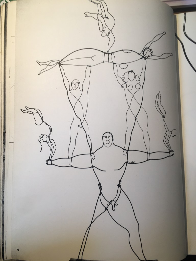
Calder didn’t start pursuing a career in art until the aged of 24 in 1922, when he began taking night drawing classes in New York, having found the working life following his graduation from engineering to be much too dull. He found his start as an illustrator at the National Police Gazette capturing athletic events including one time a circus (which was to serve as inspiration for the work that would catapult his career).
Once he had his own studio, he immediately began experimenting in wood and wire, and then wire alone. His works are recognisably playful and characterful and were sometimes called caricatures.
Left:Right, Horse, Detail of the Circus, Josephine Baker, all Alexander Calder, c.1927-9
One cannot describe his works – one must see them…The figures are amazing and in these works of art all artistic rules are suspended for the moment.
B. Werner review of Calder’s ‘Portraits, Sculptures, Wire Forms’ Nierendorf Galerie, April 1929
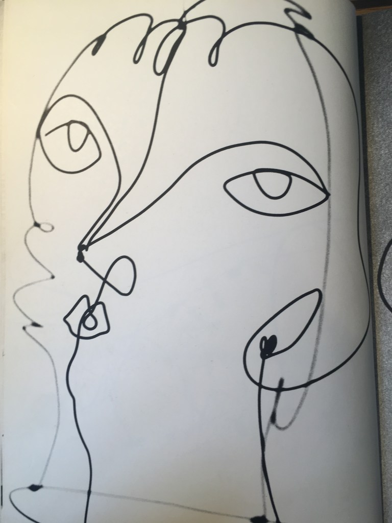
The Brass family, 1929
Kiki de Montparnasse, c.1930
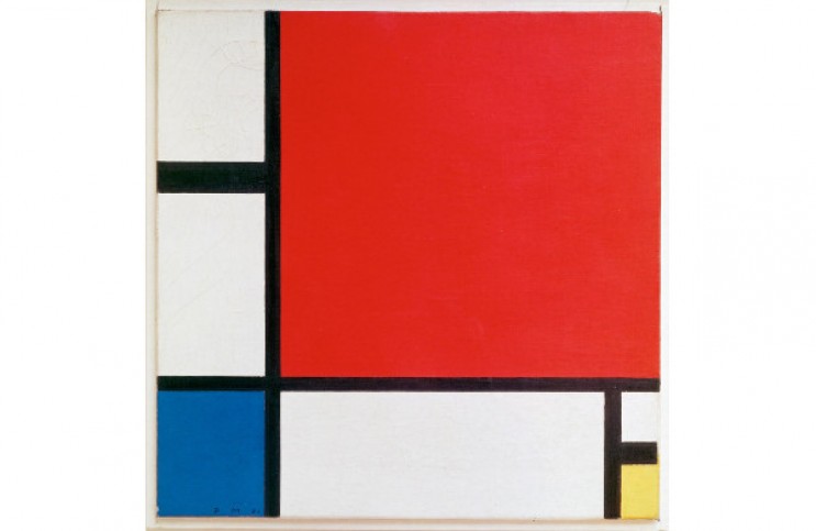
His networking in Paris was crucial to his gaining renown in the art world, and also was to provide a key catalyst to his work – none more so than his visit to Mondrian’s studio in 1930.
Piet Mondrian, Composition with Red, Blue, and Yellow, 1930, oil on canvas, Kunsthaus Zurich
It was a very exciting room. Light came in from the left and from the right, and on the solid wall between the windows there were experimental stunts with colored rectangles of cardboard tacked on… I suggested to Mondrian that perhaps it would be fun to make these rectangles oscillate…
This one visit gave me a shock that started things.
Though I had heard the word ‘modern’ before, I did not consciously know or feel the term ‘abstract’. So now, at thirty two, I wanted to paint and work in the abstract.
Alexander Calder (autobiography, 1966)
Drawings, 1931-2. Alexander Calder: “These are some of the drawings I made right after I visited Mondrian’s studio. They are among the first abstract things that I did and they led to the wire universes”
Marcel Duchamp’s ‘Nude descending the stairs’ is the result of the desire for motion. Here he also eliminated representative form…
Therefore why not plastic forms in motion?…Just as one can compose colors, or forms, so one can compose motions.
Alexander Calder, exhibition notes at Berkshire Museum, Aug 1933
I had not heard of the mention of ‘plastic forms’ before, and initially thought this referred only to the material plastic. Upon researching this though I understand it now to mean anything that has the capacity for the artist to shape it, so in most cases for Calder, wire.
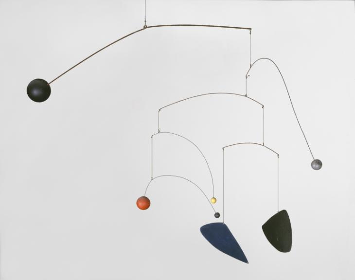
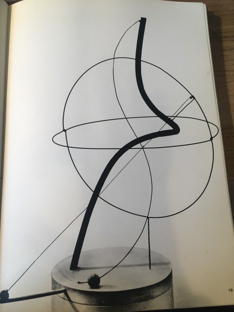
The move into kinetic or moving sculpture was groundbreaking for Calder – here he not only was playing with form and space in his wire drawings, but also time and movement. Though some were powered by motors, others were only subject to the movement of air or external stimuli.
A Universe, 1934 – motorized mobile: iron pipe, wire, wood, string
The underlying sense of form in my work has been the system of the Universe, or part thereof… the idea of detached bodies floating in space…
There is the idea of something floating – not supported – the use of a very long thread, or a long arm in cantilever…seems to best approximate this freedom from the earth.
Thus what I produce is not precisely what I have in mind – but a sort of sketch, a man-made approximation
That others grasp what I have in mind seems unessential, at least as long as they have something else in theirs.
Alexander Calder, ‘What Abstract Art means to me’, 1950
I have enjoyed learning more about Calder, after I was first fascinated by one of his mobiles at the Peggy Guggenheim in Venice. One thing that I am eager to try and take into my own practice is to try the line drawing technique. Til now I think I have shied away from this for fear of making a mistake, but I am intrigued by the unique forms that come from this method, and the simplicity of the finished work, so will resolve to experiment with this!
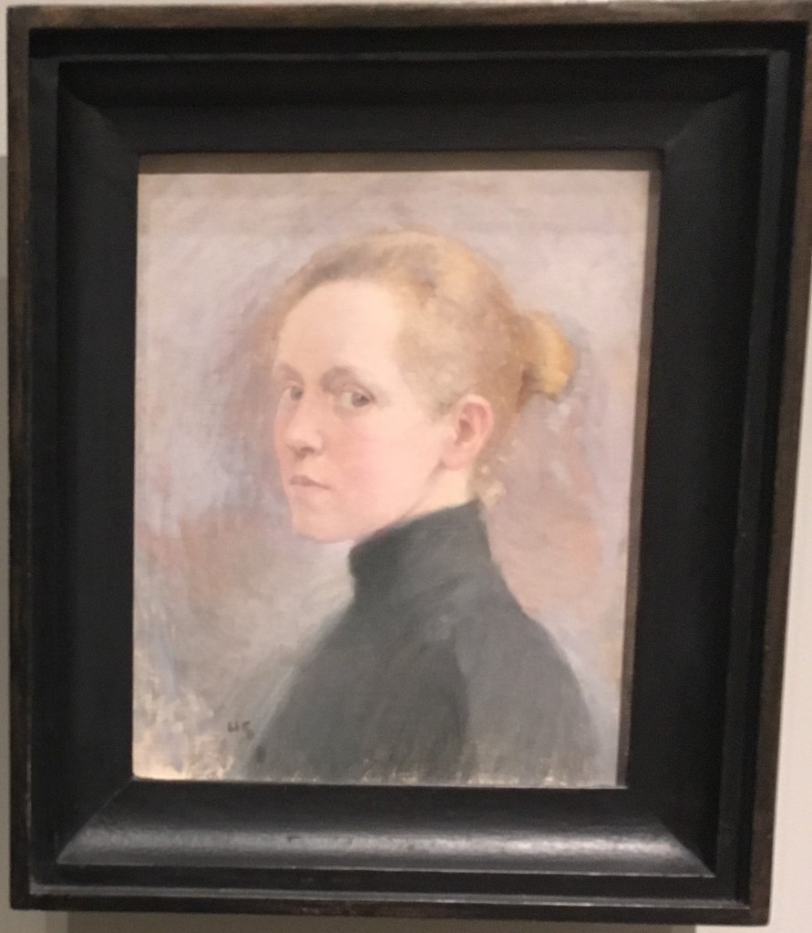
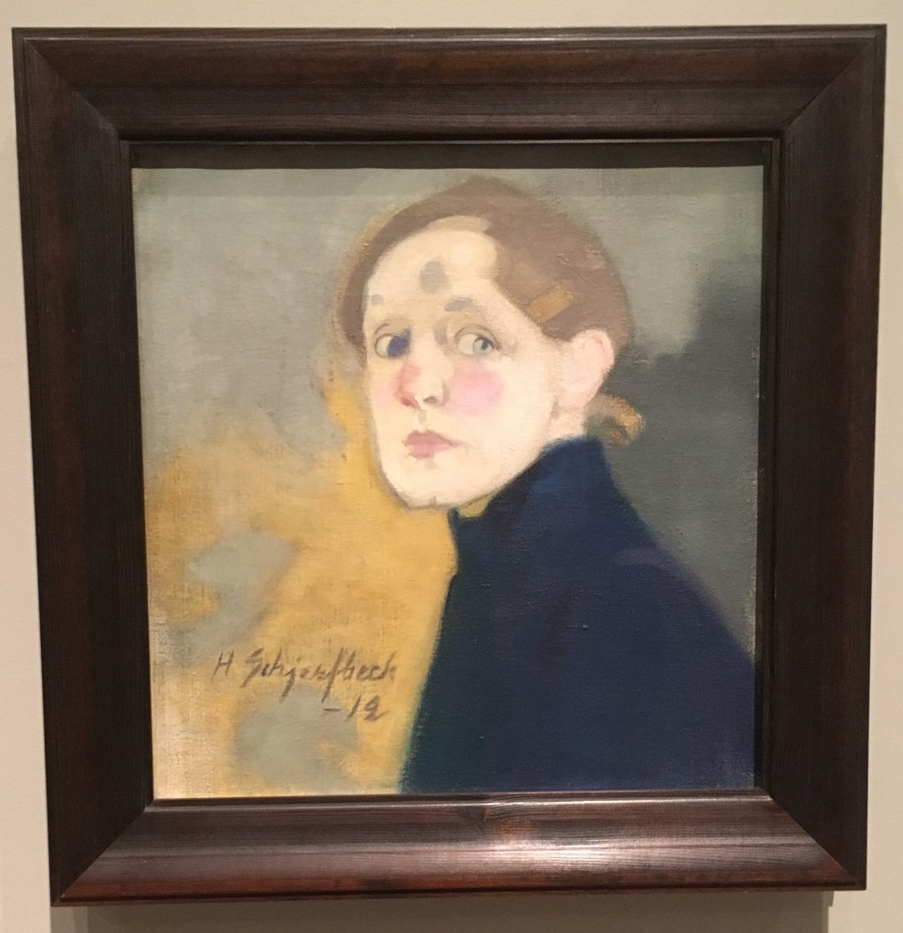
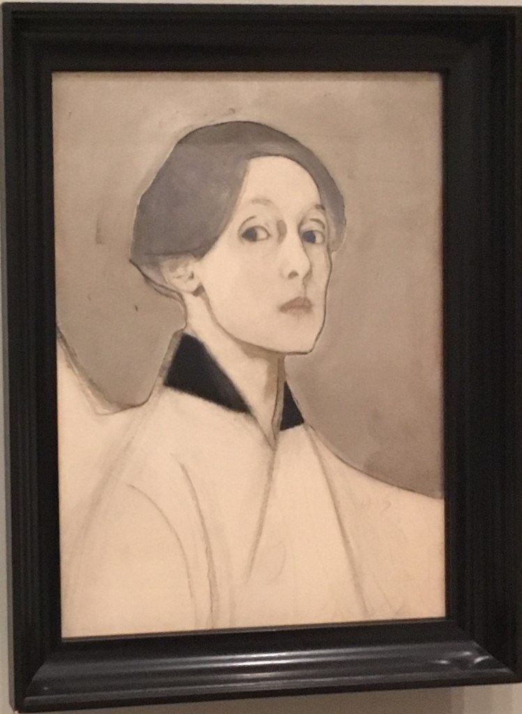
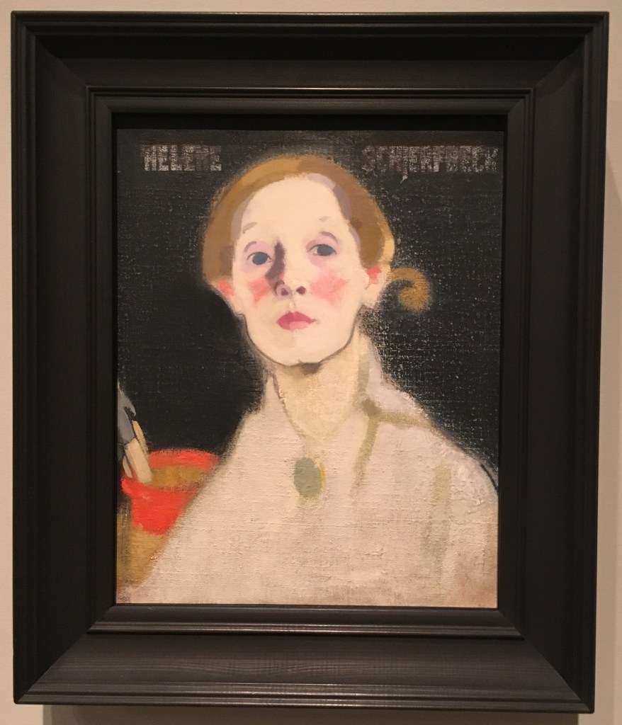
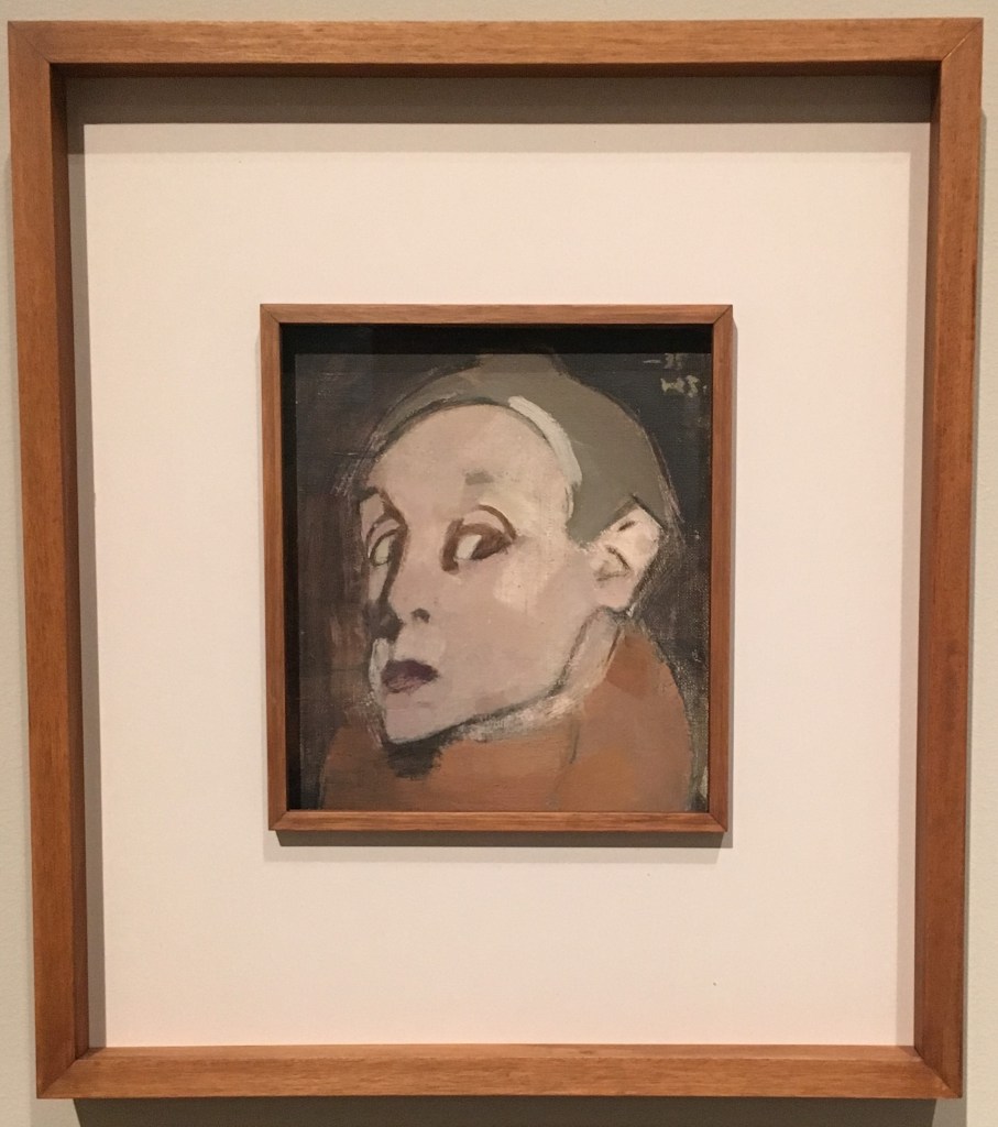
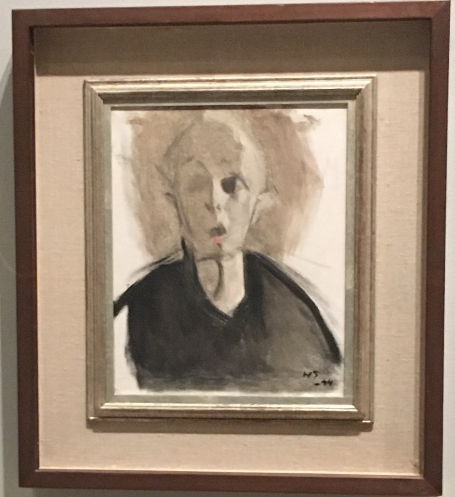
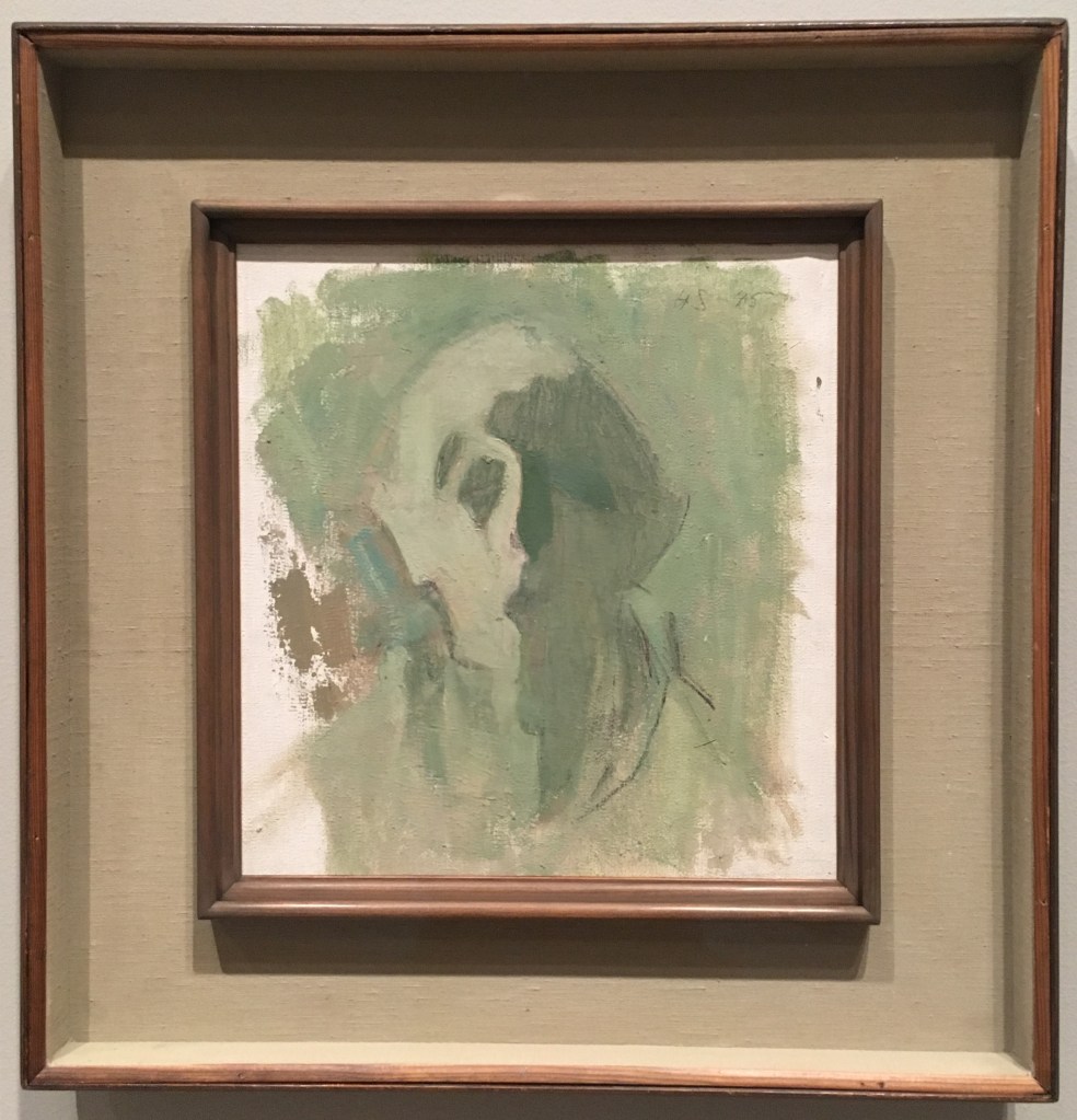
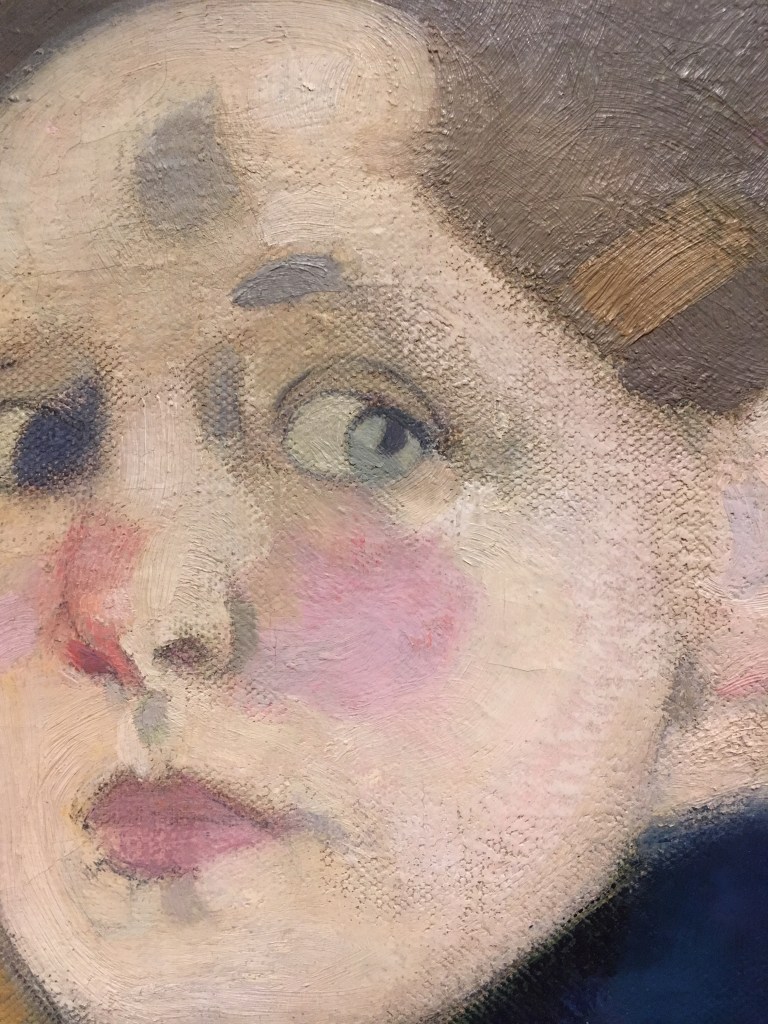
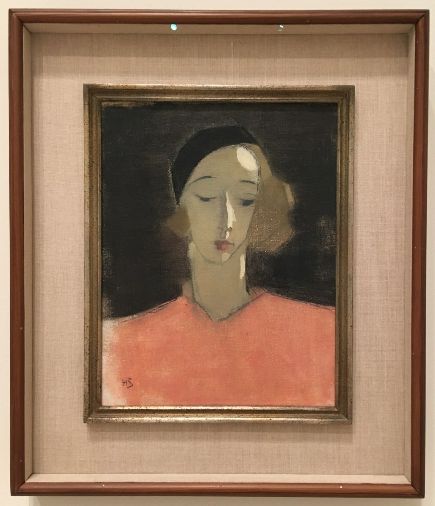
This weekend I visited the RA to see the retrospective on Helene Schjerfbeck, the first solo exhibition of her work in the UK. Born in Finland in 1862, she was an active painter until her death in 1946.
I was keen to visit this exhibition, to continue my run of women artist retrospectives in 2019, begun with Lee Krasner and Natalia Goncharova. This is motivated by various reasons for me – to do what I can to ‘vote with my feet’ and support the rewriting of art history to include women who deservedly should be included within it, in the process educating myself and reflecting on their practice, and further because something about observing depictions of female subjects devoid of the male gaze is palliative and reassuring to me in some ways. I have often felt very uncomfortable in the more historic wings of art galleries, filled with idealised and sexualised female forms, and while some women artists have continued in this convention in the hopes of subverting the narrative, I find it most interesting seeing depiction go beyond this.
The exhibition itself was divided into 5 sections, split across 3 rooms, suggesting that the curator could have filled a good number more rooms if given the space!
Dreaming does not suit me. To work, to live through work, that is my path.”
Helene Schjerfbeck
I think this artist held a deep emotional intelligence, and conveying complex emotional narratives in her work. I will highlight the works I found to be most interesting here, in the order in which they were presented in the exhibition.
Section 1.
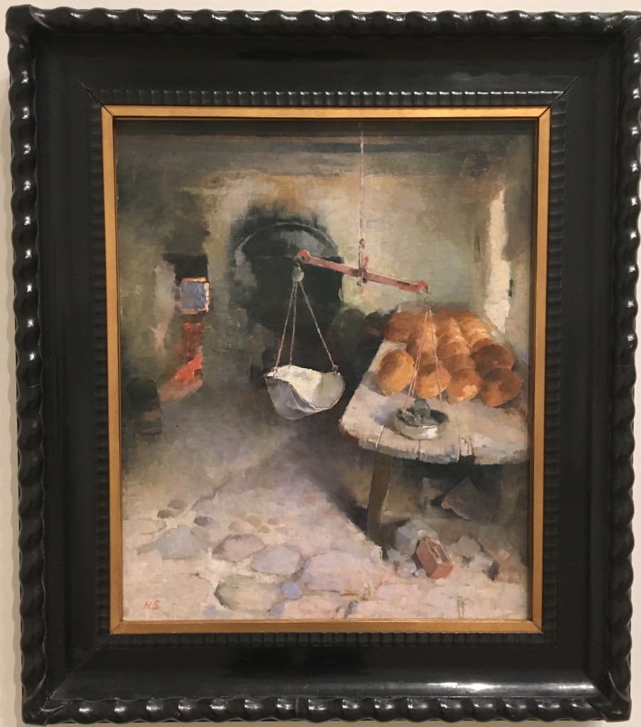
The Bakery (1887)
For this painting, Schjerbeck had set up her easel in a working bakery but chosen not to depict the bakers who no doubt would have been present at the time. In this sense she is already subverting the conventions of naturalism. I found this painting a little unsettling, and reflected on it for some time. The scales, just off centre, are unbalanced. We see a large table filled with fresh baked buns, just laying there (the perspective of this feels like it is exaggerating the size and dominance of this in the space). There is a sense of stillness and murkiness in the room, which is contrasted by the vivid light from the furnace emanating from around a corner in the distance. It implies for me a sense of waste, empty endeavour, inequality in a land of plenty.
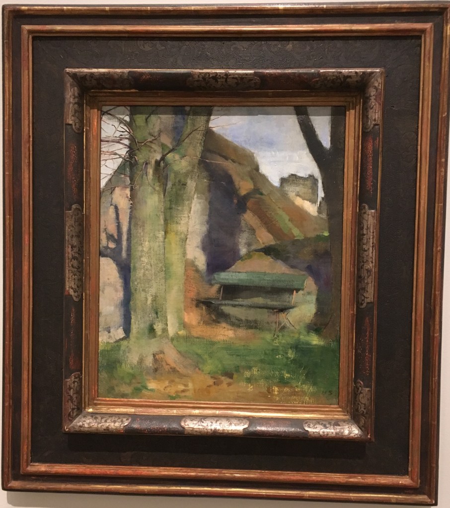
Shadow on a wall (Breton landscape), 1883
I was intrigued to see this painting in the exhibition, following my own thinking around depiction of shadows and impermanence. For me, this painting was interesting as she had taken great care to depict the detail of the young branches on the foregrounded tree, to a very fine degree, but the subject of the painting itself, the shadow, contrastingly feels slightly sketchy or blurred. I wondered if this could be defying the convention of the object of focus being also the main subject of a piece (as in photography for instance). The effect is such that it is as though we are only seeing the shadows in our peripheral vision, as though they are some ever-present looming darkness. I think this must be the intention, since the landscape itself is fairly sparse, and the space taken up by shadow is quite large, you cannot focus on the tree without seeing it.
Section 2.
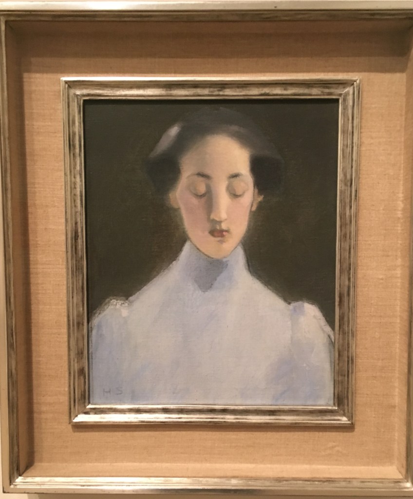
Silence, 1907
There is an interesting quality of light in this painting, her blue dress and delicately lit face contrasting with the plain dark background. The shape of her long neck and sloping shoulders makes her look ethereally elongated, and removed. Again here a sense of stillness and reservation – even regret from the downturned eyes?
Section 3
This room was dedicated to her self-portraits, painted throughout her life. Her style became more abstracted over time, and she confronted her mortality and the deterioration of age head on, with the final works completed within a year of her death at 83.
I found it quite a challenging room to be in, and felt that not only was she exploring that physical change she was seeing over time, but also capturing perhaps her self-perception and attitude towards herself. It is not a sympathetic view of aging we see in her final works, the figure abstracted to almost not being human. I wondered if here the figure of Nosferatu from early cinema might have been an influence (the film was released 20 years prior) – if so characterising oneself as a monster is certainly suggesting a troubled internal world.
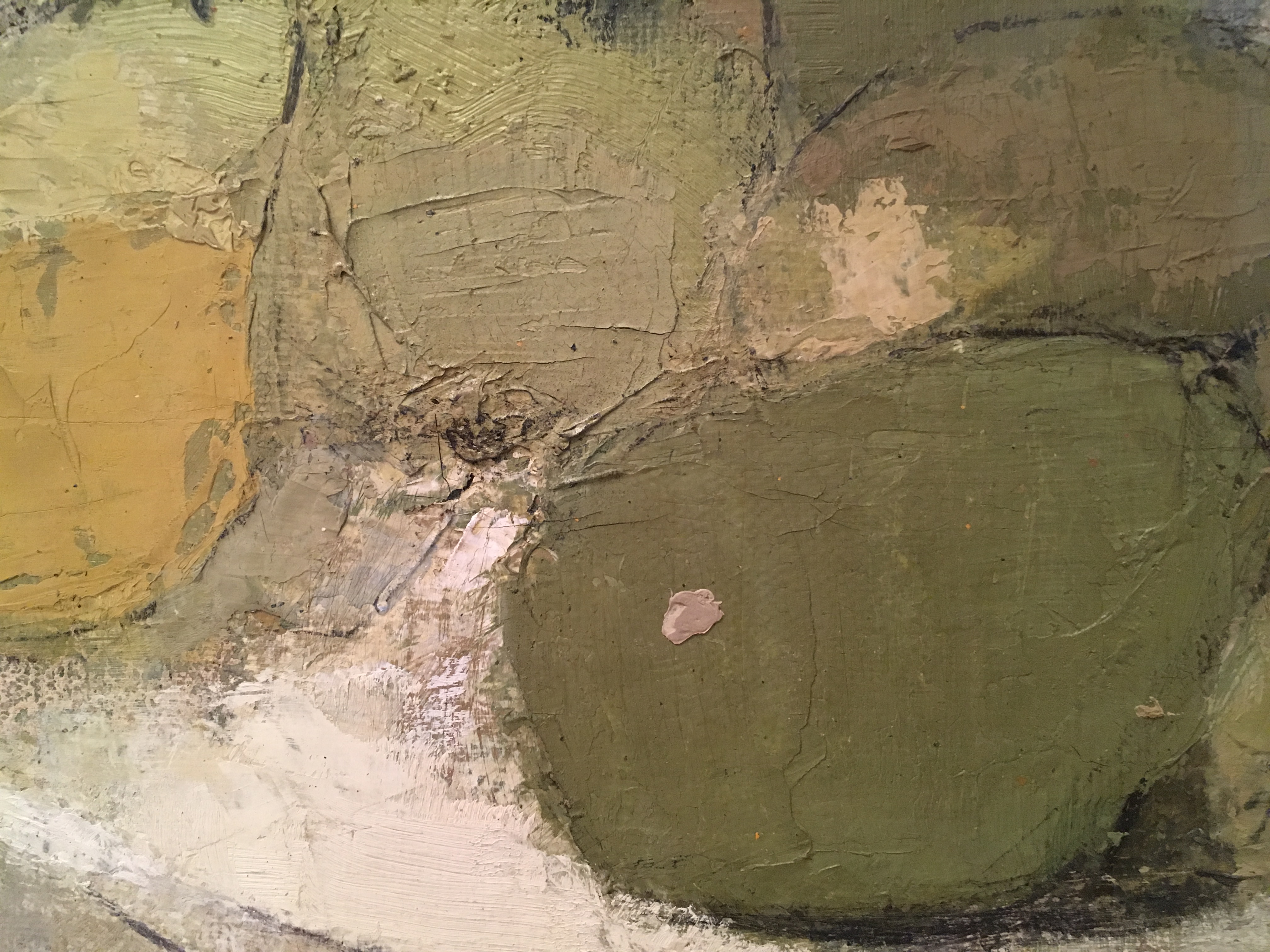
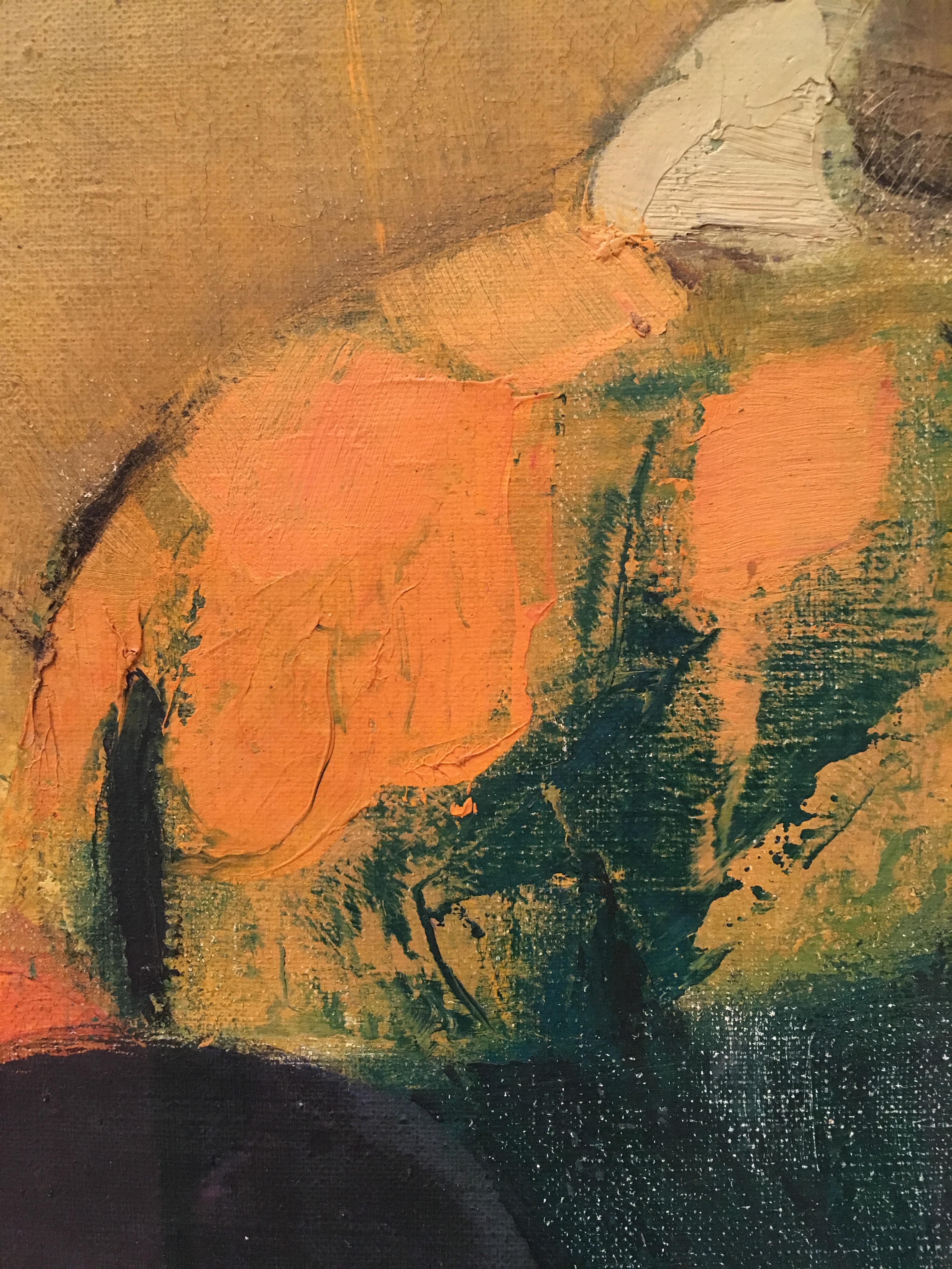
Schjerbeck’s technique involved applying paint and then scraping it off or rubbing it back. She repeatedly reworked surfaces with a brush, palette knife or cloth and even sandpaper. The layering and erasure emulate the effects of time in paint. In some cases, parts of the canvas are deliberately left bare, using this texture as part of the picture.”
RA notes – Helene Schjerbeck exhibition
I was interested to read about her techniques with paint – she used oils which I am not familiar with but if applied thickly I imagine a similar effect can be achieved with acrylic? Could be interesting to experiment with this.
Section 4
Girl with beret, 1935
In this room, we saw more of Schjerfbeck’s portraiture, and here her style has developed further. She is using a variety of source material, including the latest fashions from Marie Claire and Chanel, as well as using her own memories and imagination to influence her work. This results in something more abstract and generalised, and though here again there is a woman with downcast eyes, here it suggests a sort of melancholy or regret for me, with a sharper light being cast on the figure.
Section 5
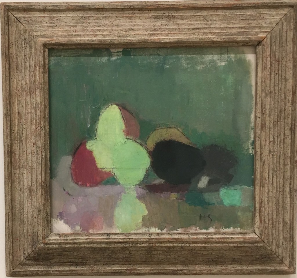
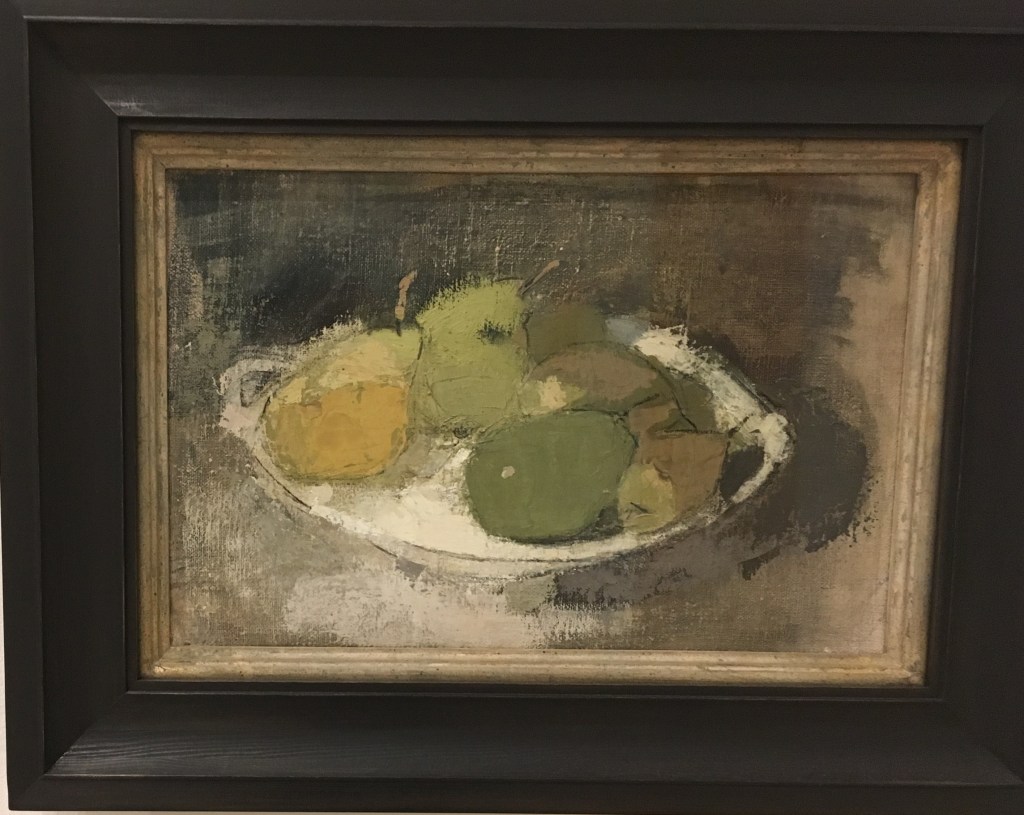
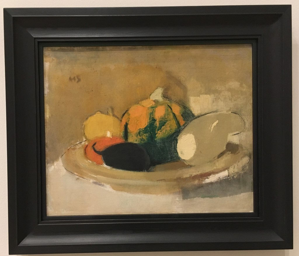
Her still lifes are for me really interesting. The exhibition notes stated that she would work on multiple canvases at a time, doing these as a counterpoint to the many portraits she did. As such I think she may have been a little freer here and we see her particular approach to painting clearly evidenced.
I especially liked seeing the variety of marks she used for the pumpkin still life and how the intent with these marks is not to recreate/emphasise what must have been a very rounded shape.
This exploration and experimentation with abstraction did not quite take her far enough in my view, and I left feeling like if only there had been a further section to her working life we might have gotten somewhere exciting. It left me somewhat unsatisfied, having seen the broad experimentation of Lee Krasner and Natalia Goncharova. But I certainly enjoyed seeing the depths of emotion contained within her works nonetheless.
Since the lecture on approaches to drawing, I’ve been interested in thinking about impermanence in art and materials disintegrating.
This specifically was sparked by the mention of artist Amanda McCavour who creates ‘thread drawings’ on water-soluble fabric. One material (the thread) remains while the other (the fabric) disappears.
I think this is different to auto-destructive / destruction art. Where the whole piece might be destroyed in the process, e.g. Gustav Metzger’s acid paintings, or Banksy’s Love is in the Bin. Instead it is the juxtaposition of something ceasing to be, while something else endures. For me, this is akin to memento mori. We are reminded of our own mortality, while at the same time viewing something that will endure beyond the life of the subject.
I looked to other water soluble materials to experiment with this idea. In both tests I took the paper and ran it under the tap directly – this alone let the pen run, but I had to stroke the sketch itself in order to distort it directly. In both cases I chose to use imagery/text that directly act as memento mori.
Light Wash HB pencil
Permanent marker and water-soluble brush pen
I think this was an interesting experiment, but I wonder if it is a little too obvious? I may try to incorporate this into a more subtle approach.
Another thought I had was to make use of fleeting phenomenon to explore impermanence. In particular, shadow. In the process of making one of the objects for my survival kit, I happened upon an interesting shadow form as I was exploring it in suspension
I would be interested in exploring this theme further also. I am aware of artists creating sculptures in order to cast figurative shadows, but am not yet aware of more abstract shadow pieces, which I am interested to look into.
Detail of shadow cast by Kira Freije’s Standing Woman Arms Folded, RA
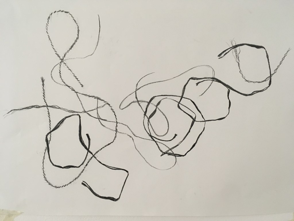
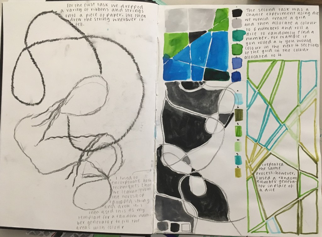
Charcoal drawing of where pieces of 4 different types of string landed when dropped from a height onto paper
In this workshop, we were introduced to 3 different approaches to drawing, and performed exercises that incorporated an element of chance within them: stochastic, system, and collaborative. We were then invited to expand on these exercises further.
The above image is what I produced for the stochastic (organic) drawing exercise. One by one I dropped pieces of string onto my paper and drew where they had fallen. I was keen to capture the difference in texture and shape demonstrated by each string type and varied my marks and weight with the charcoal to do so. I think this has been quite effective. In doing this exercise, the longer I went on (say after the first 6 drops) the more editorial I became with how the string fell – I still dropped it from a height and observed how it had landed, but if the composition was not quite to my liking I tried again without documenting this shape. It was interesting that I gained confidence/a sense of agency once I had a feel for the task at hand – that there was a sort of dance in a way of the relinquishing and regaining of control with chance.
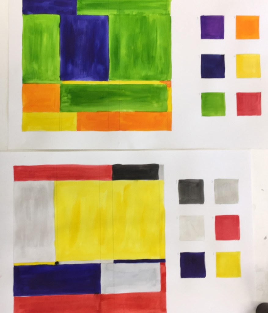
The second exercise we performed was the system drawing. Here we were told to draw a grid and then populate 6 squares to the side with 6 colours. Then we were told we would be rolling a dice and painting 6 consecutive shapes within the grid with the colour for square 6 if we rolled a 6, or 2 consecutive shapes with colour 2 if we rolled a 2, etc.
(top) my first grid, (bottom) I repeated the exercise with a less brilliant palette a la Mondrian
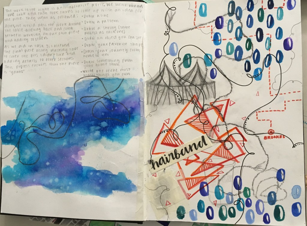
The third approach was collaborative drawing. Here we would receive an instruction from Myfanwy and add an element to the paper in front of us (e.g. draw a line). We would then pass the paper on as instructed (e.g. pass it twice to your left, and rotate it through 90 degrees). We continued like this for some time, adding what we had for breakfast, a drawing of something in the room, a pattern, etc. Finally, we were instructed to retrieve the paper that we had started with and made our first mark on (the line). We could then add to or remove elements in order to make it uniquely our own.
Here is my finished collaborative work. I chose not to obliterate any contributions from the work, though I submerged the pattern (which had been done in biro in the bottom right corner) beneath my ink strokes so that only the texture of the pattern could be seen.
I enjoyed this exercise, though I find the artefact itself I am left with does not fully capture the process I myself went on. Since I had created equivalent elements for each of those seen in my finished work, but they are not here seen, I feel there is something lost along the way. I also dislike that the orientation of the piece is difficult to really nail down, with the elements often being drawn at contrasting ones. But it was an interesting exercise.
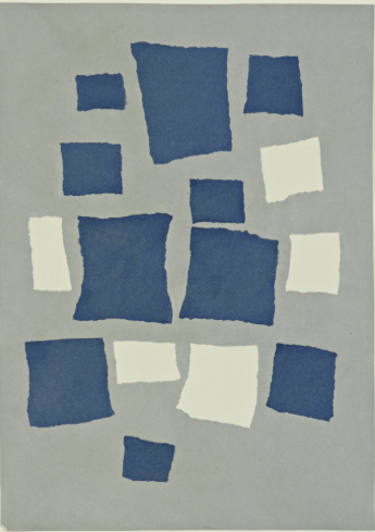
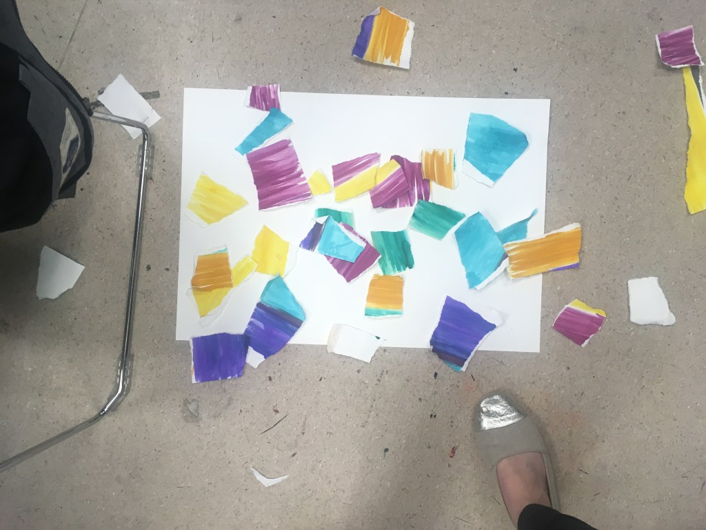
For my self-guided piece, I was keen to do another piece that captured the element of dropping. In the session we had been introduced to the below work by Jean Arp (that does appear to have been choreographed somewhat) and I was keen to try this method out for myself.
Jean Arp, Untitled (Collage with Squares Arranged according to the Law of Chance) 1916, MoMA
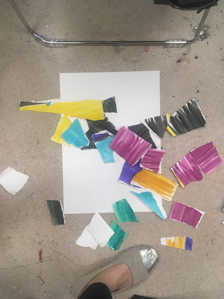
I first painted colour fields onto pieces of paper with a chosen palette, then arbitrarily teared them up into pieces.
Then above an A1 piece of paper that I had placed on the floor, one by one I (without aiming/looking blankly into the distance) dropped the pieces approximately above the page. I varied the position of my arms in relation to the paper, but maintained roughly a height of 1.5m.
In my first attempt, I found that much of the paper floated off the page, and others ended up clumping into little piles. I felt that the clumping/pile effect might be difficult to effectively capture by sticking, as I would need to deconstruct first and then recreate and might lose something in the process.
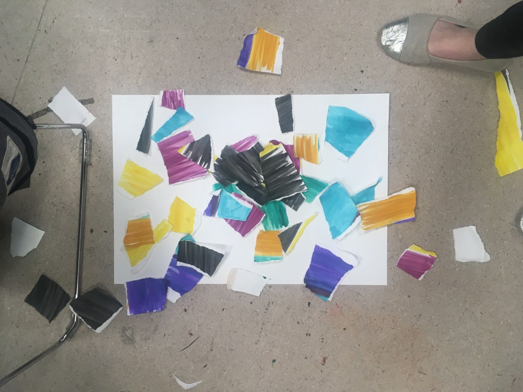
For my second attempt, I decided to introduce an element of system/rule to the dropping, and not drop all the pieces of paper in one sequence. Here I chose to drop the coloured pieces one by one first, and then reappraise prior to dropping only a selection of the black pieces. This was interesting, but I still found that the pieces formed a pile/clump.
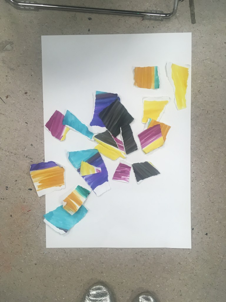
I decided to restrict the number of pieces of paper I dropped even further. Here I chose to remove from the collection pieces that did not fully have torn edges (i.e. exclude the pieces that had a straight edge)
3rd attempt with restricted pieces of paper
I was very interested by the fact that in restricting the number of pieces I used, the composition appeared to coalesce to a form of sorts – here a diagonal stripe. Below the piece following sticking down with Pritt stick.
I think it is interesting that texture and depth has been lost to some extent in the process of capturing these by sticking them down. A loss in a move to permanence from something impermanent?
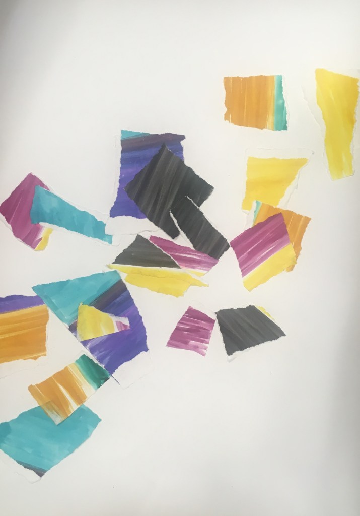
I chose to repeat this with the remaining pieces that I had excluded onto another piece of paper.
Intriguingly, again a diagonal shape was formed, this time in the opposite direction.
Last week we conducted formative reviews of our peer groups work, and gained some general feedback from the teaching staff on the Foundation course. This proved a great opportunity to get an insight into the working practices of my fellow students, and reflect on my own approach and how I could be refining it further in the coming weeks and months.
The key takeout in relation to my own work, is that I should use my sketchbook for even more experimentation and exercises beyond the brief. This should extend also to how I go about using my sketchbook in different ways and experimenting with the scale of drawings within the book itself and mixed media. Clearly documenting my progress in projects and sequentially helps guide the reader through my thinking.
I think thus far I have as a first impulse gone to my journal and hesitated to put pen to paper in my sketchbook until I have worked through my thinking in words. I think a good exercise for me would be to go first to the sketchbook with something.
Here are some examples of work by my peers that I found particularly interesting:
Sketchbook work: beyond the brief
Sketchbook work: experimentation
Sketchbook work: Mixed Media
At the end of the session, in the general feedback, Louise shared this blog with the group as an ‘outstanding’ example! This was due to the regularity of posting, variety of posts and how I was documenting everything, including research and influences from elsewhere. I was really chuffed with this! So I shall look to be continuing this as we progress in the course.
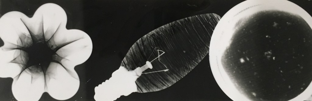
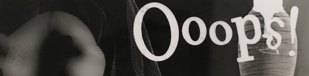
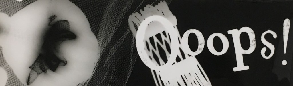
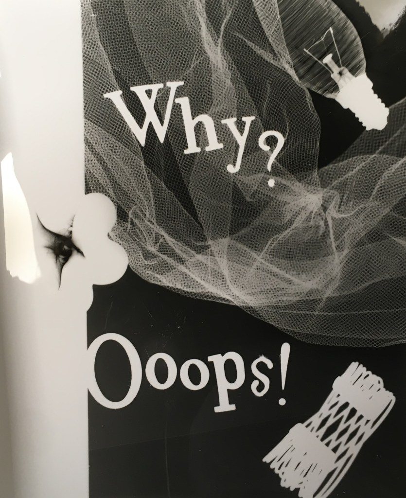
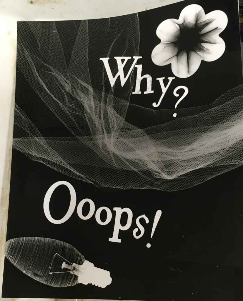
A test strip from my photogram workshop, with glass decanter stopper, lightbulb and tea strainer
Today I experienced my first dark room, and got the chance to experiment with photograms. I enjoyed learning the technique and producing my own images, though it seemed most of the time spent there was in waiting for and using the chemical trays, rather than the creation of the photograms themselves.
We had been briefed ahead to bring objects, and on some of the history of Moholy-Nagy who famously used this technique for what he would call ‘abstract seeing’ of the forms of objects themselves.
My first test strips, where I experimented with the length of exposure along it using cardboard to isolate sections along the strip. I liked the lightbulb and text here but felt the netting and stopper were a little lost.Here I made the mistake of not quite centering the paper beneath the light. It is an interesting mistake though in light of the Ooops text, and I quite enjoy the overall effect. This gave me the opportunity to reconsider the addition of the metal bracelet at the bottom right. I was really pleased with the effect of the netting here. Here I am unsure if the composition is quite as successful but I am pleased by the effect of the exposure, where each object is well exposed. I am especially intrigued by the texture suggested by each object and the contrast between them.
On reflection, I wonder if the text here added anything, or if I could have produced a more interesting composition from something purely abstract (as Moholy-Nagy himself did). I had several comments from my peers that the typeface reminded them of book covers, which amuses me but wasn’t quite my intention!
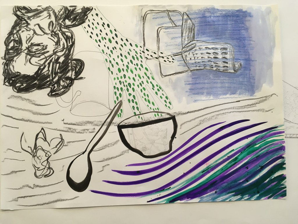
I was reflecting the other day about how several of the workshops we undertook in consideration of Dadaism and chance was in using objects in unusual ways/reducing them to their forms.
This reminded me of an artist I followed on instagram, Christoph Niemann (@abstractsunday) who illustrates for the New Yorker. He has an interesting TED talk which I include below, which discusses precisely this, and the role of the audience in visual communication (without recourse to cliche). I also enjoyed hearing about how this allows simple images to communicate complex ideas, even emotions – we fill in the blanks. The picture only need suggest enough.
I particularly enjoyed learning about his strategy here, in choosing an object from his home and reflecting on it for some time in how it might be portrayed differently.
The real magic doesn’t happen on paper, it happens in the mind of the viewer. When your expectations, your knowledge, clash with my artistic intentions.
Christoph Niemann, 2018
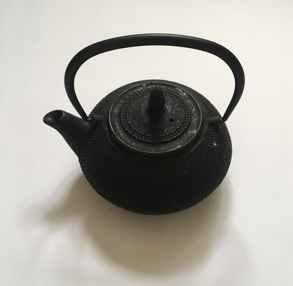
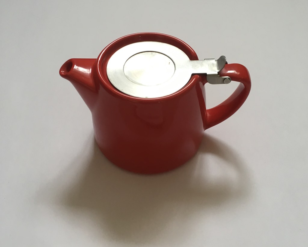
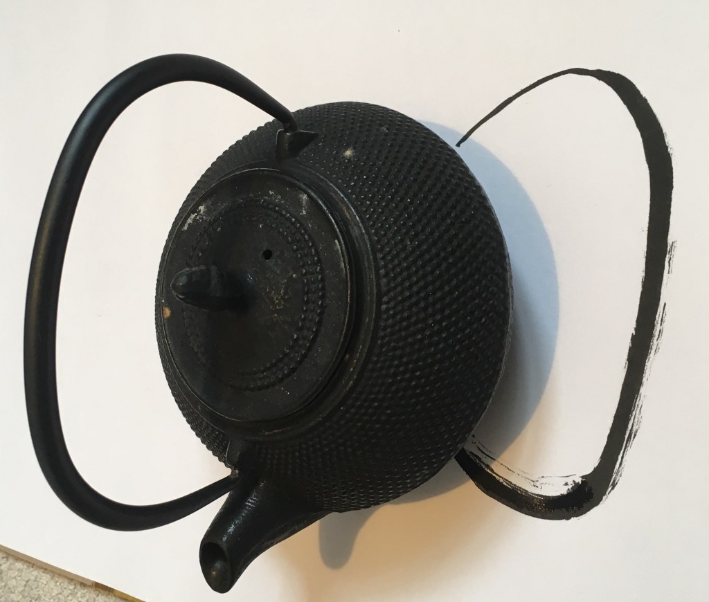
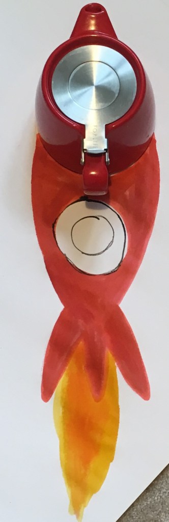
I am interested to use this strategy for myself. Following the success of my teapot figure I wondered about using one of the teapots I have at home.
I think these are interesting contrasts to each other. One is cast iron with a ridged texture and very fluid handle. It is squat and round, an ‘oriental’ design though it originates from Belgium. The other is brightly coloured but smooth, more modernist in design (i.e functional) with a sleek aesthetic, though made in China.
I like these abstractions – I think I could develop them further and take better into account the space around my drawings to ensure I can best document the intended perspective in my photography (without going off the edge of the paper! Here I used A2 paper, but perhaps A1 would be better, especially when using sizeable objects.
The use of ink felt right here, as Niemann uses, as helps for quick sketching, but collage might be interesting too.
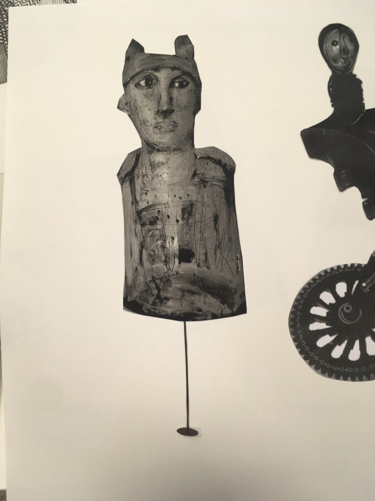
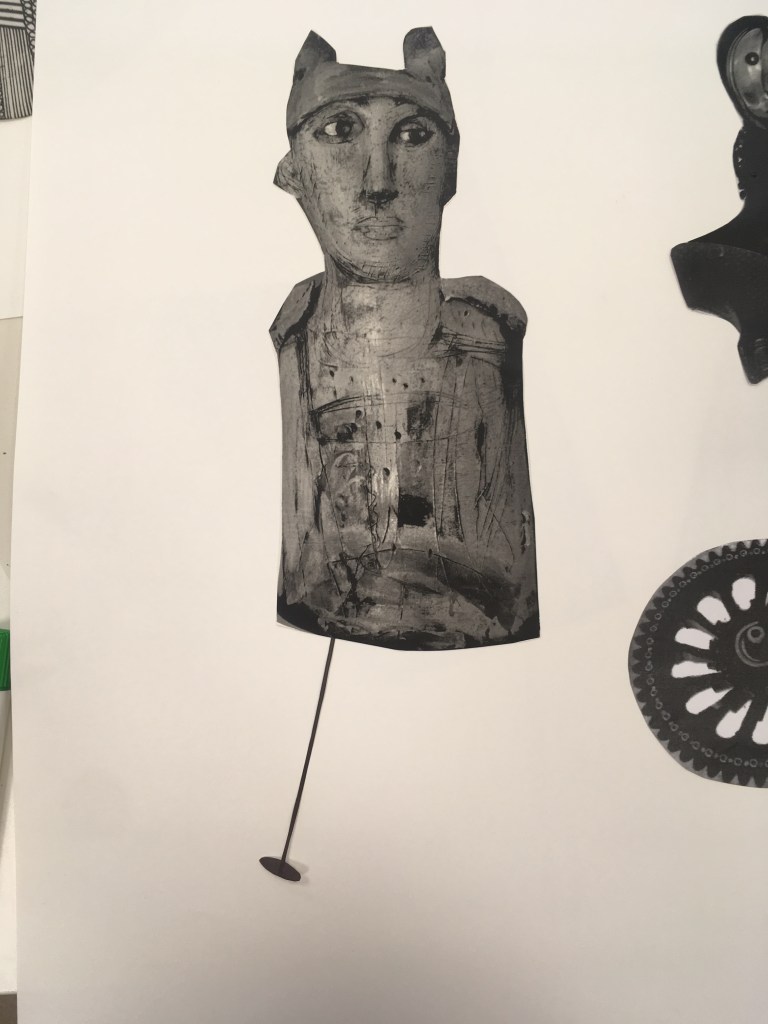
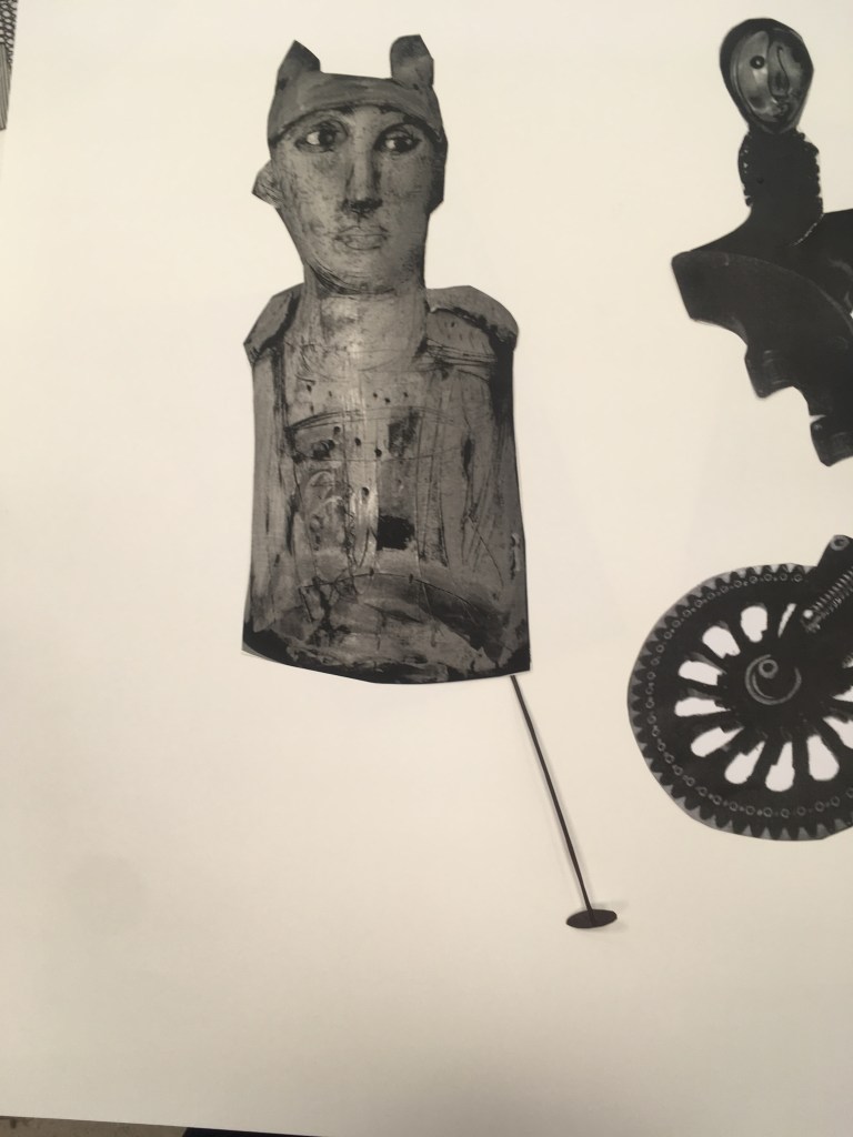
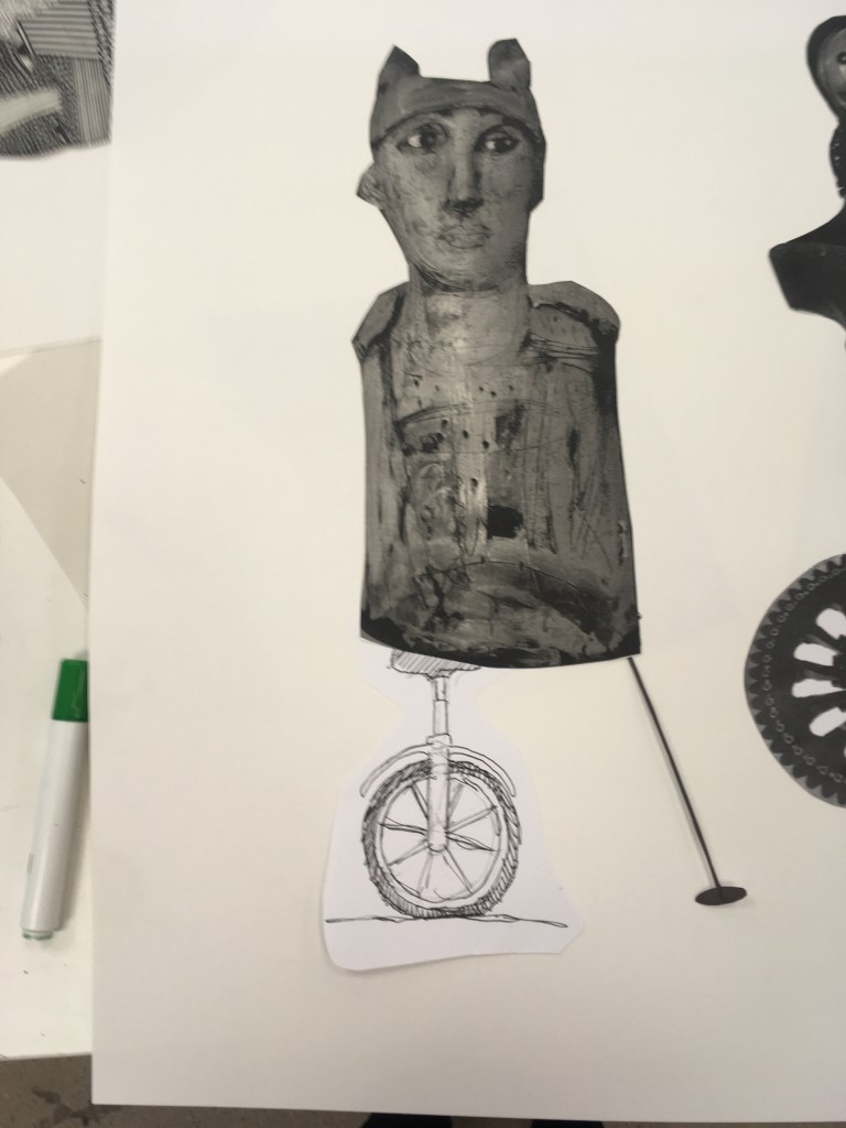
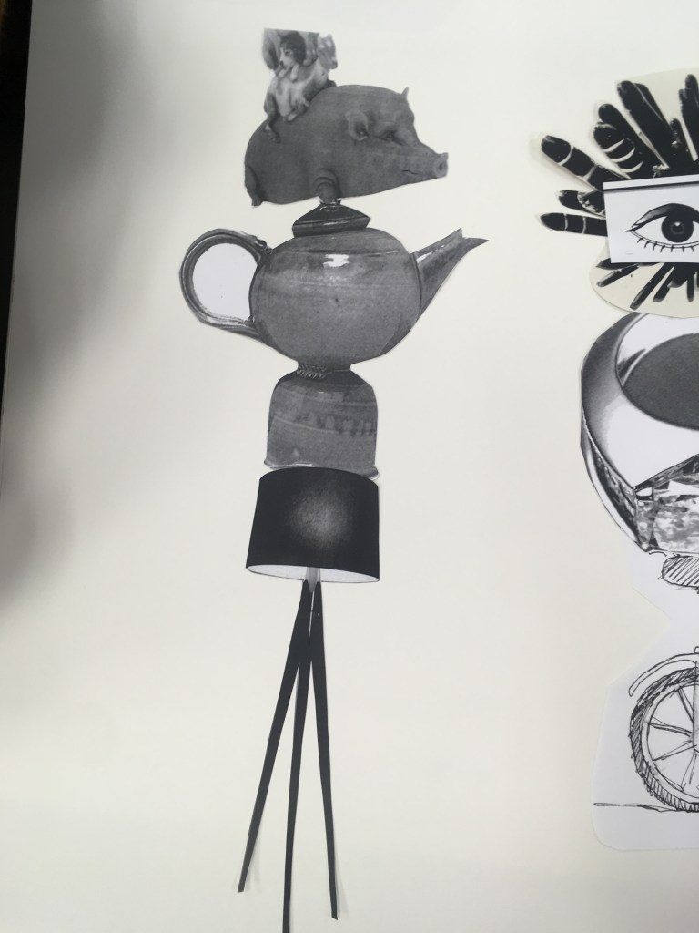
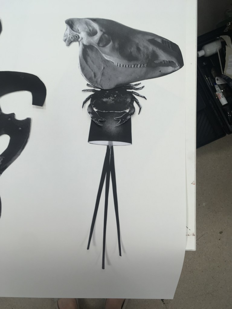
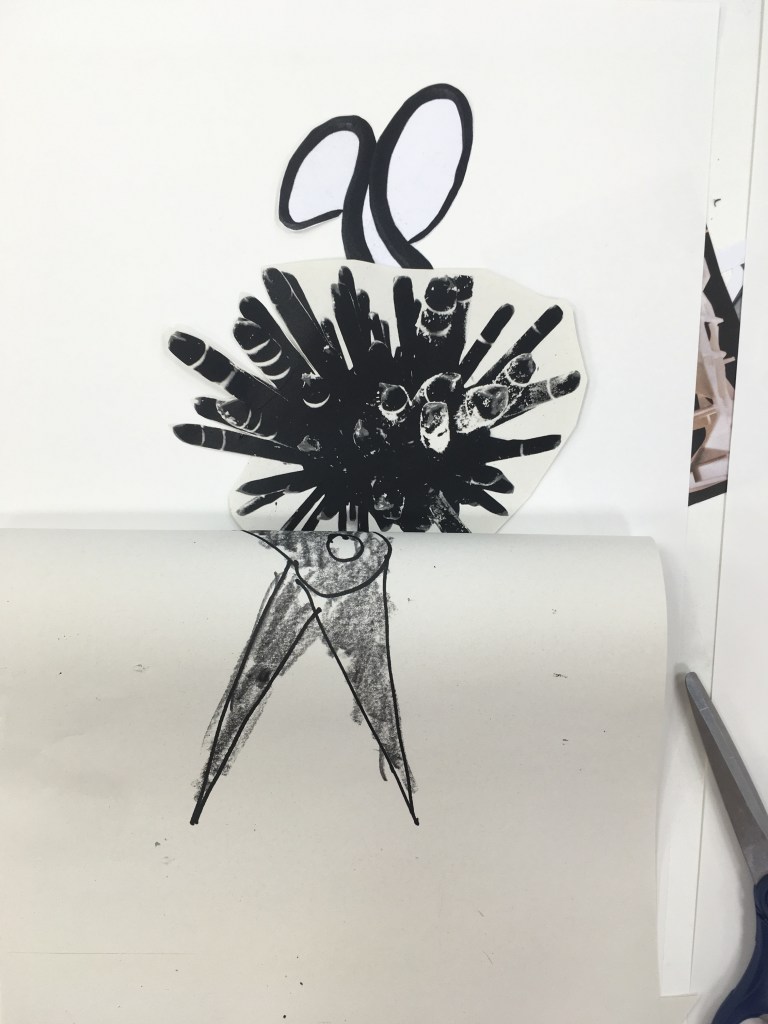
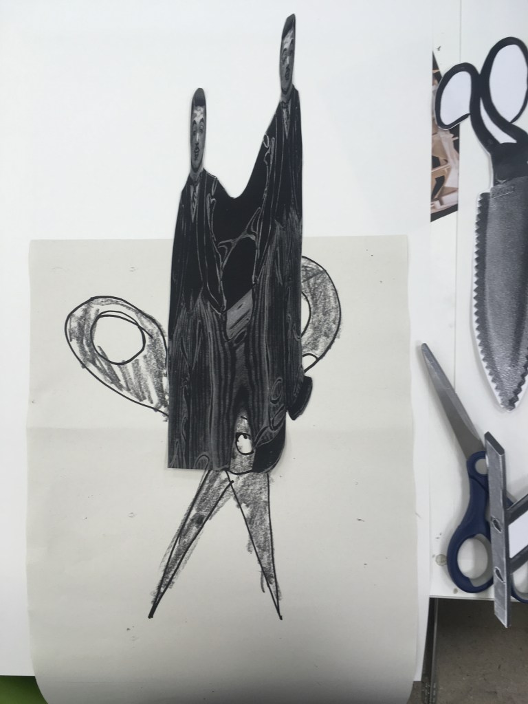
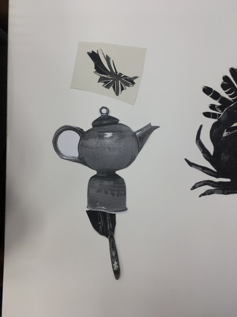
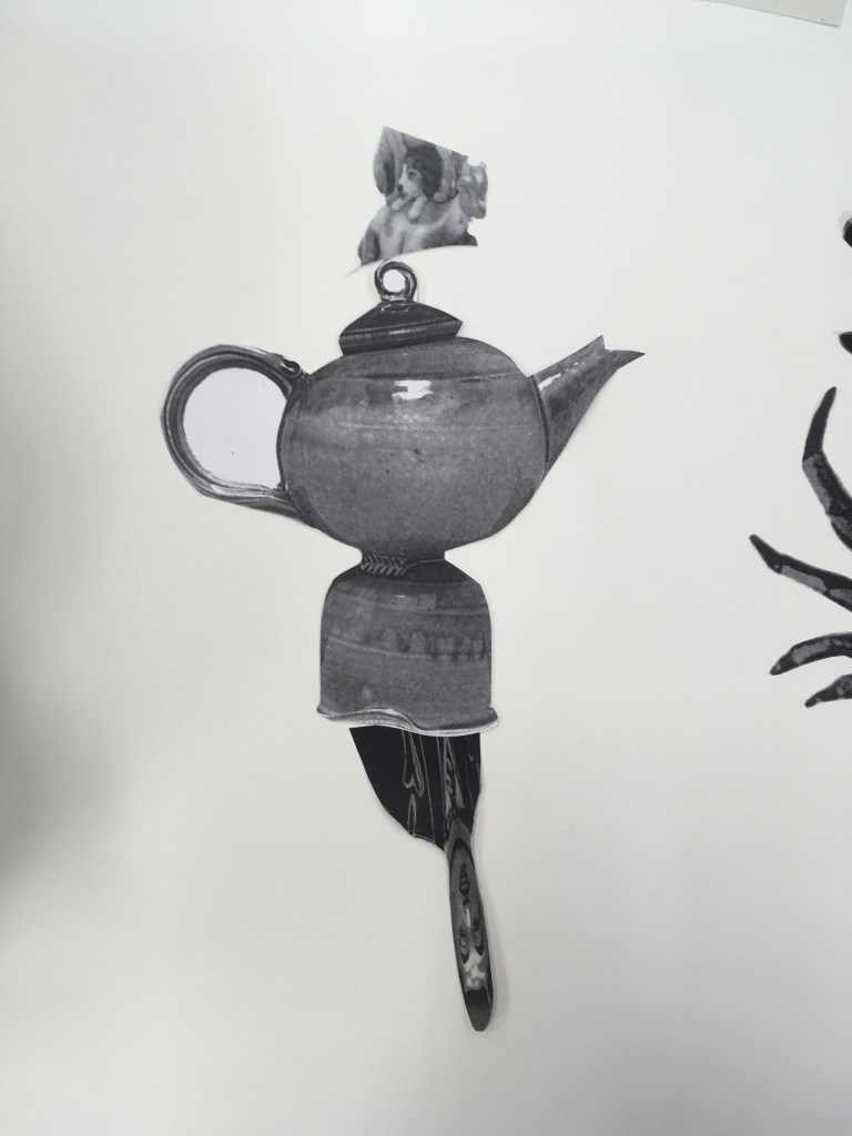
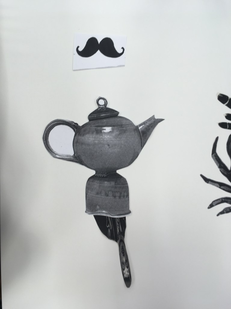
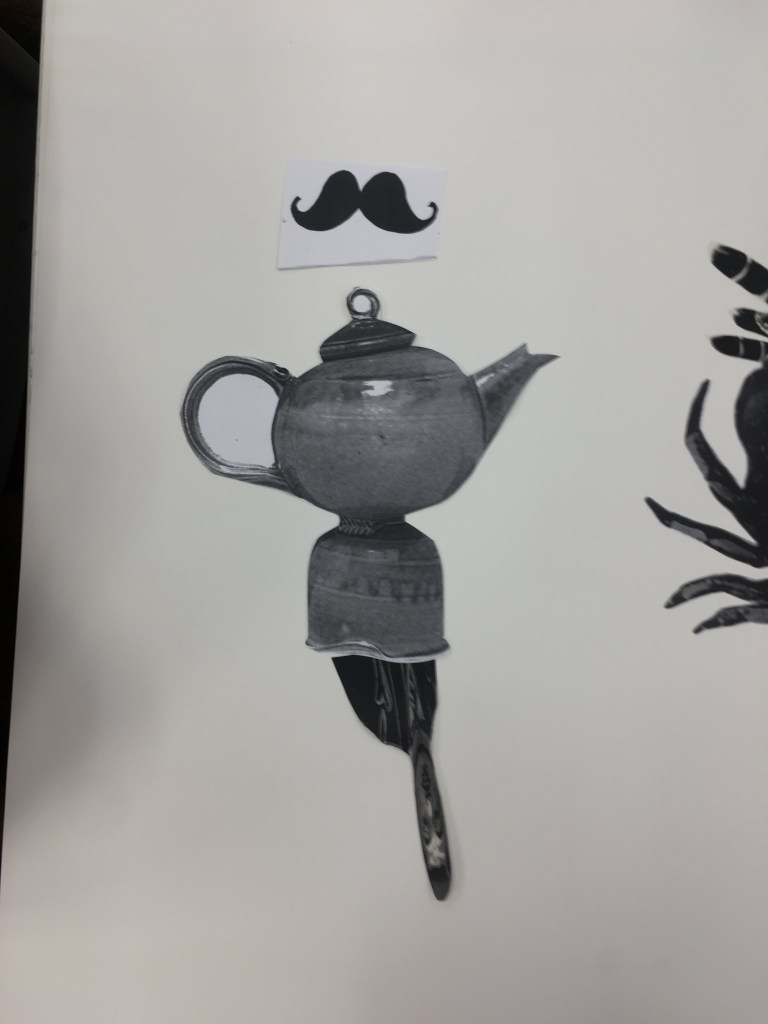
The final exquisite corpse collages I created in the workshop
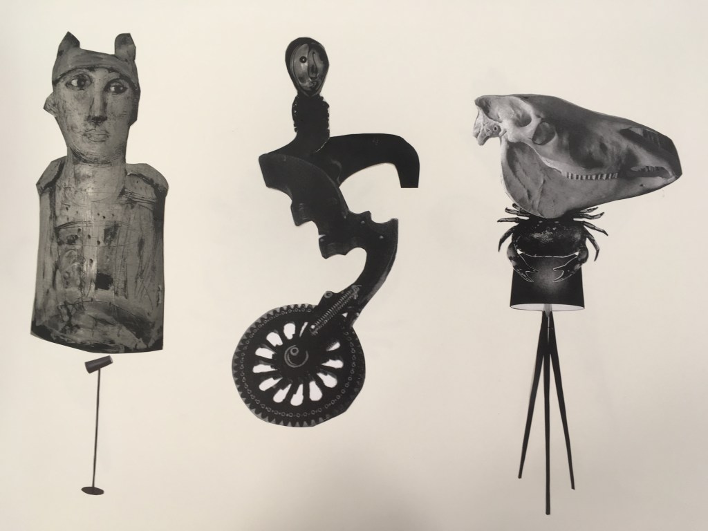
In this workshop, we collaborated as a group in generating lots of images and drawings of objects that could signify body parts – these were all photocopied and scaled in various ways to give us uniformly black and white copies. We were then tasked to create a series of characters with these body parts in collage.
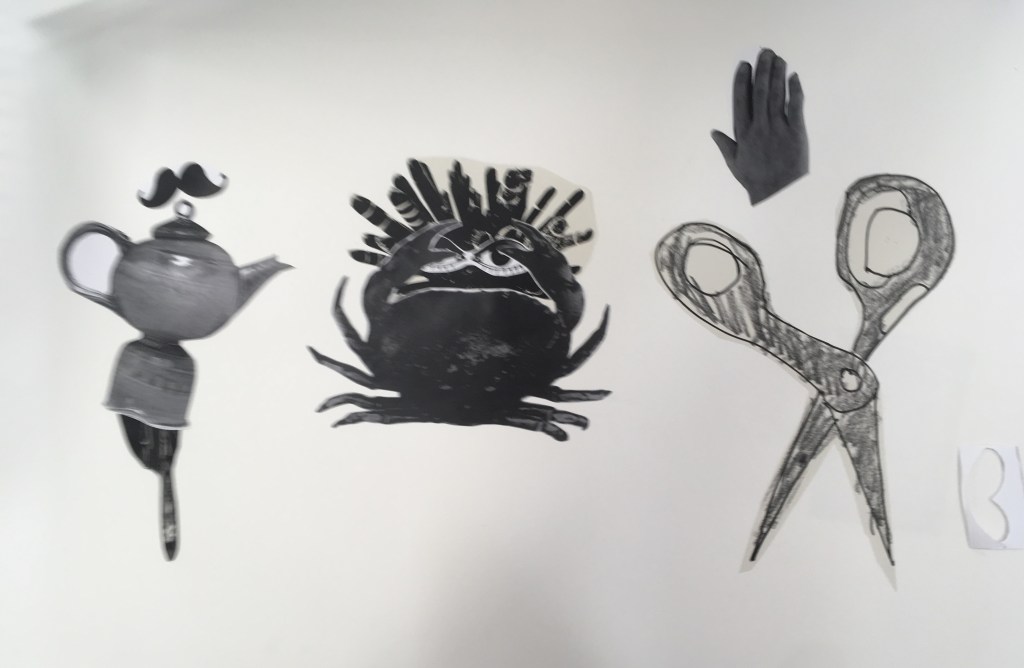
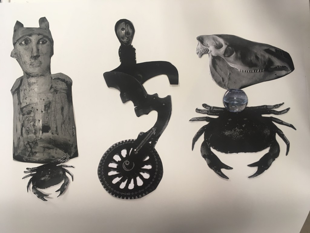
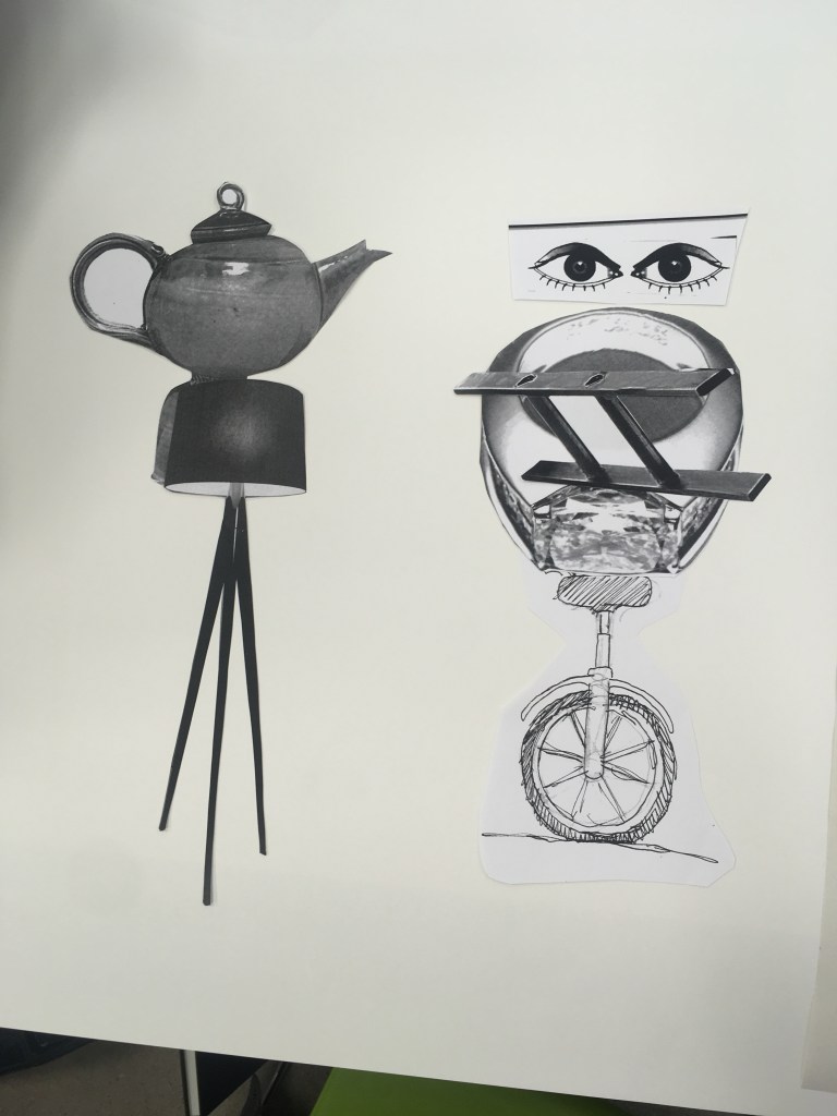
The final works I created are shown above – at the end of the workshop we walked around looking at each other’s work and came together for a brief critique, where we picked out ones we thought worked well and why. My image of the kettle with the moustache (left most on the right hand image) was picked out by several peers as being interesting, for seeming in motion, or suggesting a gesture of dance, due to how I had placed the different pieces at different angles.
There were some forms I was immediately drawn to, and for the middle figure, the two objects that form it seemed to come together perfectly in the first instant. This is the only character for whom I did not go through an iterative process. I especially like how off balance but simultaneously complete it strikes you.
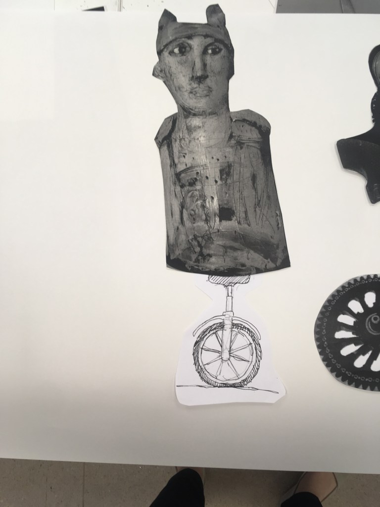
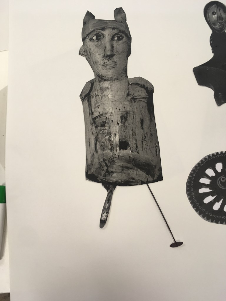
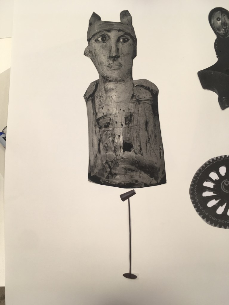
For the left hand figure here, I was keen to make use of this folk icon sculpture, particularly due to the interesting form and large scale. I wanted to play with this sense of solidity with a small or off-balance leg so experimented with a few options.
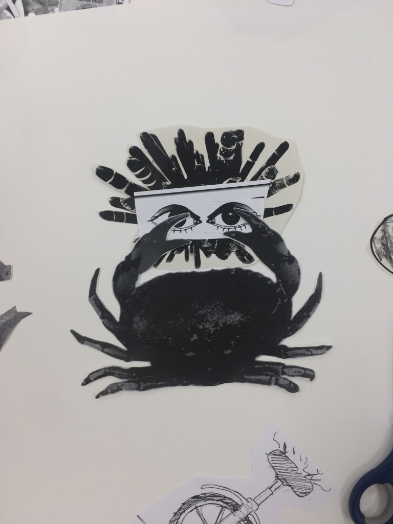
I settled on the use of the lamp that I liked – it was slender and seemed a precarious leg for this body. Including the lamp head itself also seemed a bit cheeky (something I had initially self-edited)Meanwhile on my second sheet, I liked this other lamp shape for other legs, and also the teapot, but didn’t feel they quite worked together in an interesting way. The middle figure I felt had a bit too much going on, though I was interested in incorporating the eyes somehow – I liked them being detached here from the body itself.
I experimented with the crystal form here and liked it’s use as a head of sorts. It was interesting to me that this and the crab body were natural forms but composed of jutting spikes and I liked the idea of using both to signify different things within the same character.
I realised after trying further with the lampshade/teapot, that the lampshade could do the job of elongating that I was after for the skull – and liked the crab here for arms and some sort of ruffing.
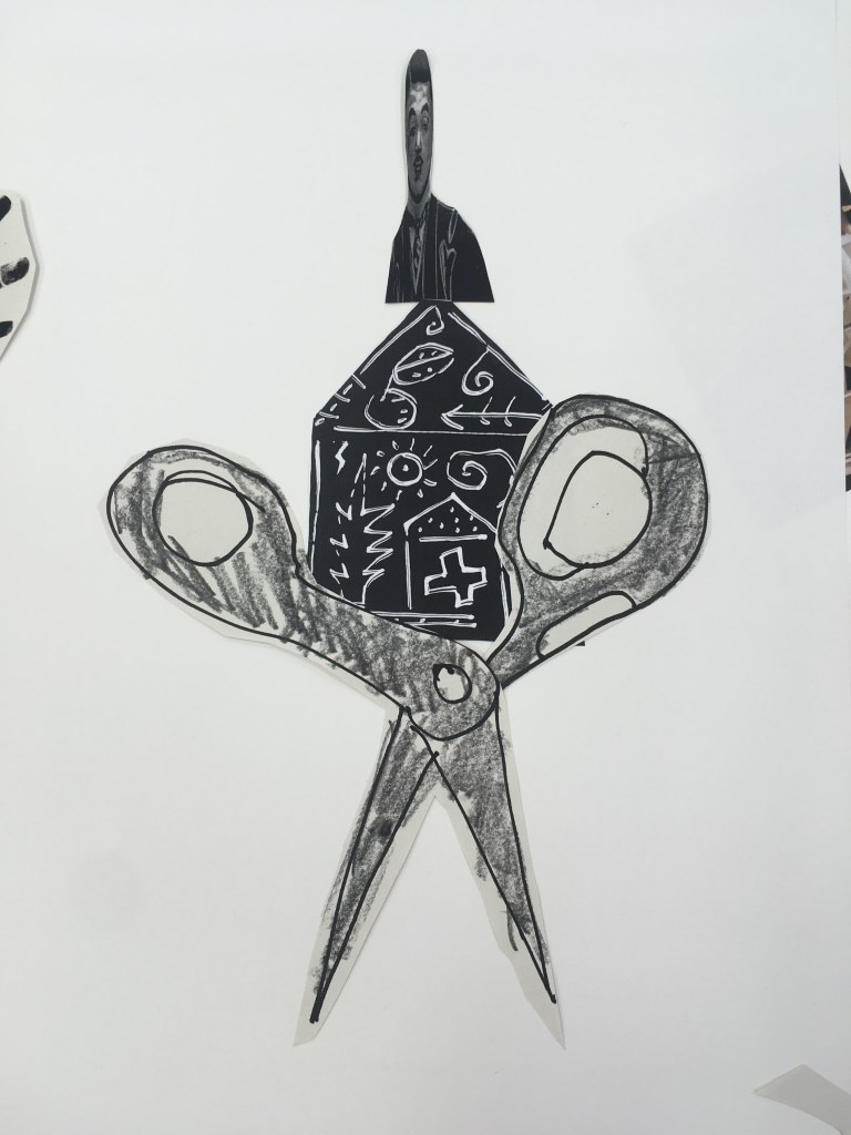
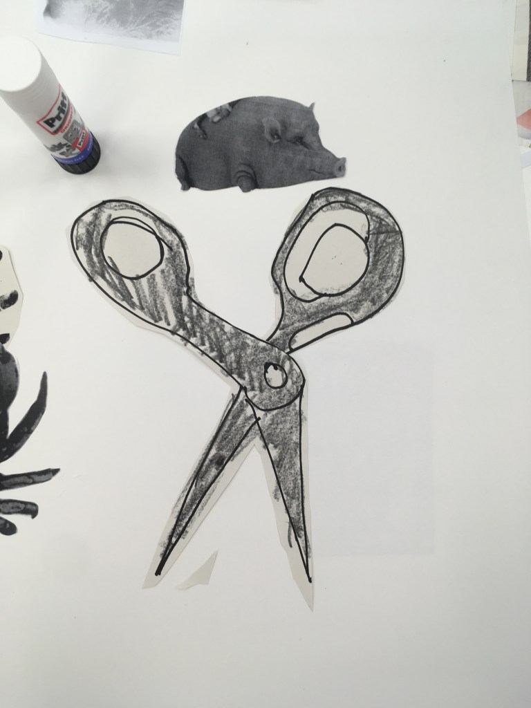
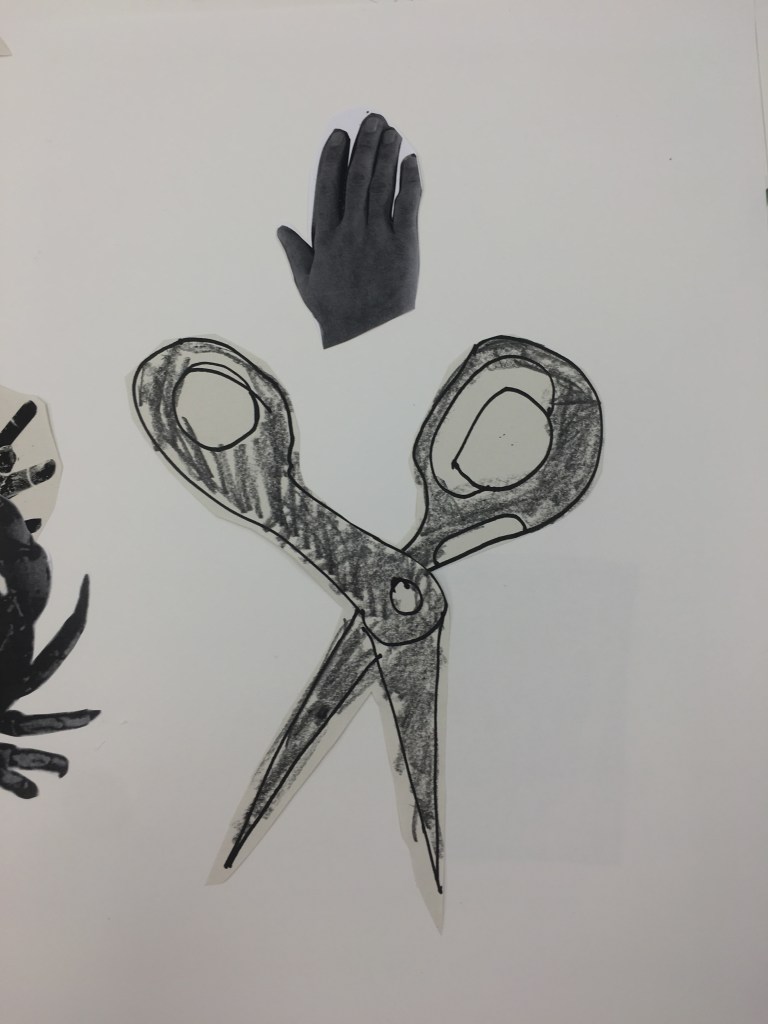
For the 3rd figure on my 2nd sheet, I wanted to incorporate this drawing of some scissors for my legs. I started out trying to build up from it with other structures but found this jarred. I also explored using the distorted image of a victorian gentleman’s head which I liked but it did not work so well. I liked instead the disconnection of the hand which I eventually chose, as despite floating above the scissors it does read as a complete figure.
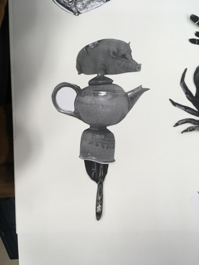
I experimented then with using the distorted head as the leg of my teapot figure – I liked especially how this immediately communicated dance/skipping to me, and combined with the arms of the teapot came across as a jovial character. Having experimented with some contrasting heads I landed on the moustache which complemented this character well. In my final composition I further exaggerated the jaunty angle this figure was depicted in.
I enjoyed this exercise especially. I think my most successful figures used shapes and forms that I had not myself selected from the material, and I found this allowed me some ‘distance’ to objectively select what I found to be most interested and explore different combinations more easily. The forms I had found (the crab, the lampshades) perhaps did not do as successfully because I had a bias to ensuring they were used and so perhaps working them in where they might not have been entirely best suited? I do like all my figures but I think some (the teapot, the wheel) are more complete than others.
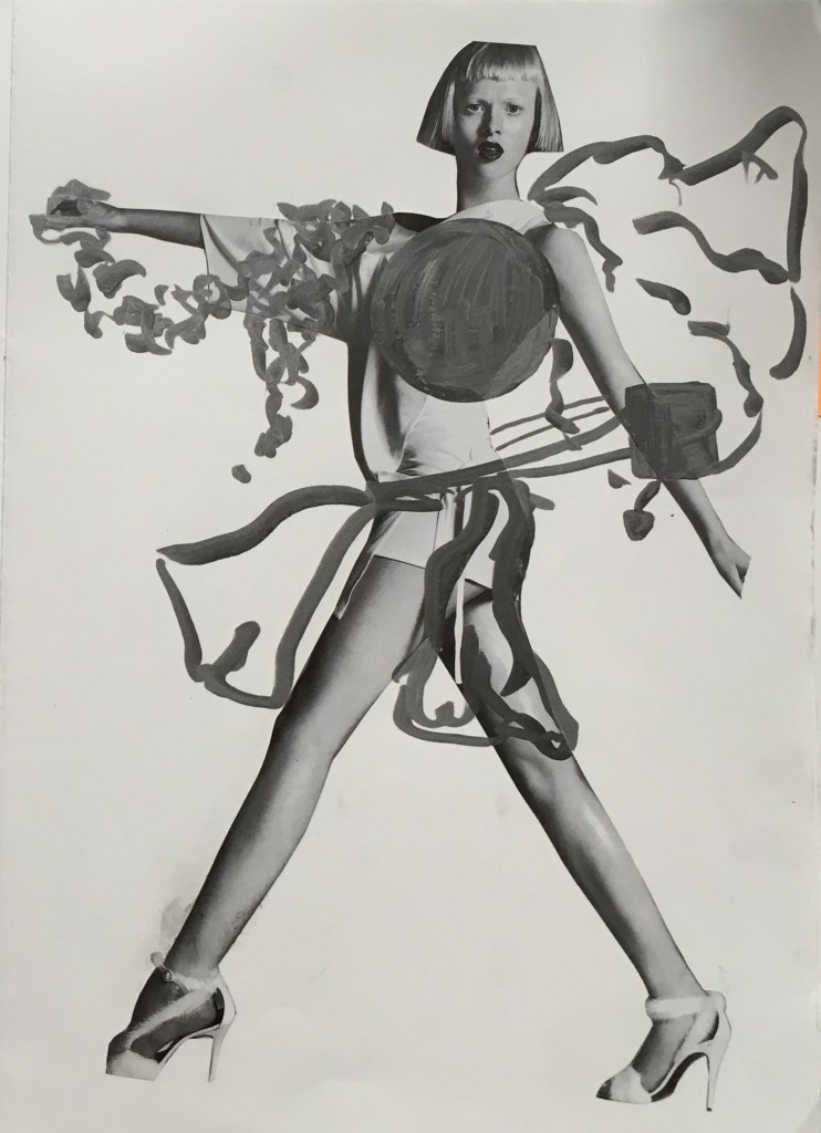
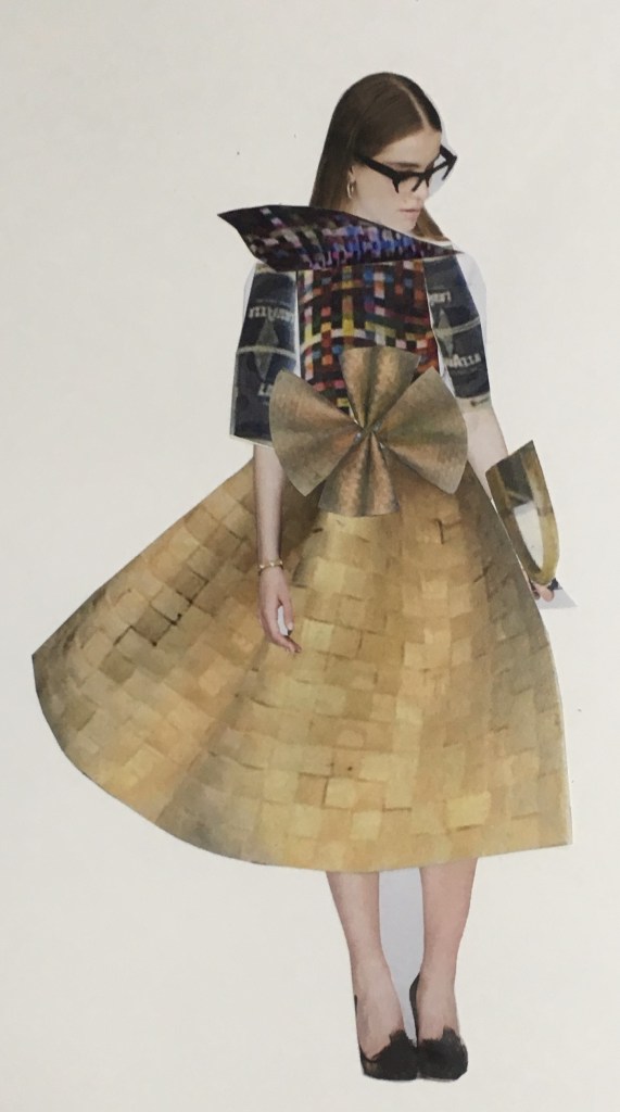
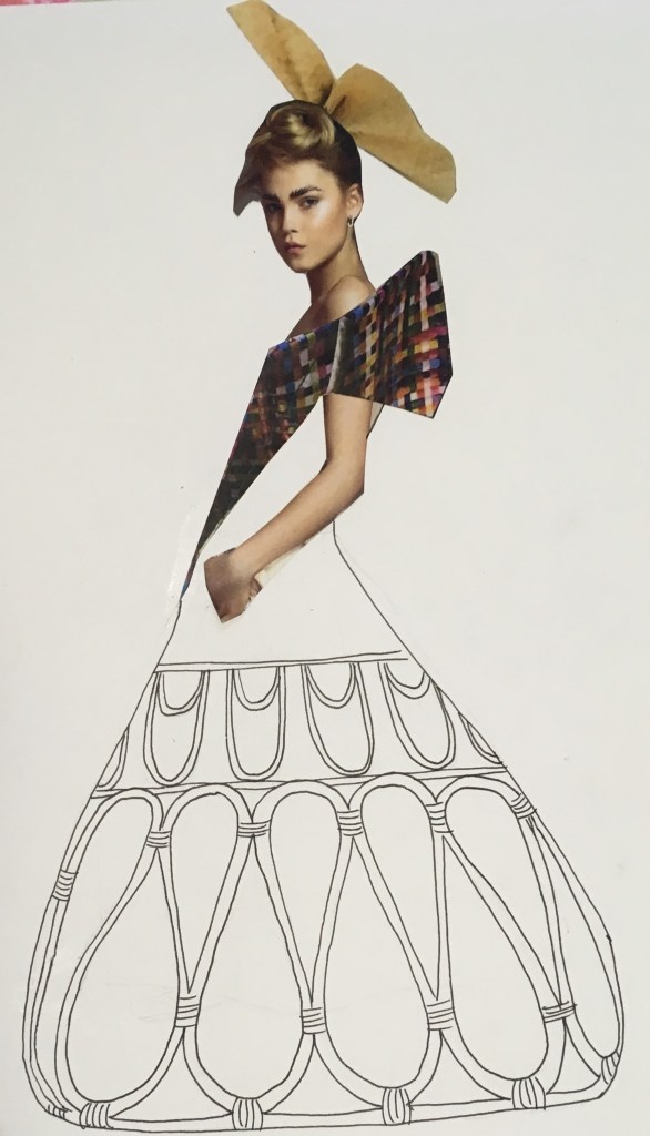
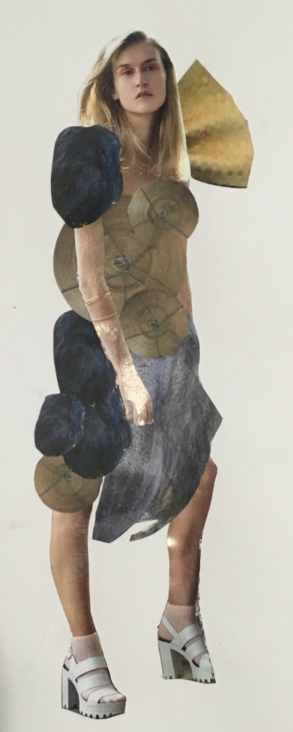
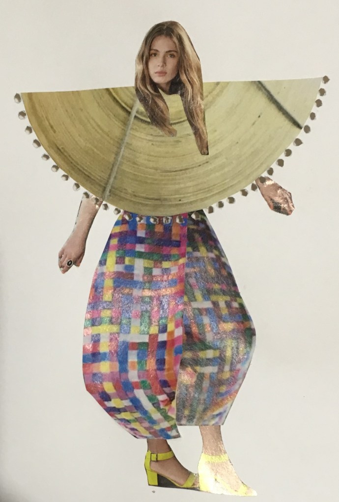
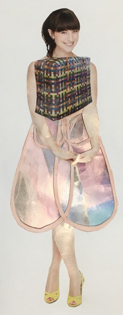
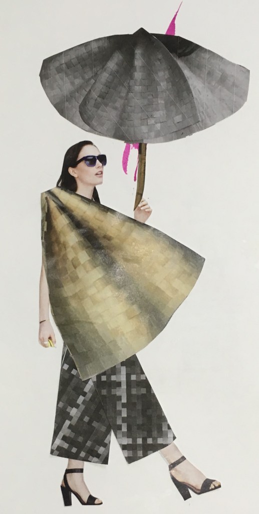
The outfits I created based on the collaborative mannequin construction in our Unconventional Bodies workshop. Here I focused on collage principally, using both colour and black and white copies of the shapes seen in the physical construction, and played with scale to explore different effects
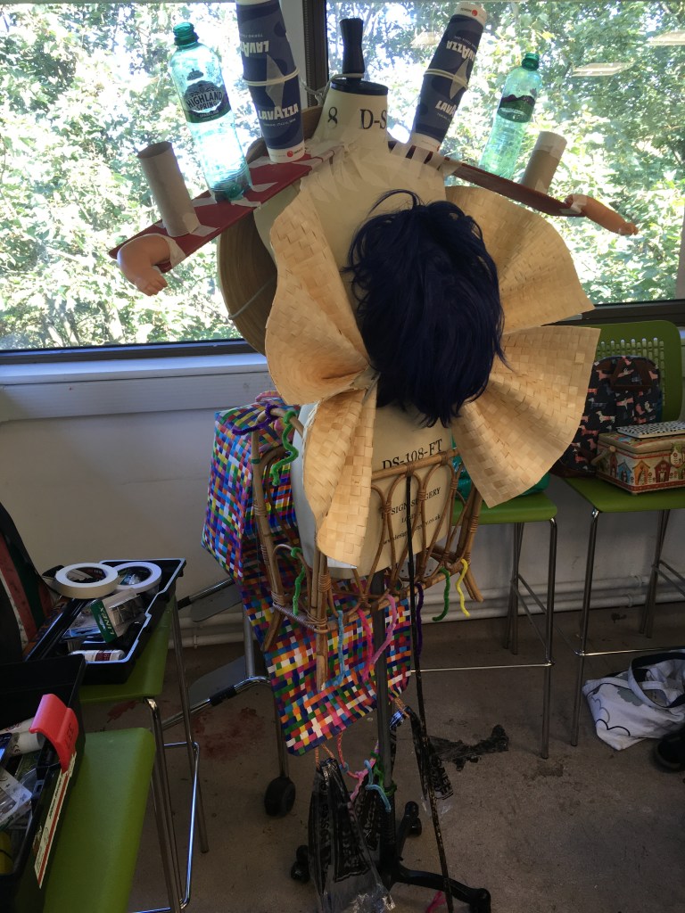
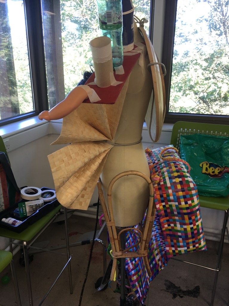
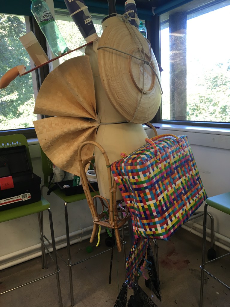
The collaborative physical construction itself (L:R Front, Side, Back views), with bric a brac found objects, including a plate/bowl, wig, placemats, woven basket, magazine holder. I was particularly interested by the shapes and textures of the natural/woven elements seen here.
In this workshop, we had been briefed to bring in objects and in teams of 3 we pooled our objects and constructed these onto a mannequin, the shapes of which were to inspire a fashion series in a sketchbook.
One thing that I think worked well in the physical construction exercise, was use of the unusual shapes and contrasts between the different objects. I found it difficult to see this as a complete structure however with so much of the mannequin visible once it was completed. I think perhaps if we had deconstructed the objects, or used something additional that was more fluid that we could have done this?
I preferred engaging with the collage exercise in developing my own series however. Here I had a little more freedom to experiment without being limited to the rudimentary construction techniques at hand in the physical task. I could also experiment further with scale and focus on the shapes that particularly interested me.
The shapes/objects I returned to most was the fan/pleats created from the woven placemats, which I variously used as accessory and detailing, but also scaled up as top and skirt in different outfits. This object with shading and curvature the most suggested an interesting 3D structure in my photographs so I found it interesting to experiment with this, particularly since the original object is in fact flat.
I was also interested in using the flat shape of the circle as photographed from the bowl/plate. This because we are so used to seeing circles as balls/spheres, I liked playing with expectations here. It provided a suggestion of structure and rigidity to some of the outfits, which I liked in the armour-like plating in outfit 4, and the egyptian flat style of outfit 5. And I liked playing with the idea of flatness in outfit 6 along with the semi-corsetry from the rattan magazine cover.
So this contrast of 2D and 3D was interesting – particularly since the exercises were themselves reflecting on this transition.