Drawing: my work/reflection/research

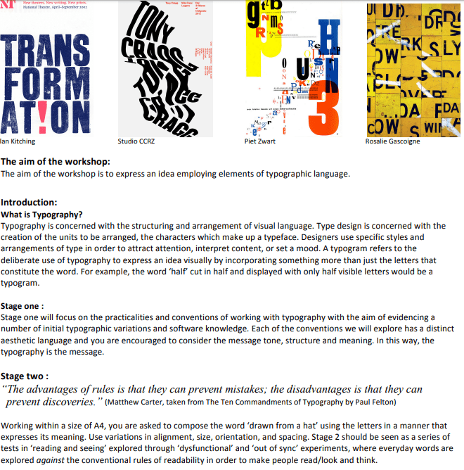
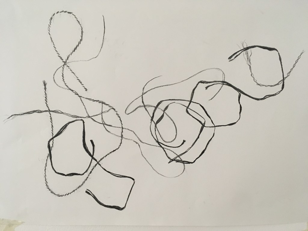
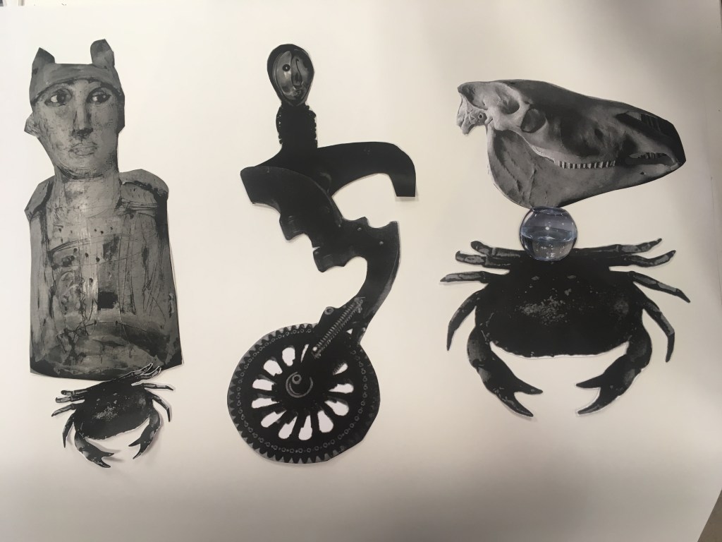
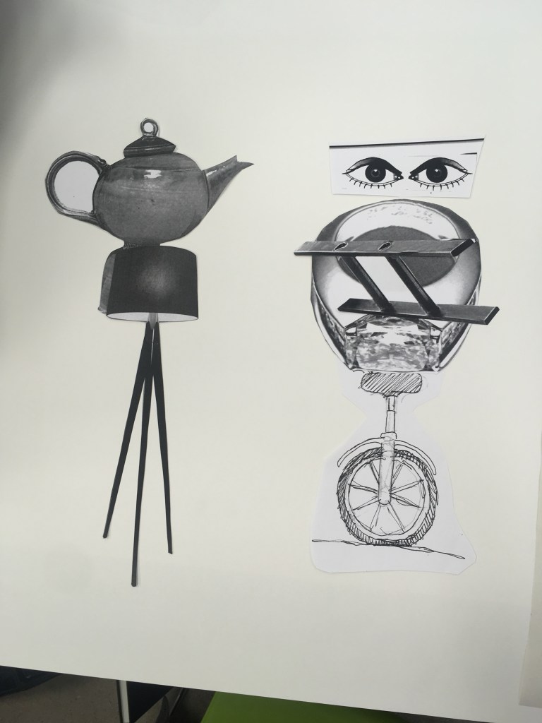
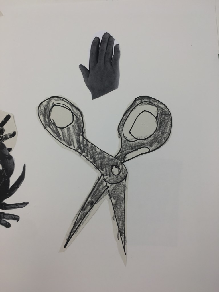
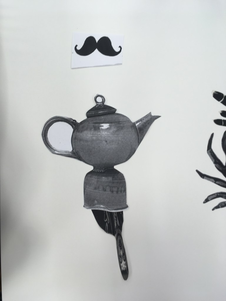
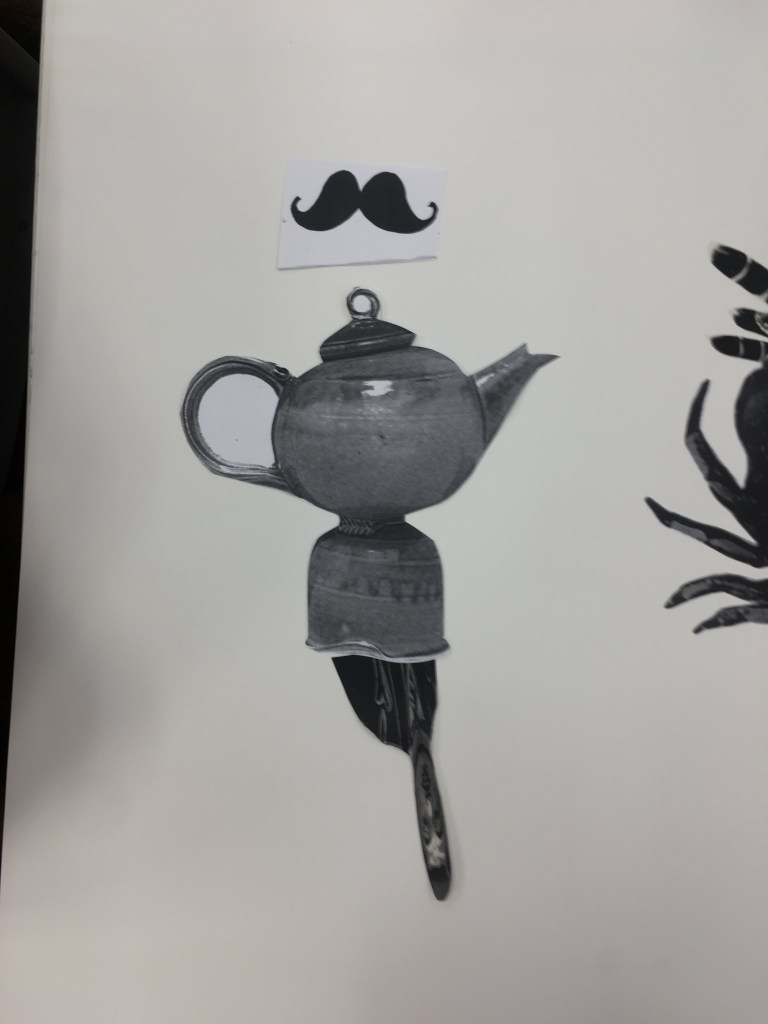
One of the aims I had for this course was to get more confident in my drawing, and for this to become more instinctive for me. I have enjoyed as part of that exploring the one line drawing style of Calder, but here follows some more descriptive drawing that I have completed first in a recent workshop, at a life drawing class (my first!) and a cast study I did in the RA recently.

Charcoal/conte/chalk on paper – Study of my cardboard object from Gained in Translation

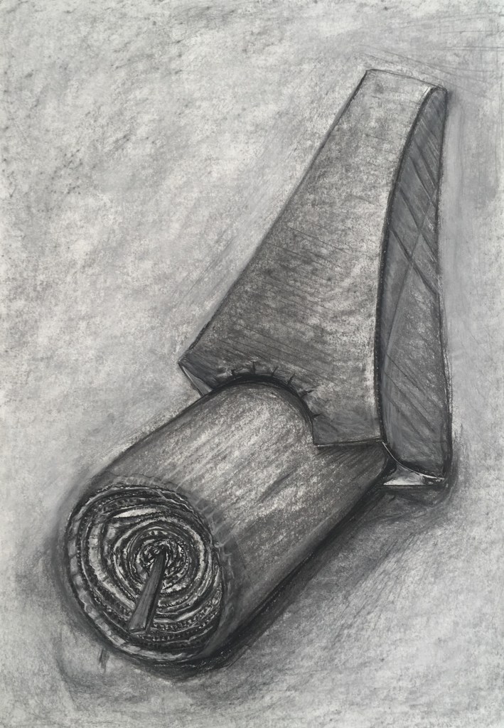
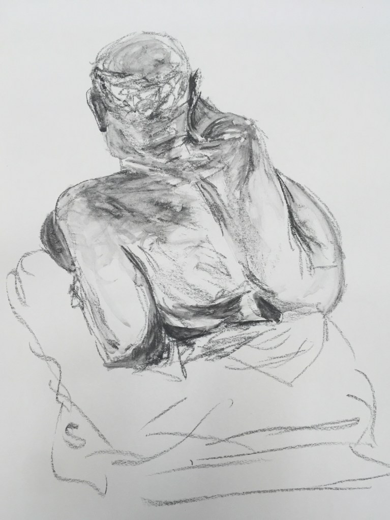
Here we were given a few hours to really study and work into our drawing – I had not before used this technique of building up a layer of charcoal to begin with, but I enjoyed how this made the process somewhat more malleable – it was forgiving to making adjustments along the way. I enjoyed also using chalk and different charcoals to add further depth and texture here. I found it difficult to get the perspective quite right on this and I think the top of the foot (the concentric circles) are not as occluded as they ought, but I am overall pleased with this work.

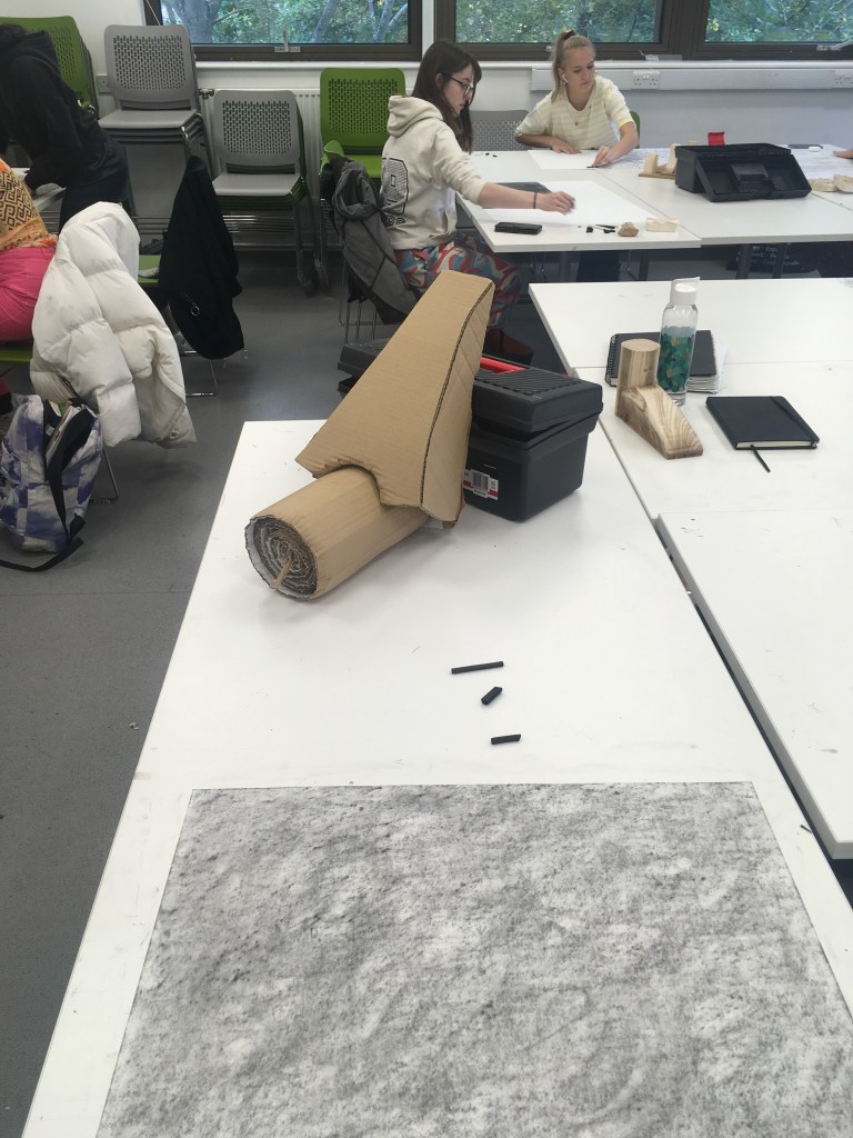
I chose this slightly altered pose for the object so that I could focus more on the interesting texture and tone of the top of the foot (the more interesting element for me). I felt that otherwise my work would be too generalised to warrant the length of sitting!

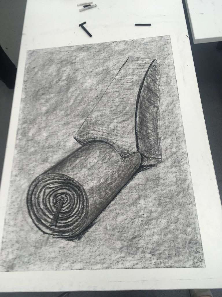
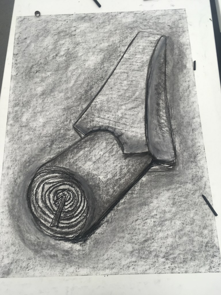
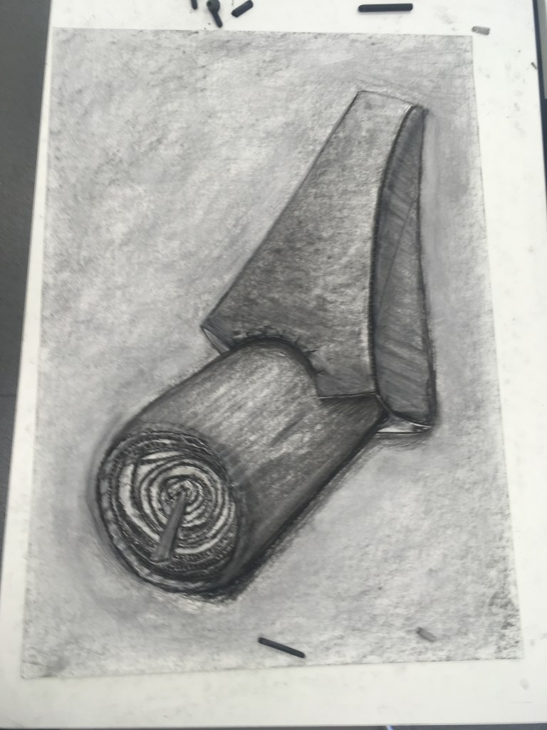
I enjoy working with charcoal for the responsiveness to weight and immediacy you have with it.

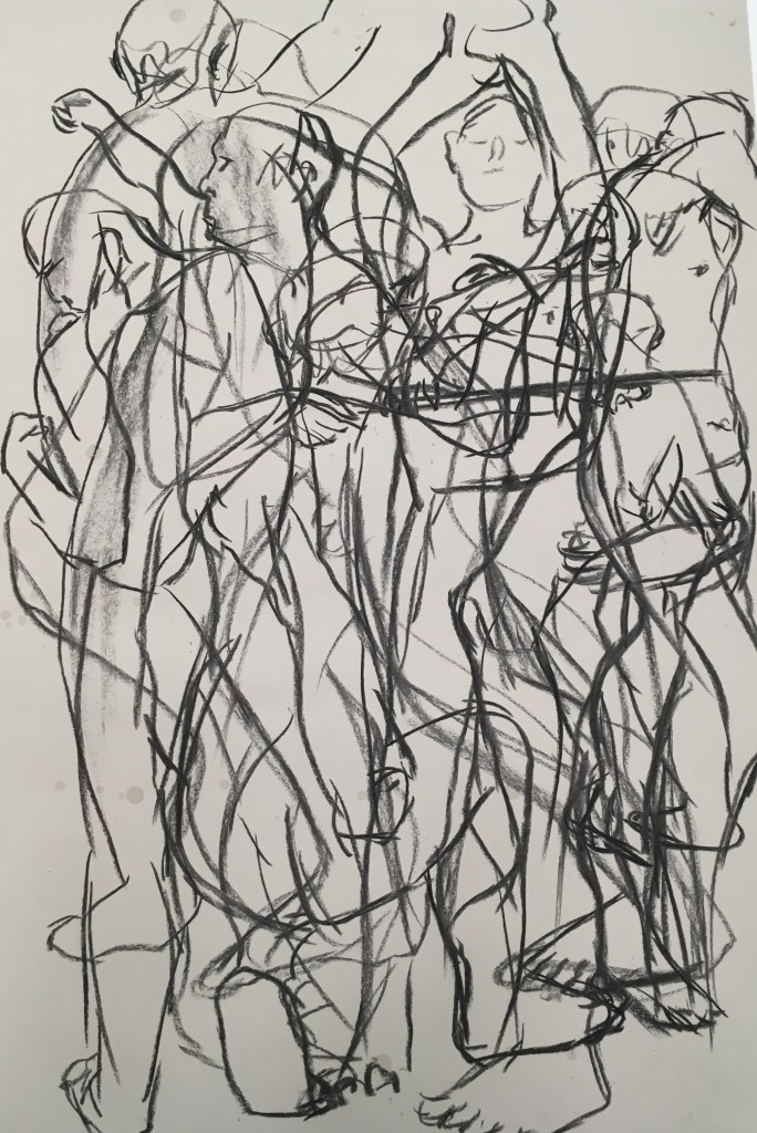
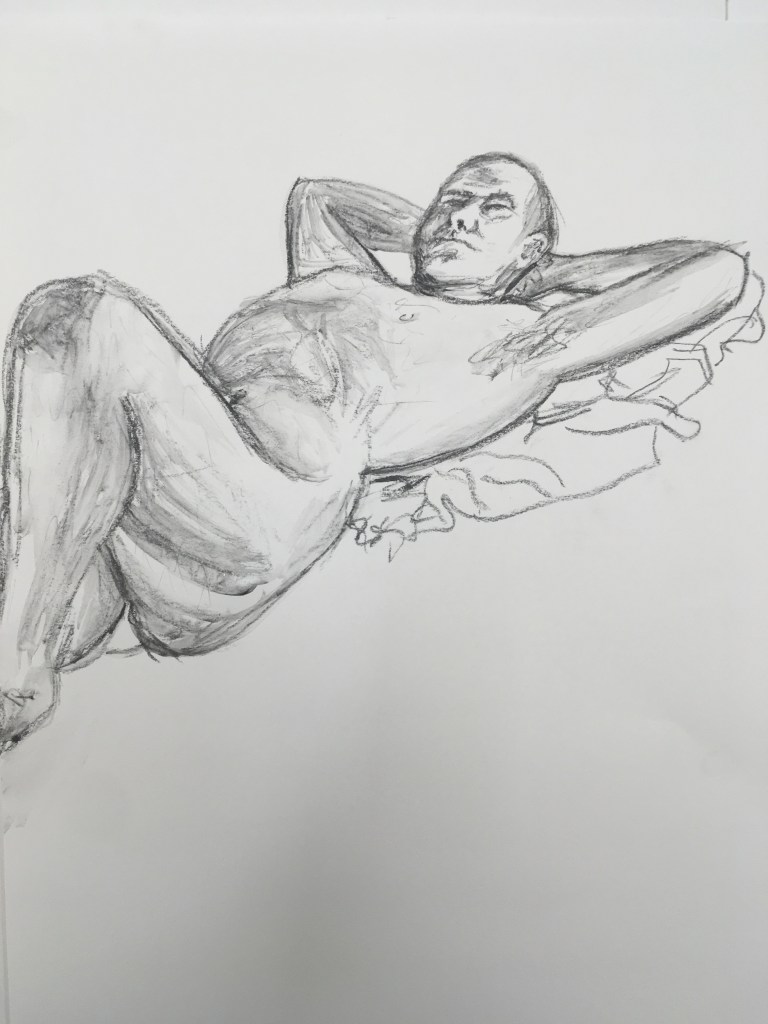
I enjoyed the life drawing class, though found it very hard going! Working at pace in quick succession was quite the challenge. I enjoyed experimenting with the soluble graphite stick (which I had not previously used) for the tonality you could achieve quite quickly and the sketchy quality you still achieve. I am most pleased with the 10 x 2 min sketch charcoal piece though. I think this allowed me to release my inhibitions somewhat and be more confident in my lines firstly since there was a time pressure, and secondly since I knew that in overlapping them any ‘errors’ might be obscured. I enjoyed in this experimenting with dynamism and scale and the more successful elements are towards the bottom of the work I think where you see the legs. I’d be interested to try this approach again but using the one-line drawing method.

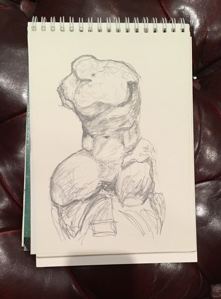
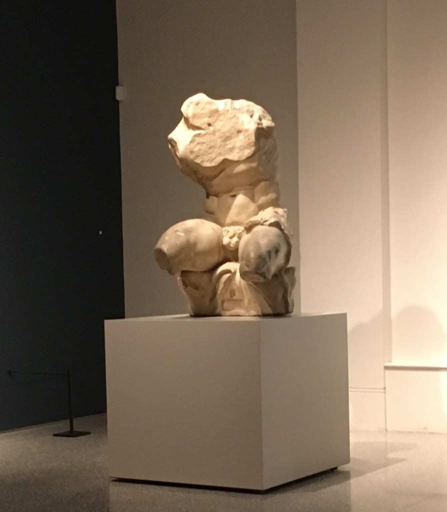
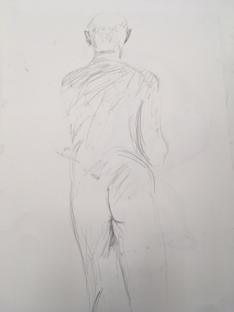
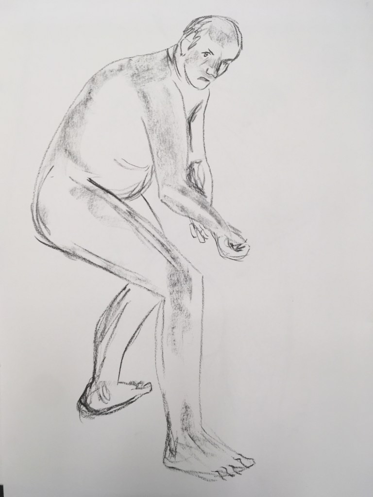
I am pleased with the tone in this piece, though I think here too my perspective could have been refined (i.e. more hunch to the left side/proximity of the torso to the thigh). I perhaps self-edited here once more and did not fully capture the tonality of the genital region..! I was a little conscious of being in public at that point.

Angelica Kaufmann, ‘Design’ c.1778, RA Collection

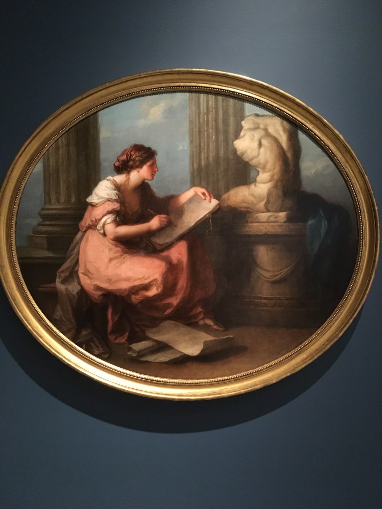
As I was leaving the Collection having completed my study of the torso, I was struck by this painting for depicting what I had just done myself!

Exhibition notes for the above painting

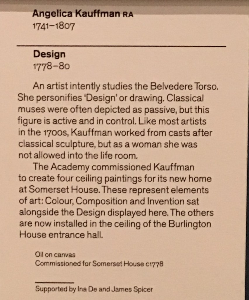
I was particularly interested to read here that women were not allowed to draw from life at the time of this painting, and so had to study from casts of classical sculpture. This would certainly have been a hindrance to the development of their craft. I would be interested to learn more about the challenges women faced in art history and the broader picture of why they went unrecognised.

Typography: my work

In this workshop, we were introduced to the Adobe InDesign app, taught several basic functions within the app, completing various exercises to put these to practice, and then finally asked to create several typographical representations of a word given to us from a hat.

I found this brief especially interesting to read and so think I would like to explore typography in greater depth.

We were instructed to use Helvetica as a neutral font type, and asked to choose a letter to experiment with. I chose a capital R as I thought it had an interesting variety of form to play round with (straight, curved and wiggly).

First we experimented with duplicating and transforming the letter in dimension and orientation. Then too with opacity and layering. What’s interesting here (which I have only just noticed) is that unintentionally I arranged the page in the shape of the R I was using..!

Then, we experimented with colour fills, as well as gradients, and outlines with varying thickness and pattern.

Here, by masking certain elements of the letter by drawing a shape over it, we experimented with deconstructing the letters and marrying them to create new letters or abstractions. I enjoyed this especially, and testing how far the letter could be pushed and still recognised.

I was given the word ‘error’ to portray through type. This word for me has connotations of machinery and computing, as it’s synonymous with ‘error messaging’ in applications and computer systems. As such I knew I wanted my typograms to play on this.

I began by writing this as one word, and sought to experiment with one of the outlining functions which makes the edges angular/squared – to increase it’s artificiality. I arbitrarily drastically increased the size of this outline and it created an unforeseen interesting result, whereby it was obliterating the word itself. I liked the effect it gives, a bit like someone has viciously markered a piece of paper. Over the top of this, I included a small ‘error’ in a typeface that evokes typewriter or mechanical writing as a footnote of sorts. I chose a contrasting yellow to have this stand out, but also give a sense of alarm. Interestingly, when printed the strength of the black ink behind this yellow note means the type is almost imperceptible.

For my next page, I wanted to experiment instead with each letter in isolation. I chose to continue with the yellow/black palette for this piece as well. I knew I wanted to mix up the sizing, typeface and capitalisation of the letters to disrupt the reading of the word. I deconstructed my capital E which I find interesting since it remains identifiable despite the middle and bottom horizontal lines being disjointed.

The fact I had three rs in my word was interesting, since I had been working with this earlier. I chose to still have one capital R here but I enjoyed exploring the lower case r in this instance – particularly when duplicating and varying the opacity and making this overlap. This reminded me of an error that used to happen with Windows OS and that was featured in the opening credits of the IT Crowd tv show (which again reinforced this connotation of error).

For the O, I wanted to again play with the outlining feature, and again using an oversized one, I achieved an interesting effect which effectively multiplied the letter itself. By scaling this up and tilting it I realised it looked a little like the iconic Vertigo poster, and I liked the additional meaning this could convey, alongside the repeating r, of you falling into an endless error. I backgrounded this to highlight that sense of falling into it. [Here again, the vortex is appearing as a motif!]

I further subverted this work by ‘accidentally’ leaving one of the InDesign function windows on top of the design and screengrabbing it to create a further page – in a postmodern sort of way.

I also enjoyed seeing this message at the bottom of the application window and thought it could in itself ironically imply a paradox of both being and not being an error.

I enjoyed this 1/2 day workshop greatly, and would like to work to extend it as suggested at the end of the brief.

Gained in Translation part 2 – my work

Following on from the cardboard structure I had created in the previous weeks (as a translation of the drawing I had made from my partner’s description of a plastic severed foot prop), we were tasked with further translating this into different materials – wood, and then clay moulding for a plaster cast.

My finished wooden piece

I enjoyed finding an even more generalised form for the wooden interpretation – I utilised some very strong timber (previously used as a wooden fencepost) as I wanted to evoke the solid and supportive role this object could take. Cutting and sanding this to smooth out a more organic form was hard going but I am pleased with the end result on the arch of the foot. The graining on this part also is very interesting, and unique to the material used – I think it adds a suggestion of movement and dynamism as well as materiality.

The most difficult was the concave jointing space that I cut out from the foot piece, to slot the cylinder within it. This was to replicate the joining mechanic I had used in cardboard, but it was too sharp a curve for the saw to do, so I had to cut straight towards the curve line and break off as many pieces as I could with the saw, before chiselling down by hand. This proved very hard work, and I did not quite achieve the finish I had wanted. I might find a different solution to this if I were to repeat this/look to produce a finished piece.

The cast plaster

I took quite a different approach with the clay/plaster sculpting – here rather than simplifying/generalising I explored detail that had featured in my cardboard structure, and some abstract forms. I first was interested in exploring the effect of depth and relief when carving the clay, though it was difficult to fully envisage what the finished result would be in the plaster reverse. I knew that I wanted to attempt a full standing foot like I had achieved in the other materials, so I doubled the depth of my clay to ensure I could achieve the height required. I’m not sure the generalised shape that I reproduced here is as effective with this material as the detail I captured, e.g. of the severed top of the foot in the bottom corner.

We were given instruction to prevent undercuts in our mould, which I tried to follow, but I think some of the finer detail in my design still meant clay was not easily removed from some of the crevices.

It’s interesting I think that here again we can see I am repeating the concentric circles/vortex motif that I have been exploring in survival!

Survival Kit – Summer project – my work

Survival kit for mental health – 7 objects for 7 strategies

Manifesto for Mental Health

In this hectic, nonsensical reality, sometimes surviving just means preserving your sanity.

A toolkit is needed for the modern human to maintain their mental health and navigate their daily lives.

This kit helps you to gain spiritual and physical sustenance, as well as clarity of vision, through the 7 objects it contains. They provide multivarious defences against an omnipresent threat – a tool for each day of the week to keep it at bay.

Spiritual: connect and reflect, ensuring you are grounded:

  • Connection to inner focus (Vortex)
  • Connection to the natural world (Nest)
  • Connection to technological advances and algorithmic personalisation (Spotify code)

Physical: the necessities that sustain basic human existence

  • Nourishing, tradition and connection to roots (Oats and Seeds)
  • Sensual, personal touch and pleasure (Spoon)

Clarity of vision – as mental health problems can often cloud and distort our view

  • Ability to see alternative perspectives (Mirror & Mirror writing)
  • Ability to see direction and purpose (Compass)

Approaches to Drawing: Research/my work

I was keen to try out the single line approach with drawing for myself having looked into Calder.

First I had a go with doing a figurative piece based on my cat, Jasmine.

My first attempt (top left) I had started with a gel pen and I like the design of this work but the line quality was not as satisfying, so I moved into brush pen for the remainder. This also gave a little more freedom to my stroke, where I perhaps had been a little more focused on ensuring the pen did not lose contact with the paper with the gel, giving a more precise and static feeling.

I explored the depiction of the distinctive markings she has – a black stripe down her back and into her tail. I think this perhaps over-complicated the picture though, and I find the more simplified line drawings more satisfying. I enjoyed adding a suggestion of texture with the outline though, and developed this in several test runs. The final work I think has the best expression of this, and I am especially pleased by the impression of the right haunch – here the line is not so literally portraying her outline but highlighting the form in another way.

It was relatively quick for me to run this exercise, so could be easily repeated, though it did require several iterations for me to explore it. Perhaps this iteration gets streamlined with practice, but I am interested that this helps process the visual into something more essential.

Impermanence: my work & research

Since the lecture on approaches to drawing, I’ve been interested in thinking about impermanence in art and materials disintegrating.

This specifically was sparked by the mention of artist Amanda McCavour who creates ‘thread drawings’ on water-soluble fabric. One material (the thread) remains while the other (the fabric) disappears.

I think this is different to auto-destructive / destruction art. Where the whole piece might be destroyed in the process, e.g. Gustav Metzger’s acid paintings, or Banksy’s Love is in the Bin. Instead it is the juxtaposition of something ceasing to be, while something else endures. For me, this is akin to memento mori. We are reminded of our own mortality, while at the same time viewing something that will endure beyond the life of the subject.

I looked to other water soluble materials to experiment with this idea. In both tests I took the paper and ran it under the tap directly – this alone let the pen run, but I had to stroke the sketch itself in order to distort it directly. In both cases I chose to use imagery/text that directly act as memento mori.

I think this was an interesting experiment, but I wonder if it is a little too obvious? I may try to incorporate this into a more subtle approach.

Another thought I had was to make use of fleeting phenomenon to explore impermanence. In particular, shadow. In the process of making one of the objects for my survival kit, I happened upon an interesting shadow form as I was exploring it in suspension

I would be interested in exploring this theme further also. I am aware of artists creating sculptures in order to cast figurative shadows, but am not yet aware of more abstract shadow pieces, which I am interested to look into.

Detail of shadow cast by Kira Freije’s Standing Woman Arms Folded, RA

Play: Chance & Sequence – my work

Charcoal drawing of where pieces of 4 different types of string landed when dropped from a height onto paper

In this workshop, we were introduced to 3 different approaches to drawing, and performed exercises that incorporated an element of chance within them: stochastic, system, and collaborative. We were then invited to expand on these exercises further.

The above image is what I produced for the stochastic (organic) drawing exercise. One by one I dropped pieces of string onto my paper and drew where they had fallen. I was keen to capture the difference in texture and shape demonstrated by each string type and varied my marks and weight with the charcoal to do so. I think this has been quite effective. In doing this exercise, the longer I went on (say after the first 6 drops) the more editorial I became with how the string fell – I still dropped it from a height and observed how it had landed, but if the composition was not quite to my liking I tried again without documenting this shape. It was interesting that I gained confidence/a sense of agency once I had a feel for the task at hand – that there was a sort of dance in a way of the relinquishing and regaining of control with chance.

The second exercise we performed was the system drawing. Here we were told to draw a grid and then populate 6 squares to the side with 6 colours. Then we were told we would be rolling a dice and painting 6 consecutive shapes within the grid with the colour for square 6 if we rolled a 6, or 2 consecutive shapes with colour 2 if we rolled a 2, etc.

(top) my first grid, (bottom) I repeated the exercise with a less brilliant palette a la Mondrian

The third approach was collaborative drawing. Here we would receive an instruction from Myfanwy and add an element to the paper in front of us (e.g. draw a line). We would then pass the paper on as instructed (e.g. pass it twice to your left, and rotate it through 90 degrees). We continued like this for some time, adding what we had for breakfast, a drawing of something in the room, a pattern, etc. Finally, we were instructed to retrieve the paper that we had started with and made our first mark on (the line). We could then add to or remove elements in order to make it uniquely our own.

Here is my finished collaborative work. I chose not to obliterate any contributions from the work, though I submerged the pattern (which had been done in biro in the bottom right corner) beneath my ink strokes so that only the texture of the pattern could be seen.

I enjoyed this exercise, though I find the artefact itself I am left with does not fully capture the process I myself went on. Since I had created equivalent elements for each of those seen in my finished work, but they are not here seen, I feel there is something lost along the way. I also dislike that the orientation of the piece is difficult to really nail down, with the elements often being drawn at contrasting ones. But it was an interesting exercise.

For my self-guided piece, I was keen to do another piece that captured the element of dropping. In the session we had been introduced to the below work by Jean Arp (that does appear to have been choreographed somewhat) and I was keen to try this method out for myself.

Jean Arp, Untitled (Collage with Squares Arranged according to the Law of Chance) 1916, MoMA

Then above an A1 piece of paper that I had placed on the floor, one by one I (without aiming/looking blankly into the distance) dropped the pieces approximately above the page. I varied the position of my arms in relation to the paper, but maintained roughly a height of 1.5m.

In my first attempt, I found that much of the paper floated off the page, and others ended up clumping into little piles. I felt that the clumping/pile effect might be difficult to effectively capture by sticking, as I would need to deconstruct first and then recreate and might lose something in the process.

For my second attempt, I decided to introduce an element of system/rule to the dropping, and not drop all the pieces of paper in one sequence. Here I chose to drop the coloured pieces one by one first, and then reappraise prior to dropping only a selection of the black pieces. This was interesting, but I still found that the pieces formed a pile/clump.

I decided to restrict the number of pieces of paper I dropped even further. Here I chose to remove from the collection pieces that did not fully have torn edges (i.e. exclude the pieces that had a straight edge)

3rd attempt with restricted pieces of paper

I was very interested by the fact that in restricting the number of pieces I used, the composition appeared to coalesce to a form of sorts – here a diagonal stripe. Below the piece following sticking down with Pritt stick.

I think it is interesting that texture and depth has been lost to some extent in the process of capturing these by sticking them down. A loss in a move to permanence from something impermanent?

I chose to repeat this with the remaining pieces that I had excluded onto another piece of paper.

Intriguingly, again a diagonal shape was formed, this time in the opposite direction.

Photogram workshop

A test strip from my photogram workshop, with glass decanter stopper, lightbulb and tea strainer

Today I experienced my first dark room, and got the chance to experiment with photograms. I enjoyed learning the technique and producing my own images, though it seemed most of the time spent there was in waiting for and using the chemical trays, rather than the creation of the photograms themselves.

We had been briefed ahead to bring objects, and on some of the history of Moholy-Nagy who famously used this technique for what he would call ‘abstract seeing’ of the forms of objects themselves.

Here I made the mistake of not quite centering the paper beneath the light. It is an interesting mistake though in light of the Ooops text, and I quite enjoy the overall effect. This gave me the opportunity to reconsider the addition of the metal bracelet at the bottom right. I was really pleased with the effect of the netting here.
Here I am unsure if the composition is quite as successful but I am pleased by the effect of the exposure, where each object is well exposed. I am especially intrigued by the texture suggested by each object and the contrast between them.

On reflection, I wonder if the text here added anything, or if I could have produced a more interesting composition from something purely abstract (as Moholy-Nagy himself did). I had several comments from my peers that the typeface reminded them of book covers, which amuses me but wasn’t quite my intention!

Play: abstract use of objects – Research/my work

I was reflecting the other day about how several of the workshops we undertook in consideration of Dadaism and chance was in using objects in unusual ways/reducing them to their forms.

This reminded me of an artist I followed on instagram, Christoph Niemann (@abstractsunday) who illustrates for the New Yorker. He has an interesting TED talk which I include below, which discusses precisely this, and the role of the audience in visual communication (without recourse to cliche). I also enjoyed hearing about how this allows simple images to communicate complex ideas, even emotions – we fill in the blanks. The picture only need suggest enough.

I particularly enjoyed learning about his strategy here, in choosing an object from his home and reflecting on it for some time in how it might be portrayed differently.

The real magic doesn’t happen on paper, it happens in the mind of the viewer. When your expectations, your knowledge, clash with my artistic intentions.

Christoph Niemann, 2018

I am interested to use this strategy for myself. Following the success of my teapot figure I wondered about using one of the teapots I have at home.

I like these abstractions – I think I could develop them further and take better into account the space around my drawings to ensure I can best document the intended perspective in my photography (without going off the edge of the paper! Here I used A2 paper, but perhaps A1 would be better, especially when using sizeable objects.

The use of ink felt right here, as Niemann uses, as helps for quick sketching, but collage might be interesting too.

Play – Exquisite Corpse: Critique/my work

In this workshop, we collaborated as a group in generating lots of images and drawings of objects that could signify body parts – these were all photocopied and scaled in various ways to give us uniformly black and white copies. We were then tasked to create a series of characters with these body parts in collage.

The final works I created are shown above – at the end of the workshop we walked around looking at each other’s work and came together for a brief critique, where we picked out ones we thought worked well and why. My image of the kettle with the moustache (left most on the right hand image) was picked out by several peers as being interesting, for seeming in motion, or suggesting a gesture of dance, due to how I had placed the different pieces at different angles.

There were some forms I was immediately drawn to, and for the middle figure, the two objects that form it seemed to come together perfectly in the first instant. This is the only character for whom I did not go through an iterative process. I especially like how off balance but simultaneously complete it strikes you.

For the left hand figure here, I was keen to make use of this folk icon sculpture, particularly due to the interesting form and large scale. I wanted to play with this sense of solidity with a small or off-balance leg so experimented with a few options.

Meanwhile on my second sheet, I liked this other lamp shape for other legs, and also the teapot, but didn’t feel they quite worked together in an interesting way. The middle figure I felt had a bit too much going on, though I was interested in incorporating the eyes somehow – I liked them being detached here from the body itself.

I enjoyed this exercise especially. I think my most successful figures used shapes and forms that I had not myself selected from the material, and I found this allowed me some ‘distance’ to objectively select what I found to be most interested and explore different combinations more easily. The forms I had found (the crab, the lampshades) perhaps did not do as successfully because I had a bias to ensuring they were used and so perhaps working them in where they might not have been entirely best suited? I do like all my figures but I think some (the teapot, the wheel) are more complete than others.

Design a site like this with WordPress.com
Get started