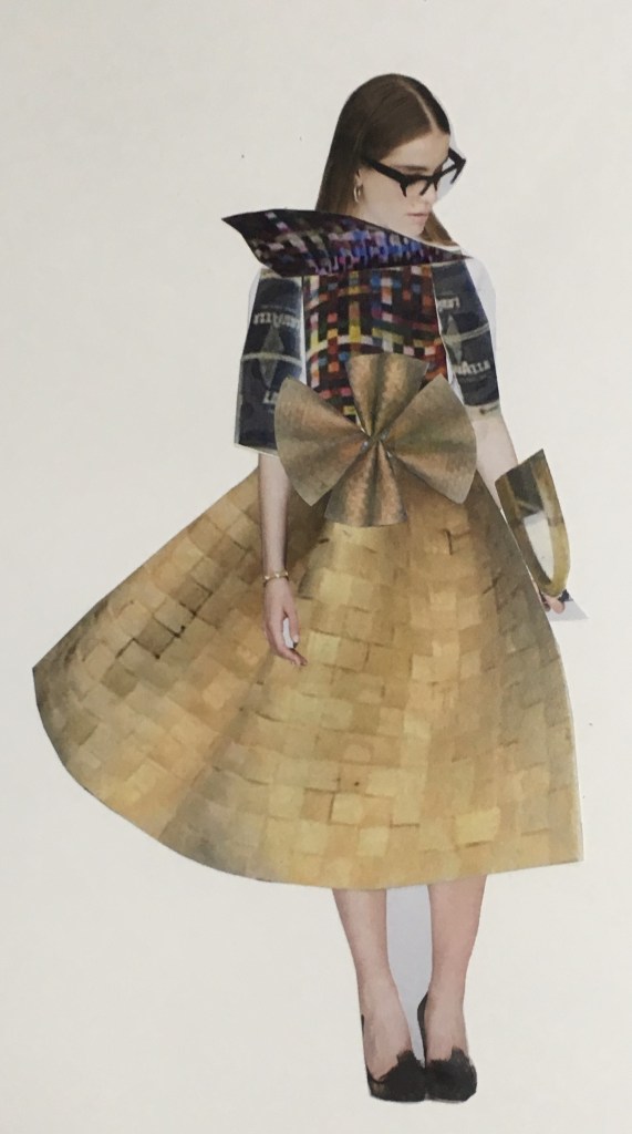
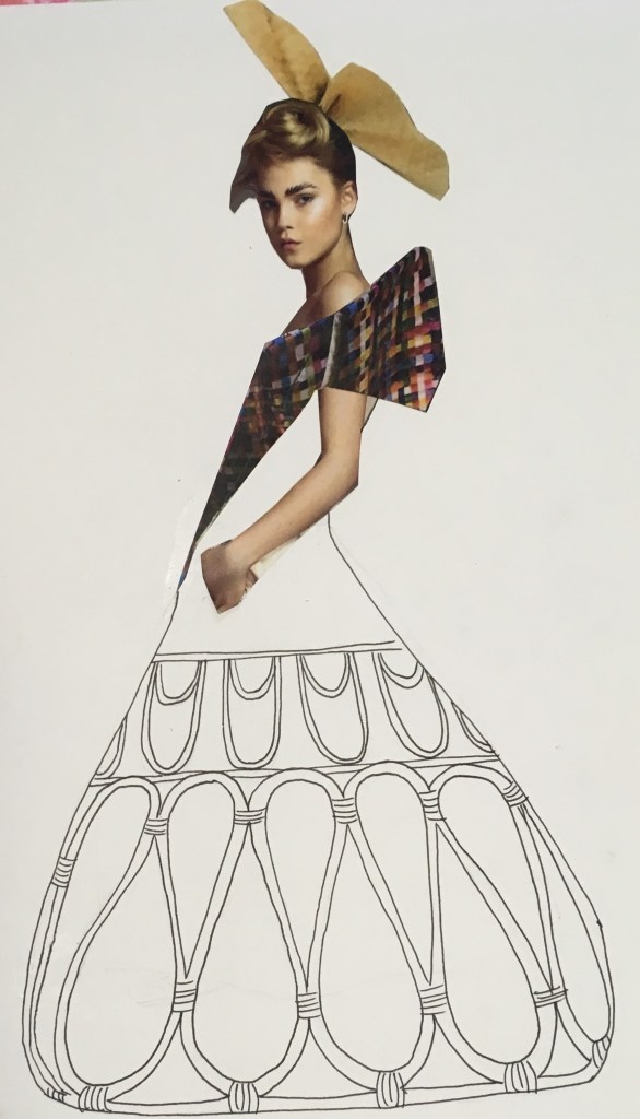
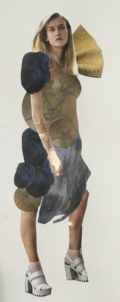
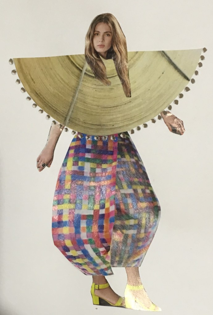
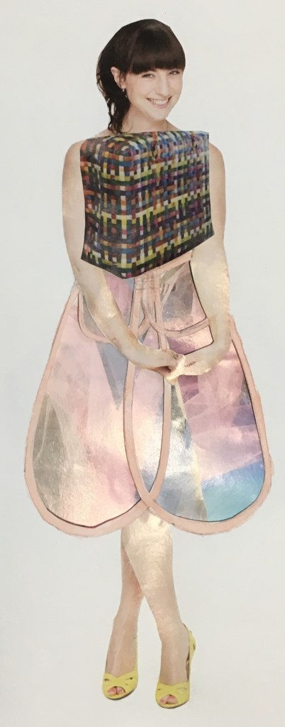
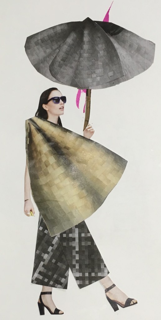
The outfits I created based on the collaborative mannequin construction in our Unconventional Bodies workshop. Here I focused on collage principally, using both colour and black and white copies of the shapes seen in the physical construction, and played with scale to explore different effects
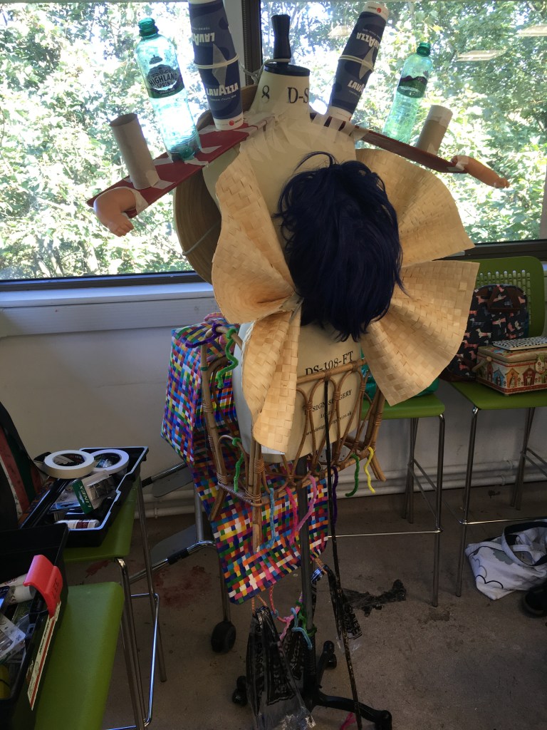
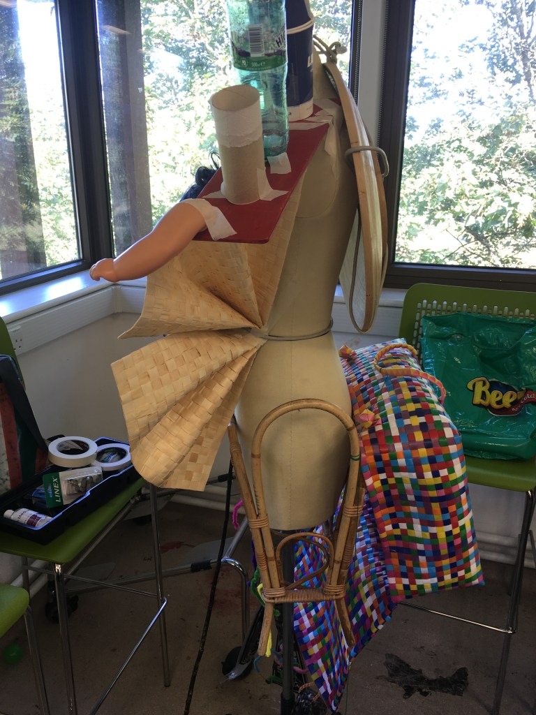
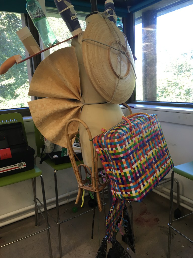
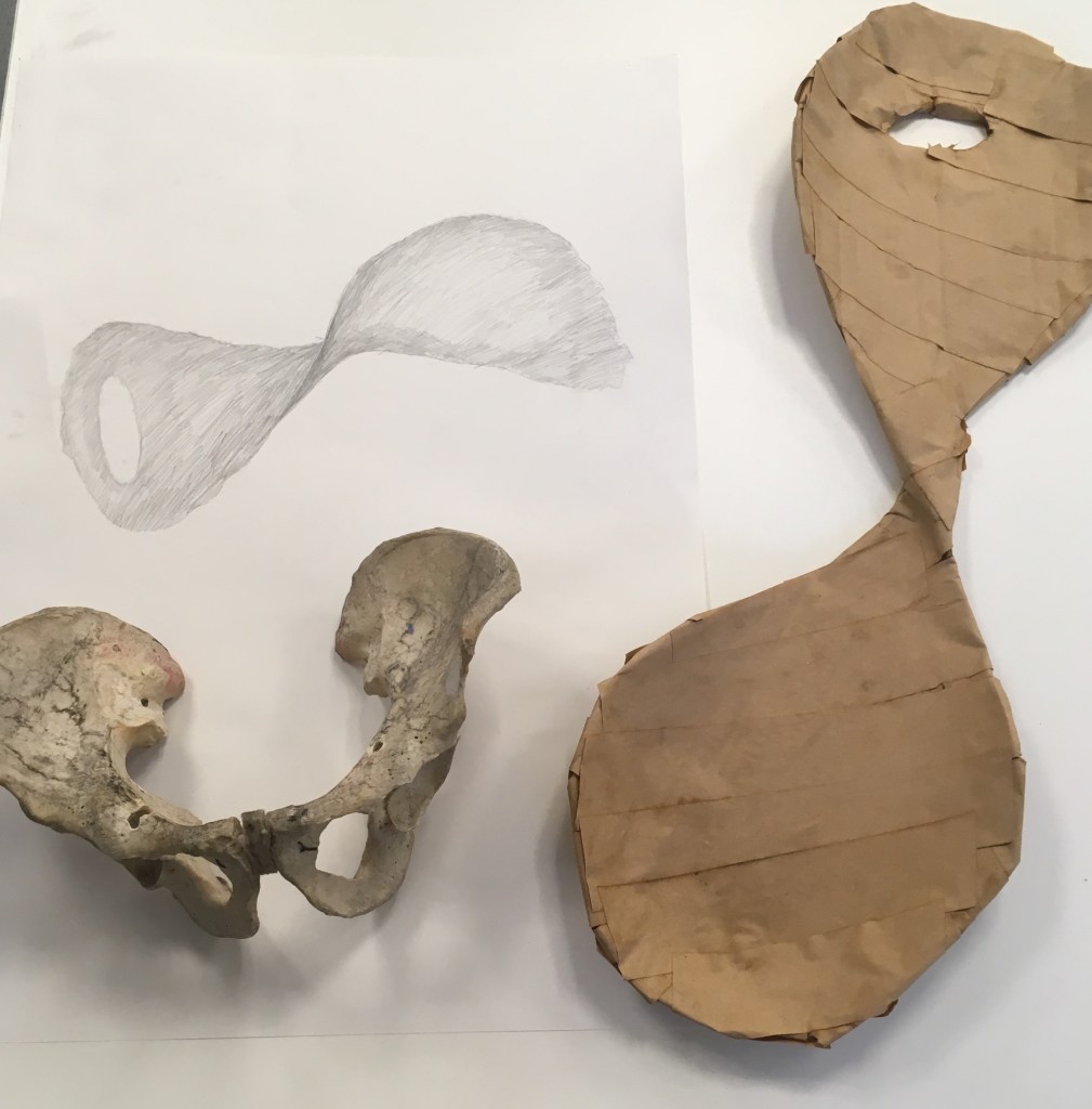
The collaborative physical construction itself (L:R Front, Side, Back views), with bric a brac found objects, including a plate/bowl, wig, placemats, woven basket, magazine holder. I was particularly interested by the shapes and textures of the natural/woven elements seen here.
In this workshop, we had been briefed to bring in objects and in teams of 3 we pooled our objects and constructed these onto a mannequin, the shapes of which were to inspire a fashion series in a sketchbook.
One thing that I think worked well in the physical construction exercise, was use of the unusual shapes and contrasts between the different objects. I found it difficult to see this as a complete structure however with so much of the mannequin visible once it was completed. I think perhaps if we had deconstructed the objects, or used something additional that was more fluid that we could have done this?
I preferred engaging with the collage exercise in developing my own series however. Here I had a little more freedom to experiment without being limited to the rudimentary construction techniques at hand in the physical task. I could also experiment further with scale and focus on the shapes that particularly interested me.
The shapes/objects I returned to most was the fan/pleats created from the woven placemats, which I variously used as accessory and detailing, but also scaled up as top and skirt in different outfits. This object with shading and curvature the most suggested an interesting 3D structure in my photographs so I found it interesting to experiment with this, particularly since the original object is in fact flat.
I was also interested in using the flat shape of the circle as photographed from the bowl/plate. This because we are so used to seeing circles as balls/spheres, I liked playing with expectations here. It provided a suggestion of structure and rigidity to some of the outfits, which I liked in the armour-like plating in outfit 4, and the egyptian flat style of outfit 5. And I liked playing with the idea of flatness in outfit 6 along with the semi-corsetry from the rattan magazine cover.
So this contrast of 2D and 3D was interesting – particularly since the exercises were themselves reflecting on this transition.
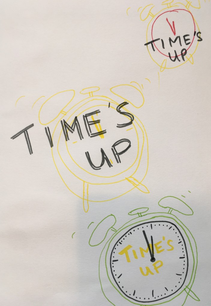
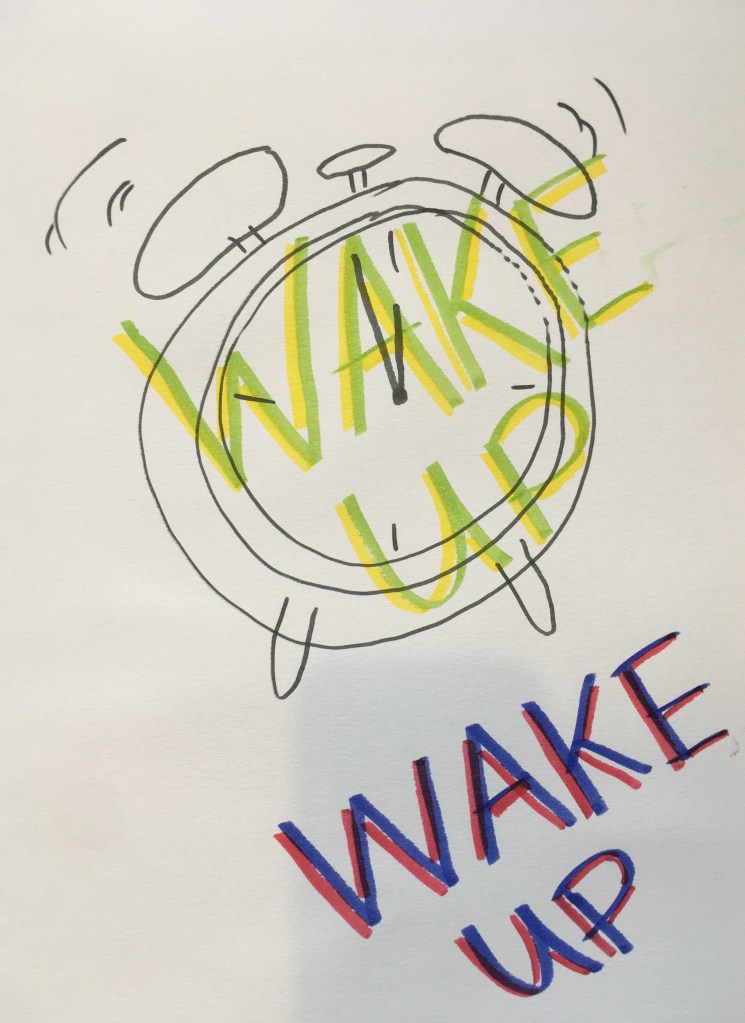
I started by experimenting with an alarm clock visual with the Extinction Rebellion slogan ‘Time’s Up’. I like the naive graphic style employed and have continued on this theme – the use of felt tip on paper also feels child-like and in keeping with the idea of our children’s future being at stake. I was experimenting with the use of yellow as contrast to black/grey but found this hampered legibility
An alarm clock seems a highly relevant object to be depicting here – alarm and a sense of urgency is precisely what is needed to drive action, and you do not allow an alarm clock to keep on ringing once it goes off – you act.
In my first drawing of the clock, I considered what time to show on the face. It immediately occurred that in depicting an analogue clock face, I could show the doomsday clock as it stands in 2019 (at two minutes to midnight https://thebulletin.org/doomsday-clock/current-time/ )
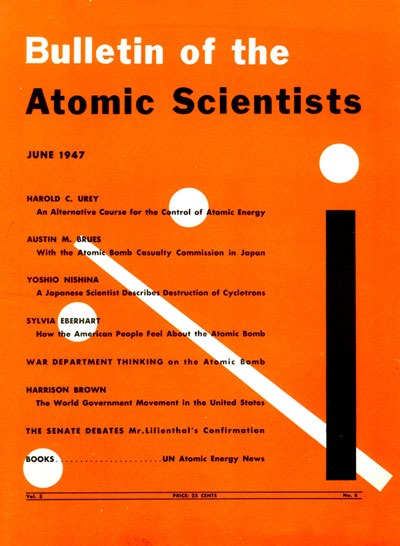
The first graphic depiction of the doomsday clock by Martyl Langsdorf
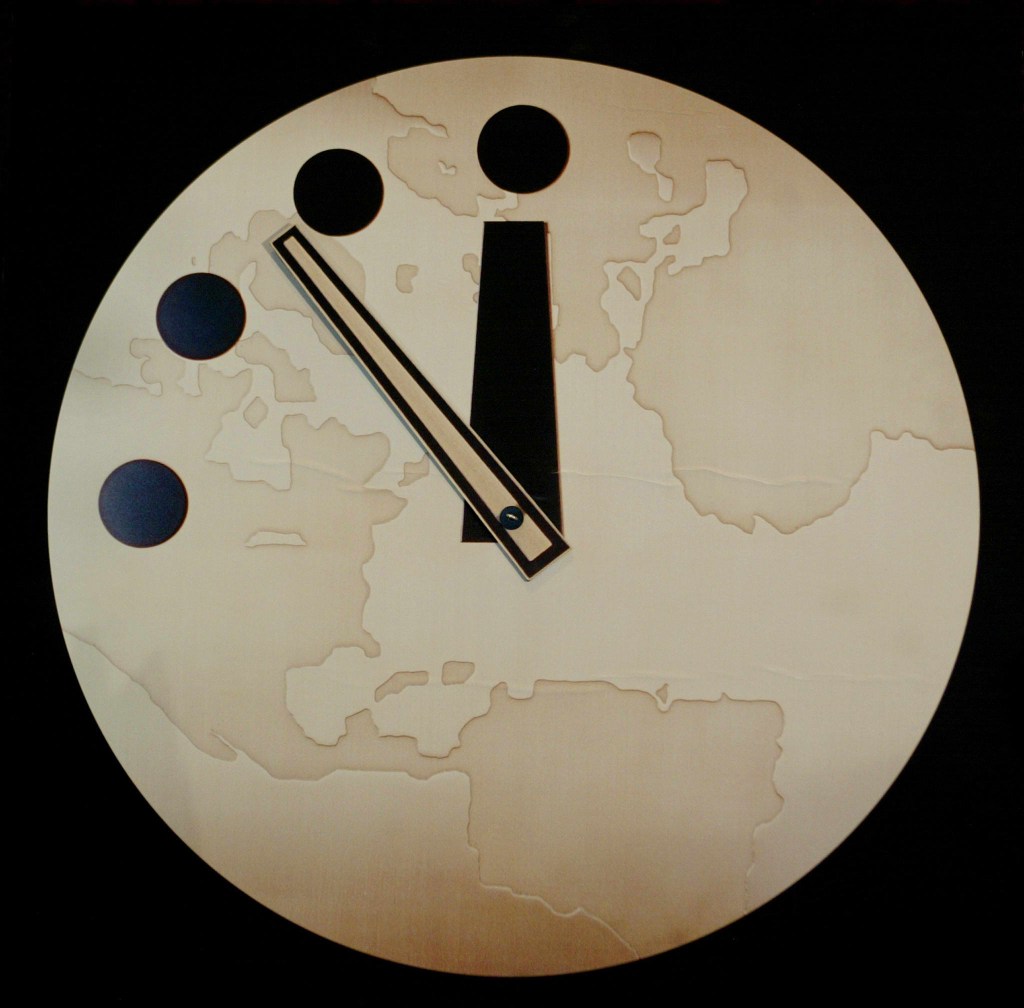
Later, a physical clock with a globe background was used by the Atomic Scientists Bulletin to demonstrate the changes in time
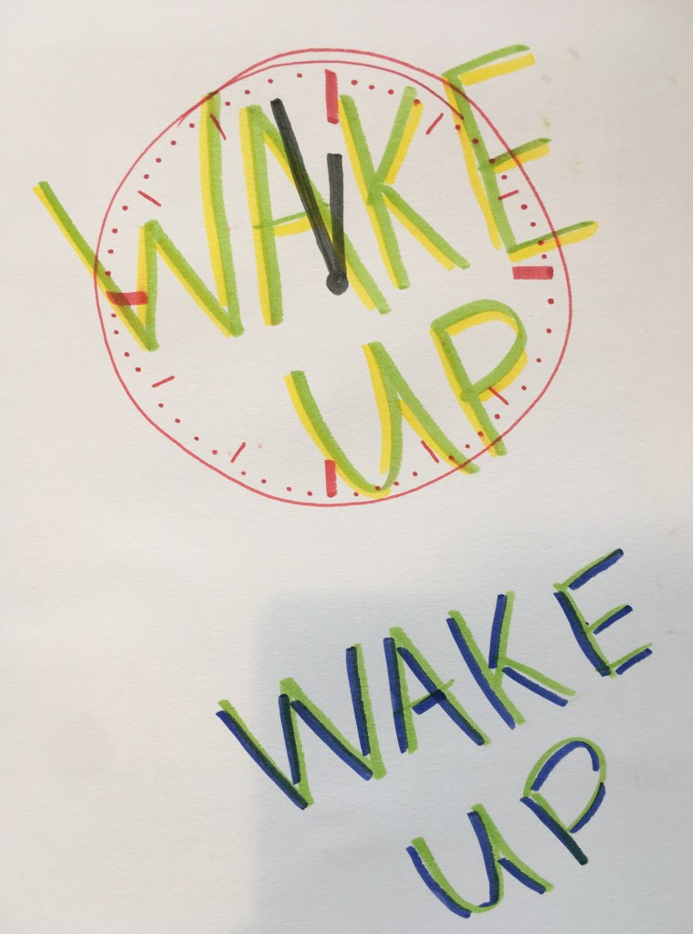
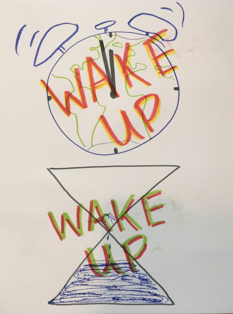
Here, I experimented with use of different colour and creating a 3D effect with the text to aid standout, and now adopted my own slogan of Wake up. I liked this slogan/text effect but felt more could be done to increase the focus on the doomsday time. I also experimented with blue/red as an alternative but this didn’t have the same sense of alarm for me.Here I dropped the alarm clock motif and focused on the doomsday clock itself. Using red here for the clock face, but a grey/black for the hands did help highlight the message, but it seemed a little more static now that it wasn’t an alarm clock. Experimenting with green/blue with the text felt a bit confusing for the eye.Here I experimented with further graphic detail in the icons. I adopted the globa background in my doomsday clock (adding back in the alarm bell element of the alarm clock) and i think this was highly effective. Also using red/yellow for the text reinforced alarm and a sense of heating that could help carry the message. Below I experimented instead with the Extinction Rebellion symbol and a melting ice cap imagery within it, but I think this was less successful (though an interesting idea I think)
Our 2nd theme is related to Dada and Surrealism, and we will be exploring various elements of play and chance around this in the next few weeks.
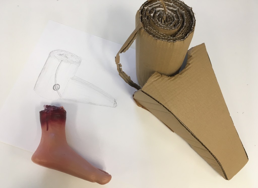
In the first of our briefs, we were to seek to remove ourselves from the subject matter. This would be achieved by the subject not being direct interaction with an object itself but the description of that object by someone only feeling it with their hands from inside a bag (reminiscent of some parlour games I had played as a child). So the visual object was twice removed from the subject of the drawing we were to make initially, and three times removed from the eventual cardboard sculpture we would construct from the drawing. It was only once we had completed our sculpture that we would discover what that object really was. We were paired up and took it in turns to describe or draw a different object.
In this way we were exploring the idea of authorship and subject as done by Francis Alys – who briefs into two sign painters to create a triptych based on his own original painting.
Francis Alÿs, Untitled (in three parts), 1995-1996. Triptych, encaustic on linen. Collection of Institute of Contemporary Art, Miami. Gift of Stanley and Nancy Singer.
I found this task very interesting, and enjoyed the challenge of conceptualising the object in a new and different way. The fact that we were working from organic forms which would not usually be summarised by geometric shapes made this an interesting challenge. When describing the object for my partner, it was easiest to talk in comparison and simile, e.g. ‘it is curved inwards like a spoon or a shovel’, and to use gesture to help indicate the contorted forms and shapes in the air.
The object I described to my partner, her drawing of this description, and the cardboard sculpture she created of this, 09/2019
It was interesting to see the elements of my description that were picked up in her drawing, and what details were lost. The form was greatly simplified and generalised, but the crucial elements remain (of the broad curved planes and the twisted dimension). The finer detail and symmetry of the piece was lost, though these had been described they were perhaps less easily conceptualised by the non-viewer.
My drawing and sculpture, based on the object described to me by my partner, 09/2019
Here too the forms were simplified towards geometry. I drew tentatively, so that I could reshape and revisit the lines as the description progressed. She began describing the foot itself as a rectangle, before clarifying that it was in fact more sloping and curved. Other elements were depicted that were less visible, but tangible nonetheless, e.g. the seam of the plastic moulding of the foot.
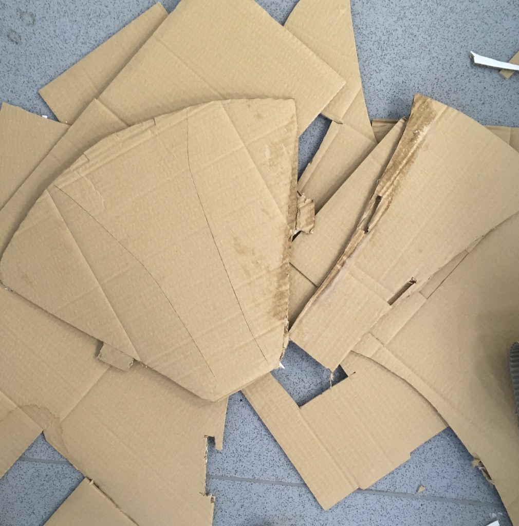
When converting the drawing to a cardboard sculpture, I further generalised the forms, in light of the thick cardboard material we were given. The curved shapes and ‘lumps’ that ended up being the toes were details that were lost. After finding the gummed tape difficult to use as a fast adhesive for the structures I was seeking to achieve, I redesigned the foot to be formed from one piece to minimise the need of the tape. I used scoring to gain the bends that would be needed.
A failed foot attempt using two pieces, using gummed tape which made the cardboard itself soggy and unable to retain its shape
I enjoyed the conceptual challenges in this task, but am not overall happy with the artefacts produced. That said, the task was indeed to remove our own aesthetic preferences from the process, so in this sense I have been successful!!
What has interested me is this notion of reducing objects to their essential elements, or simplifying them. I am reminded of the notion of Plato’s Forms, which were the ideal essence of the objects we see in the world (i.e. that there is a Chair Form which all chairs in the world harken to and symbolize in some way, that we recognise). Perhaps this act of simplification gets us closer to the Form?
I am interested to learn more about the idea of form in sculpture, and plan to visit the Henry Moore studios to discover more.
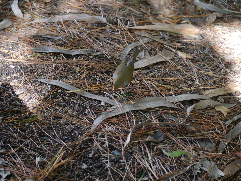
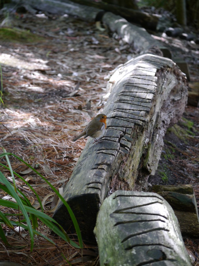
A robin took advantage of some crumbs that had fallen from my lunch @ Eden Project, 09/2019
There is a lot of support indirectly and perhaps unconsciously given to the world around us. In Eden I witnessed a Robin picking up crumbs that I had just swept from my knee during a quick lunch in the woods.
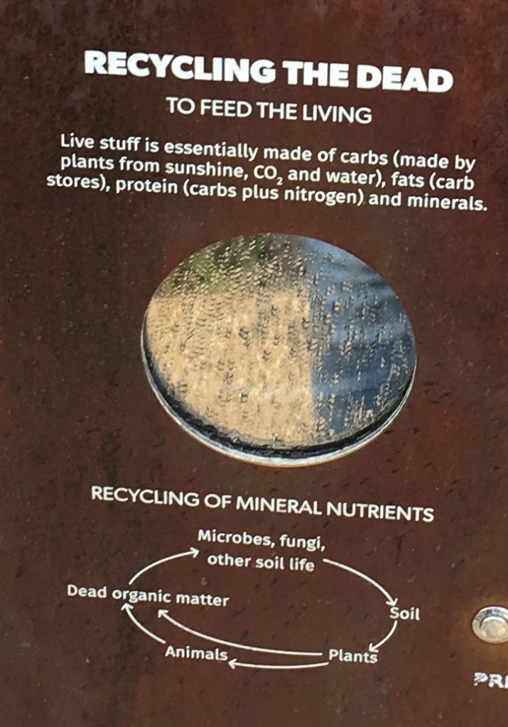
The pinnacle of unintended support and connection comes after death. Our bodies return to the earth and can support other lifeforms.
But this is not the only way dead lifeforms can support the living. Humans make various use of dead lifeforms as raw materials for construction, and other supportive functions for life.
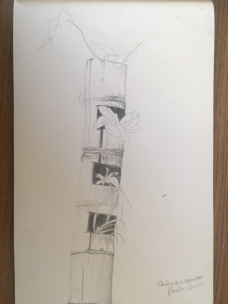
Here bamboo was being used as a planter
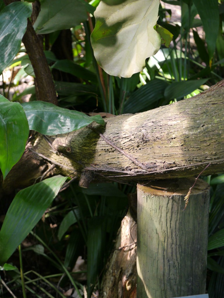
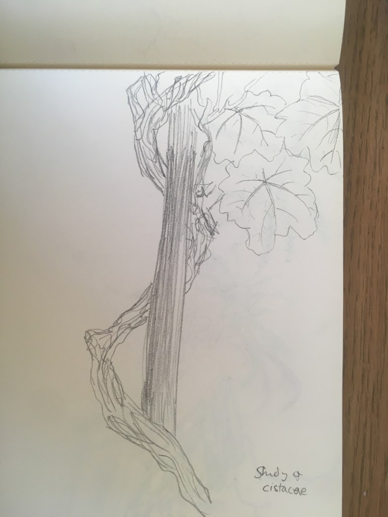
A tree stump is being used as a literal support for the bending trunk of a living one.A Cistacae plant grown twisted around and supported by a wooden post.
Bees are a support system in themselves – providing vital pollination to plantlife, and nourishing animals like humans in turn.
A bee on a flower at Eden Project, 09/2019
While reflecting on the importance of the support from bees, it is unsurprising that a honeycomb structure was chosen for the iconic biomes at the Eden project – where they aspire to be connecting us. The delicate structure appears bubble-like from the outside, with the tesselated structure dominant all across the heavens inside.
The Eden Project biomes, 09/2019Internal biome dome study, pencil on paper 09/2019
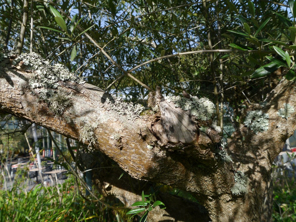
Lichens are interesting to the idea of inter-connectedness and support for several reasons:
Lichens are communities of fungi, algae and other bacteria which support each other – fungi provide a home and minerals, algae convert sunlight to food.
Lichens can survive in all kinds of hostile conditions – on mountain tops, the coast, tropical forests and limestone pores under the ice in Antarctica
Many birds use lichen for nest building to help them camouflage
Some insects such as Markia hystrix (a grasshopper in south america) live in and on lichen.
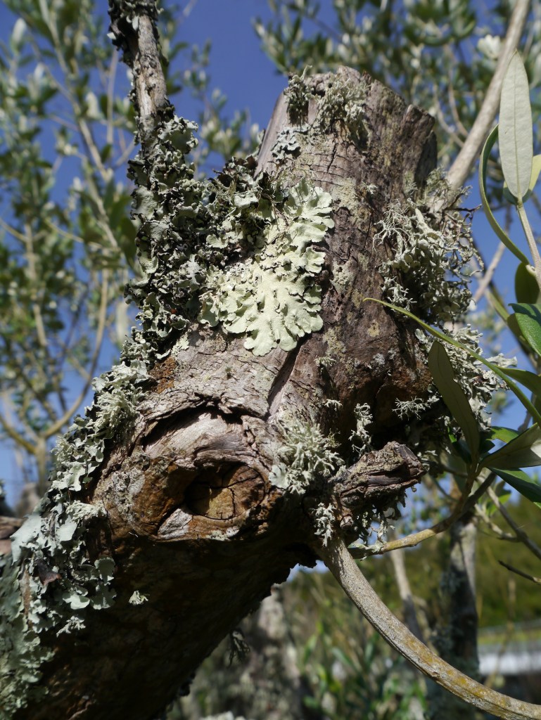
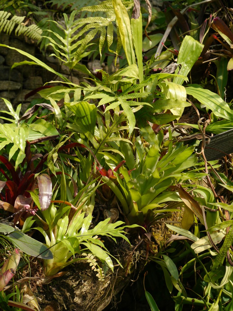
I observed various instances of lichen growing on other lifeforms around the Eden Project. I particularly like their textural contrast.
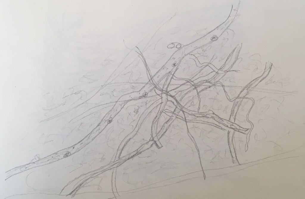
Pencil on paper sketch of lichen on tree branch stump 09/2019
Besides the visual communications Eden themselves used to evoke inter-connectedness, I was interested to witness this survival strategy in action in the lifeforms in and around the site itself.
Lifeform directly supported by another lifeform: ‘symbiosis’
Lifeform supported indirectly by another lifeform e.g. benefiting from the death of another, or picking up scraps.
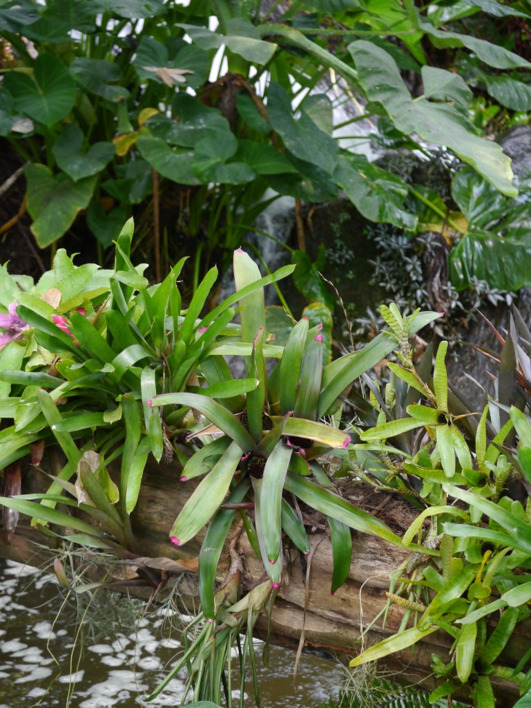
Direct Connection/Support: Epiphytes
Within the rainforest biome, I observed an interesting type of plant known as ‘epiphytes’ – ones that use other plants for support and do not themselves require soil, and are not parasitic.
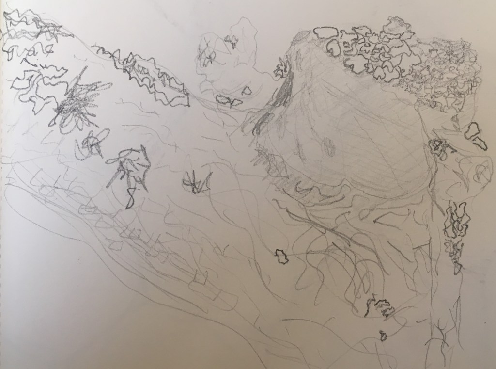
Here some epiphytes growing off a tree trunk, fallen across the base of a waterfall in the Rainforest biome at Eden Project, 09/2019Here another fallen trunk covered in epiphytes – here we can see the trunk is covered in moss and tendril-like roots
These plants are supported in a literal sense, as they are suspended in the air by the trunk on which they grow. That they grow on the trunk but are not parasites is particularly interesting. In both of these photographs I like how vibrant and full of energy the plants look, with their spiky forms and vivid green colours.
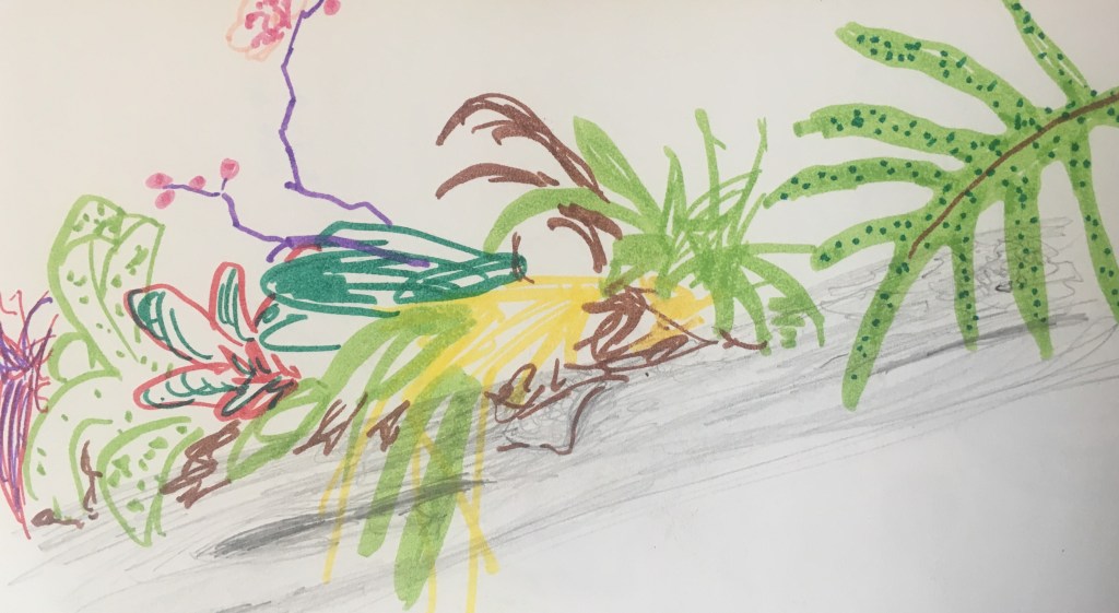
Epiphytes, Felt tip and pencil on paper, 09/2019Study of epiphyte roots detail, pencil on paper 09/2019
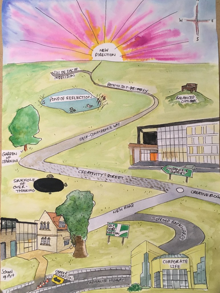
My map – Sophie Green – using watercolour, inks, pen – 09/2019
My map tells the story of my future upon embarking on the Foundation Art & Design course, having diverted from my corporate career. Creativity, self-confidence and discovery will all lead me to a new direction. Along the way I will need guidance & support, learning, reflection and a balanced outlook to help me avoid the hazards of self-doubt, over-thinking and indecision. Here I have incorporated the conventions of mapped allegory with a naive illustration style as seen in children’s fiction.
On reflection, I think it may have been good to incorporate some way of showing where I am on this journey now, as a reflection of the viewpoint from which this was created. There is a sense of there being less charm and life to it than the 100 acre wood, which could be improved by including wildlife/characters, or small asides/commentary and more shrubbery. I’m not sure this conveys as much humour as I might have liked either. The overall image is very flat, perhaps slightly more than intended. Perhaps instead this is not helped by a very flat horizon/endpoint?
That said, I am pleased with the materials I chose, and the perspectives of the buildings I depicted as I think they are recognisable likenesses.