Typography: my work

In this workshop, we were introduced to the Adobe InDesign app, taught several basic functions within the app, completing various exercises to put these to practice, and then finally asked to create several typographical representations of a word given to us from a hat.

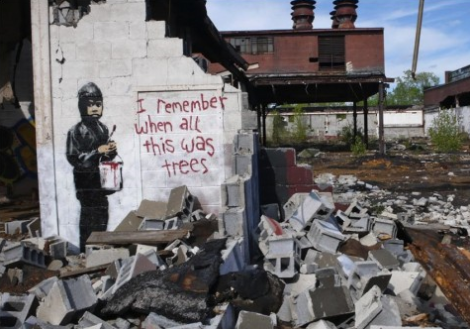
I found this brief especially interesting to read and so think I would like to explore typography in greater depth.

We were instructed to use Helvetica as a neutral font type, and asked to choose a letter to experiment with. I chose a capital R as I thought it had an interesting variety of form to play round with (straight, curved and wiggly).

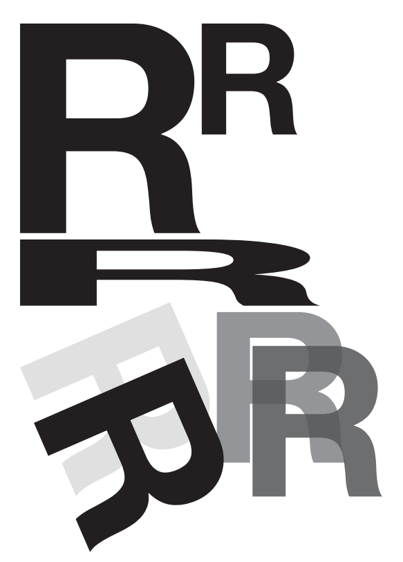
First we experimented with duplicating and transforming the letter in dimension and orientation. Then too with opacity and layering. What’s interesting here (which I have only just noticed) is that unintentionally I arranged the page in the shape of the R I was using..!

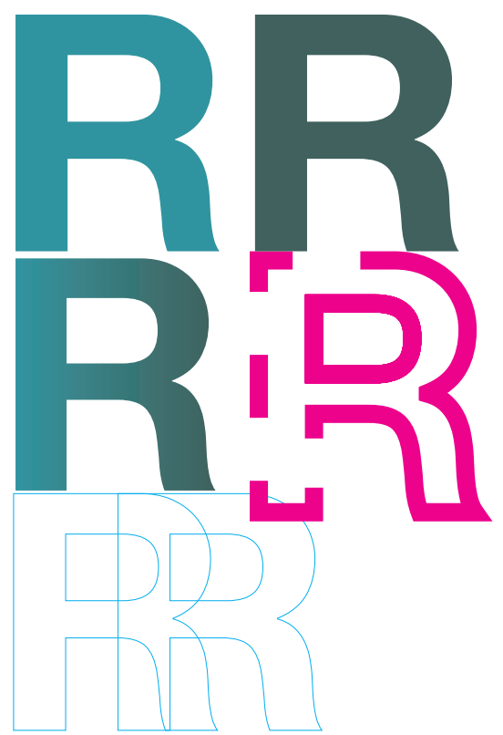
Then, we experimented with colour fills, as well as gradients, and outlines with varying thickness and pattern.

Here, by masking certain elements of the letter by drawing a shape over it, we experimented with deconstructing the letters and marrying them to create new letters or abstractions. I enjoyed this especially, and testing how far the letter could be pushed and still recognised.

I was given the word ‘error’ to portray through type. This word for me has connotations of machinery and computing, as it’s synonymous with ‘error messaging’ in applications and computer systems. As such I knew I wanted my typograms to play on this.

I began by writing this as one word, and sought to experiment with one of the outlining functions which makes the edges angular/squared – to increase it’s artificiality. I arbitrarily drastically increased the size of this outline and it created an unforeseen interesting result, whereby it was obliterating the word itself. I liked the effect it gives, a bit like someone has viciously markered a piece of paper. Over the top of this, I included a small ‘error’ in a typeface that evokes typewriter or mechanical writing as a footnote of sorts. I chose a contrasting yellow to have this stand out, but also give a sense of alarm. Interestingly, when printed the strength of the black ink behind this yellow note means the type is almost imperceptible.

For my next page, I wanted to experiment instead with each letter in isolation. I chose to continue with the yellow/black palette for this piece as well. I knew I wanted to mix up the sizing, typeface and capitalisation of the letters to disrupt the reading of the word. I deconstructed my capital E which I find interesting since it remains identifiable despite the middle and bottom horizontal lines being disjointed.

The fact I had three rs in my word was interesting, since I had been working with this earlier. I chose to still have one capital R here but I enjoyed exploring the lower case r in this instance – particularly when duplicating and varying the opacity and making this overlap. This reminded me of an error that used to happen with Windows OS and that was featured in the opening credits of the IT Crowd tv show (which again reinforced this connotation of error).

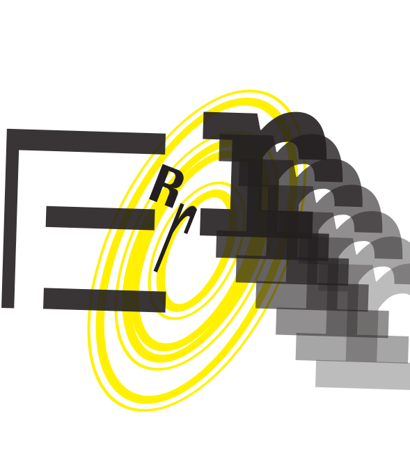
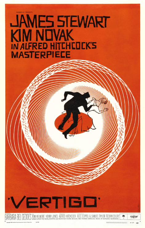
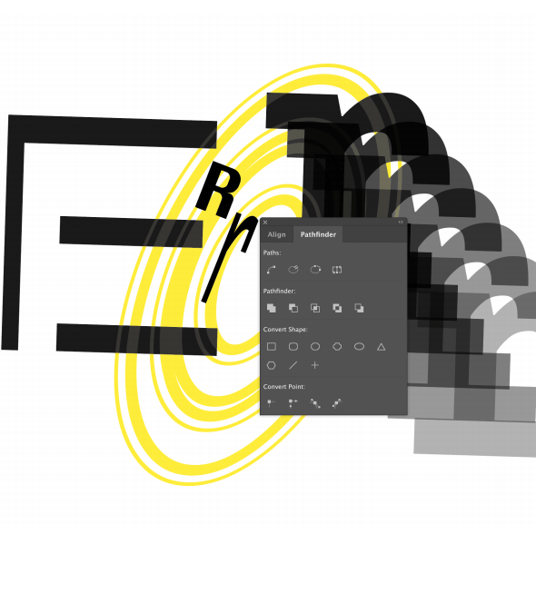
For the O, I wanted to again play with the outlining feature, and again using an oversized one, I achieved an interesting effect which effectively multiplied the letter itself. By scaling this up and tilting it I realised it looked a little like the iconic Vertigo poster, and I liked the additional meaning this could convey, alongside the repeating r, of you falling into an endless error. I backgrounded this to highlight that sense of falling into it. [Here again, the vortex is appearing as a motif!]

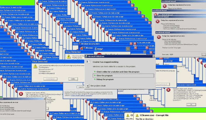
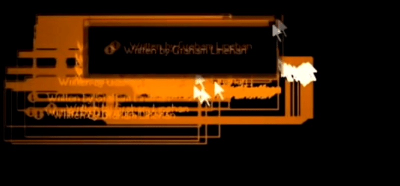
I further subverted this work by ‘accidentally’ leaving one of the InDesign function windows on top of the design and screengrabbing it to create a further page – in a postmodern sort of way.

I also enjoyed seeing this message at the bottom of the application window and thought it could in itself ironically imply a paradox of both being and not being an error.

I enjoyed this 1/2 day workshop greatly, and would like to work to extend it as suggested at the end of the brief.

Approaches to Drawing: Research/my work

I was keen to try out the single line approach with drawing for myself having looked into Calder.

First I had a go with doing a figurative piece based on my cat, Jasmine.

My first attempt (top left) I had started with a gel pen and I like the design of this work but the line quality was not as satisfying, so I moved into brush pen for the remainder. This also gave a little more freedom to my stroke, where I perhaps had been a little more focused on ensuring the pen did not lose contact with the paper with the gel, giving a more precise and static feeling.

I explored the depiction of the distinctive markings she has – a black stripe down her back and into her tail. I think this perhaps over-complicated the picture though, and I find the more simplified line drawings more satisfying. I enjoyed adding a suggestion of texture with the outline though, and developed this in several test runs. The final work I think has the best expression of this, and I am especially pleased by the impression of the right haunch – here the line is not so literally portraying her outline but highlighting the form in another way.

It was relatively quick for me to run this exercise, so could be easily repeated, though it did require several iterations for me to explore it. Perhaps this iteration gets streamlined with practice, but I am interested that this helps process the visual into something more essential.

Approaches to Drawing: Alexander Calder

They used to sell wrapping paper at the League and we found that it was pretty good for drawing. You folded a sheet into eight rectangles and it would fit in your pocket. With this we used to pass our time drawing people in the subway on our way to and fro.

I seemed to have a knack for doing it with a single line.

Alexander Calder (autobiography, 1966)

Calder didn’t start pursuing a career in art until the aged of 24 in 1922, when he began taking night drawing classes in New York, having found the working life following his graduation from engineering to be much too dull. He found his start as an illustrator at the National Police Gazette capturing athletic events including one time a circus (which was to serve as inspiration for the work that would catapult his career).

Once he had his own studio, he immediately began experimenting in wood and wire, and then wire alone. His works are recognisably playful and characterful and were sometimes called caricatures.

One cannot describe his works – one must see them…The figures are amazing and in these works of art all artistic rules are suspended for the moment.

B. Werner review of Calder’s ‘Portraits, Sculptures, Wire Forms’ Nierendorf Galerie, April 1929
The Brass family, 1929
Kiki de Montparnasse, c.1930

His networking in Paris was crucial to his gaining renown in the art world, and also was to provide a key catalyst to his work – none more so than his visit to Mondrian’s studio in 1930.

Piet Mondrian, Composition with Red, Blue, and Yellow, 1930, oil on canvas, Kunsthaus Zurich

It was a very exciting room. Light came in from the left and from the right, and on the solid wall between the windows there were experimental stunts with colored rectangles of cardboard tacked on… I suggested to Mondrian that perhaps it would be fun to make these rectangles oscillate…

This one visit gave me a shock that started things.

Though I had heard the word ‘modern’ before, I did not consciously know or feel the term ‘abstract’. So now, at thirty two, I wanted to paint and work in the abstract.

Alexander Calder (autobiography, 1966)
Drawings, 1931-2. Alexander Calder: “These are some of the drawings I made right after I visited Mondrian’s studio. They are among the first abstract things that I did and they led to the wire universes”
Mobile c.1932 Alexander Calder 1898-1976 Lent from a private collection 1992 http://www.tate.org.uk/art/work/L01686

Marcel Duchamp’s ‘Nude descending the stairs’ is the result of the desire for motion. Here he also eliminated representative form…

Therefore why not plastic forms in motion?…Just as one can compose colors, or forms, so one can compose motions.

Alexander Calder, exhibition notes at Berkshire Museum, Aug 1933

I had not heard of the mention of ‘plastic forms’ before, and initially thought this referred only to the material plastic. Upon researching this though I understand it now to mean anything that has the capacity for the artist to shape it, so in most cases for Calder, wire.

The move into kinetic or moving sculpture was groundbreaking for Calder – here he not only was playing with form and space in his wire drawings, but also time and movement. Though some were powered by motors, others were only subject to the movement of air or external stimuli.

A Universe, 1934 – motorized mobile: iron pipe, wire, wood, string

The underlying sense of form in my work has been the system of the Universe, or part thereof… the idea of detached bodies floating in space…

There is the idea of something floating – not supported – the use of a very long thread, or a long arm in cantilever…seems to best approximate this freedom from the earth.

Thus what I produce is not precisely what I have in mind – but a sort of sketch, a man-made approximation

That others grasp what I have in mind seems unessential, at least as long as they have something else in theirs.

Alexander Calder, ‘What Abstract Art means to me’, 1950

I have enjoyed learning more about Calder, after I was first fascinated by one of his mobiles at the Peggy Guggenheim in Venice. One thing that I am eager to try and take into my own practice is to try the line drawing technique. Til now I think I have shied away from this for fear of making a mistake, but I am intrigued by the unique forms that come from this method, and the simplicity of the finished work, so will resolve to experiment with this!

Helene Schjerfbeck exhibition: research/reflection

This weekend I visited the RA to see the retrospective on Helene Schjerfbeck, the first solo exhibition of her work in the UK. Born in Finland in 1862, she was an active painter until her death in 1946.

I was keen to visit this exhibition, to continue my run of women artist retrospectives in 2019, begun with Lee Krasner and Natalia Goncharova. This is motivated by various reasons for me – to do what I can to ‘vote with my feet’ and support the rewriting of art history to include women who deservedly should be included within it, in the process educating myself and reflecting on their practice, and further because something about observing depictions of female subjects devoid of the male gaze is palliative and reassuring to me in some ways. I have often felt very uncomfortable in the more historic wings of art galleries, filled with idealised and sexualised female forms, and while some women artists have continued in this convention in the hopes of subverting the narrative, I find it most interesting seeing depiction go beyond this.

The exhibition itself was divided into 5 sections, split across 3 rooms, suggesting that the curator could have filled a good number more rooms if given the space!

Dreaming does not suit me. To work, to live through work, that is my path.”

Helene Schjerfbeck

I think this artist held a deep emotional intelligence, and conveying complex emotional narratives in her work. I will highlight the works I found to be most interesting here, in the order in which they were presented in the exhibition.

Section 1.

The Bakery (1887)

For this painting, Schjerbeck had set up her easel in a working bakery but chosen not to depict the bakers who no doubt would have been present at the time. In this sense she is already subverting the conventions of naturalism. I found this painting a little unsettling, and reflected on it for some time. The scales, just off centre, are unbalanced. We see a large table filled with fresh baked buns, just laying there (the perspective of this feels like it is exaggerating the size and dominance of this in the space). There is a sense of stillness and murkiness in the room, which is contrasted by the vivid light from the furnace emanating from around a corner in the distance. It implies for me a sense of waste, empty endeavour, inequality in a land of plenty.

Shadow on a wall (Breton landscape), 1883

I was intrigued to see this painting in the exhibition, following my own thinking around depiction of shadows and impermanence. For me, this painting was interesting as she had taken great care to depict the detail of the young branches on the foregrounded tree, to a very fine degree, but the subject of the painting itself, the shadow, contrastingly feels slightly sketchy or blurred. I wondered if this could be defying the convention of the object of focus being also the main subject of a piece (as in photography for instance). The effect is such that it is as though we are only seeing the shadows in our peripheral vision, as though they are some ever-present looming darkness. I think this must be the intention, since the landscape itself is fairly sparse, and the space taken up by shadow is quite large, you cannot focus on the tree without seeing it.

Section 2.

Silence, 1907

There is an interesting quality of light in this painting, her blue dress and delicately lit face contrasting with the plain dark background. The shape of her long neck and sloping shoulders makes her look ethereally elongated, and removed. Again here a sense of stillness and reservation – even regret from the downturned eyes?

Section 3

This room was dedicated to her self-portraits, painted throughout her life. Her style became more abstracted over time, and she confronted her mortality and the deterioration of age head on, with the final works completed within a year of her death at 83.

I found it quite a challenging room to be in, and felt that not only was she exploring that physical change she was seeing over time, but also capturing perhaps her self-perception and attitude towards herself. It is not a sympathetic view of aging we see in her final works, the figure abstracted to almost not being human. I wondered if here the figure of Nosferatu from early cinema might have been an influence (the film was released 20 years prior) – if so characterising oneself as a monster is certainly suggesting a troubled internal world.

Schjerbeck’s technique involved applying paint and then scraping it off or rubbing it back. She repeatedly reworked surfaces with a brush, palette knife or cloth and even sandpaper. The layering and erasure emulate the effects of time in paint. In some cases, parts of the canvas are deliberately left bare, using this texture as part of the picture.”

RA notes – Helene Schjerbeck exhibition

I was interested to read about her techniques with paint – she used oils which I am not familiar with but if applied thickly I imagine a similar effect can be achieved with acrylic? Could be interesting to experiment with this.

Section 4

Girl with beret, 1935

In this room, we saw more of Schjerfbeck’s portraiture, and here her style has developed further. She is using a variety of source material, including the latest fashions from Marie Claire and Chanel, as well as using her own memories and imagination to influence her work. This results in something more abstract and generalised, and though here again there is a woman with downcast eyes, here it suggests a sort of melancholy or regret for me, with a sharper light being cast on the figure.

Section 5

Her still lifes are for me really interesting. The exhibition notes stated that she would work on multiple canvases at a time, doing these as a counterpoint to the many portraits she did. As such I think she may have been a little freer here and we see her particular approach to painting clearly evidenced.

I especially liked seeing the variety of marks she used for the pumpkin still life and how the intent with these marks is not to recreate/emphasise what must have been a very rounded shape.

This exploration and experimentation with abstraction did not quite take her far enough in my view, and I left feeling like if only there had been a further section to her working life we might have gotten somewhere exciting. It left me somewhat unsatisfied, having seen the broad experimentation of Lee Krasner and Natalia Goncharova. But I certainly enjoyed seeing the depths of emotion contained within her works nonetheless.

Impermanence: my work & research

Since the lecture on approaches to drawing, I’ve been interested in thinking about impermanence in art and materials disintegrating.

This specifically was sparked by the mention of artist Amanda McCavour who creates ‘thread drawings’ on water-soluble fabric. One material (the thread) remains while the other (the fabric) disappears.

I think this is different to auto-destructive / destruction art. Where the whole piece might be destroyed in the process, e.g. Gustav Metzger’s acid paintings, or Banksy’s Love is in the Bin. Instead it is the juxtaposition of something ceasing to be, while something else endures. For me, this is akin to memento mori. We are reminded of our own mortality, while at the same time viewing something that will endure beyond the life of the subject.

I looked to other water soluble materials to experiment with this idea. In both tests I took the paper and ran it under the tap directly – this alone let the pen run, but I had to stroke the sketch itself in order to distort it directly. In both cases I chose to use imagery/text that directly act as memento mori.

I think this was an interesting experiment, but I wonder if it is a little too obvious? I may try to incorporate this into a more subtle approach.

Another thought I had was to make use of fleeting phenomenon to explore impermanence. In particular, shadow. In the process of making one of the objects for my survival kit, I happened upon an interesting shadow form as I was exploring it in suspension

I would be interested in exploring this theme further also. I am aware of artists creating sculptures in order to cast figurative shadows, but am not yet aware of more abstract shadow pieces, which I am interested to look into.

Detail of shadow cast by Kira Freije’s Standing Woman Arms Folded, RA

Play: abstract use of objects – Research/my work

I was reflecting the other day about how several of the workshops we undertook in consideration of Dadaism and chance was in using objects in unusual ways/reducing them to their forms.

This reminded me of an artist I followed on instagram, Christoph Niemann (@abstractsunday) who illustrates for the New Yorker. He has an interesting TED talk which I include below, which discusses precisely this, and the role of the audience in visual communication (without recourse to cliche). I also enjoyed hearing about how this allows simple images to communicate complex ideas, even emotions – we fill in the blanks. The picture only need suggest enough.

I particularly enjoyed learning about his strategy here, in choosing an object from his home and reflecting on it for some time in how it might be portrayed differently.

The real magic doesn’t happen on paper, it happens in the mind of the viewer. When your expectations, your knowledge, clash with my artistic intentions.

Christoph Niemann, 2018

I am interested to use this strategy for myself. Following the success of my teapot figure I wondered about using one of the teapots I have at home.

I like these abstractions – I think I could develop them further and take better into account the space around my drawings to ensure I can best document the intended perspective in my photography (without going off the edge of the paper! Here I used A2 paper, but perhaps A1 would be better, especially when using sizeable objects.

The use of ink felt right here, as Niemann uses, as helps for quick sketching, but collage might be interesting too.

Survival Strategies/a call to action: Research & my work (pt 4)

I started by experimenting with an alarm clock visual with the Extinction Rebellion slogan ‘Time’s Up’. I like the naive graphic style employed and have continued on this theme – the use of felt tip on paper also feels child-like and in keeping with the idea of our children’s future being at stake. I was experimenting with the use of yellow as contrast to black/grey but found this hampered legibility

An alarm clock seems a highly relevant object to be depicting here – alarm and a sense of urgency is precisely what is needed to drive action, and you do not allow an alarm clock to keep on ringing once it goes off – you act.

In my first drawing of the clock, I considered what time to show on the face. It immediately occurred that in depicting an analogue clock face, I could show the doomsday clock as it stands in 2019 (at two minutes to midnight https://thebulletin.org/doomsday-clock/current-time/ )

Here, I experimented with use of different colour and creating a 3D effect with the text to aid standout, and now adopted my own slogan of Wake up. I liked this slogan/text effect but felt more could be done to increase the focus on the doomsday time. I also experimented with blue/red as an alternative but this didn’t have the same sense of alarm for me.
Here I dropped the alarm clock motif and focused on the doomsday clock itself. Using red here for the clock face, but a grey/black for the hands did help highlight the message, but it seemed a little more static now that it wasn’t an alarm clock. Experimenting with green/blue with the text felt a bit confusing for the eye.
Here I experimented with further graphic detail in the icons. I adopted the globa background in my doomsday clock (adding back in the alarm bell element of the alarm clock) and i think this was highly effective. Also using red/yellow for the text reinforced alarm and a sense of heating that could help carry the message. Below I experimented instead with the Extinction Rebellion symbol and a melting ice cap imagery within it, but I think this was less successful (though an interesting idea I think)

Survival Strategies / a call to action: Research (pt 3)

Yesterday, Greta Thunberg gave an impassioned and uncomfortable speech to the UN Climate Summit, berating them for not acting on climate change, despite the 30 years of science warning them of the consequences. It is chilling to think of the inaction of society against such an existential threat.

Text of the speech can also be found here: https://www.theguardian.com/commentisfree/2019/sep/23/world-leaders-generation-climate-breakdown-greta-thunberg

This made me think of the allegory of zombies used by George Romero in his 1978 film Dawn of the Dead, as a scathing critique of consumerist culture in the Western world. The zombies’ lumbering gait and slow speed imply an inevitable threat (like climate change) but also we see they are un-thinkingly stuck within the habits they have formed in their human lives – in the film we see the zombies gravitate to the mall, and this highlights just how irrational this constant need for more is. Even more starkly, the living protagonists fight to the death over their ownership of the resources within the mall – they cannot separate their need to possess from the drive to survive. Just like these protagonists/zombies, we cannot break free of the habits of our lives despite the existential threat looming in the climate crisis, and politicians to now have sought to assuage the guilt we might feel with empty reassurances and hope rather than action.

Here we see the Zombies in the shopping mall in George Romero’s Dawn of the Dead (1978)

This made me reflect on the use by Extinction Rebellion of the egg timer logo and the slogan ‘Time’s Up’. I wondered if another apt slogan might be ‘Wake Up’, in response to the idea of us and our governments being like zombies or sleepwalkers on the climate crisis.

Rage Against the Machine’s ‘Wake Up’ (1992)

In their return tour in the 2000s, Rage Against the Machine frontman Zack de la Rocha used this song as a platform to raise awareness on key political and social issues, by making a speech towards the end of the song during a more quiet section, to be followed by him screaming ‘WAKE UP’ 8 times.

 And in the face of all this propaganda I wanna say, we have here to unite here in Europe, we have to unite here in Europe across ethnic lines across religious differences across racial lines and its now the lines are clear. It’s us against the wealthy plain and simple. It’s time to wake up. WAKE UP.

Zack de la Rocha, 2010

Survival Strategies/A call to action: Research (pt 2)

I was interested in looking more into how graphic artists have influenced the imagery of protest. One such artist of recent times is Patrick Thomas, who with his book the Protest Stencil Toolkit sought to provide activists with ready-to-go icons to use in protest banners and materials, or even street art. This builds on the relationship street art now has with social consciousness and bringing art to a wider audience – catalysed by Banksy (see below).

Patrick Thomas himself has aligned with Extinction Rebellion

Banksy has long portrayed environmental concerns in his street art, but has credibly been attributed a mural that is linked to Extinction Rebellion in 2019. The use of child-like handwriting and depiction of children underlines the importance of protecting future generations – a key message of Extinction Rebellion. That his artworks are generally to be found in public spaces means that it is truly art for the masses, and speaking directly to them (without the curation of an elite art world). In this way, it may break down the artifice and engage with people more meaningfully than other art might – and so potentially be more persuasive.

Extinction Rebellion mural in Marble Arch attributed to Banksy 2019
This previous Banksy mural echoes the style seen in the Extinction Rebellion one. That a child should recall trees in a derelict building site is eery, as it implies the rapid speed of destruction of the natural world.
Design a site like this with WordPress.com
Get started